Embed Size (px)
Citation preview
CHARTE GRAPHIQUEGRAPHIC GUIDELINES
DECEMBREDECEMBER 2013
01
Mai 2010 : Carbone Lorraine devient Mersen. Cette date marque
un tournant de notre histoire. En changeant d’identité, nous renouvelons
notre promesse d’expertise et d’innovation pour nous engager dans un futur
résolument durable.
Ces ambitions, nous les signifions par de nouvelles couleurs et de nouvelles
formes. Mais celles-ci n’auront de force que si nous les faisons tous vivre de
manière rigoureuse. C’est tout l’objet de ce document à vocation pratique :
détailler de manière très factuelle les règles d’utilisation de notre nouvelle charte
graphique. Et affirmer ainsi un groupe uni, solide et homogène.
Par le respect attentif et scrupuleux de ces règles d’utilisation, chacun de nous
contribue activement à faire rayonner notre Groupe dans le monde.
May 2010: Carbone Lorraine is becoming Mersen. This date marks
a turning point in our history. As we change our identity, we renew our promise of
expertise and innovation, committing ourselves to a future that is determinedly
sustainable.
Our new ambitions will be made known through new colours and new contours. But
these will only have an impact if we apply them with rigorous consistency. This is the
very purpose of this informative document which clearly and factually explains the
guidelines for using the elements of our new corporate identity, thus presenting to the
world a solid, cohesive and unified Group.
Through our thoughtful and scrupulous application of these guidelines, each of us
actively contributes to our Group’s reputation and influence across the globe.
Luc ThemelinPrésident du Directoire
Chairman of the Management Board
Avant-propos
Introduction
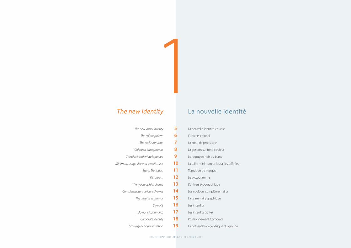
La nouvelle identité 4
La papeterie 21
La bureautique 28
L’édition 34
Les applications spécifiques 47
Le CD-Rom 51
Table des matières 54
The new identity 4
Stationary 21
Office applications 28
Publications 34
Specific applications 47
CD-ROMs 51
Table of contents 54
Sommaire
Contents
CHARTE GRAPHIQUE MERSEN : DECEMBRE 2013
1
CHARTE GRAPHIQUE MERSEN : DECEMBRE 2013
La nouvelle identité
La nouvelle identité visuelle
L’univers coloriel
La zone de protection
La gestion sur fond couleur
Le logotype noir ou blanc
La taille minimum et les tailles définies
Transition de marque
Le pictogramme
L’univers typographique
Les couleurs complémentaires
La grammaire graphique
Les interdits
Les interdits (suite)
Positionnement Corporate
La présentation générique du groupe
The new identity
The new visual identity
The colour palette
The exclusion zone
Coloured backgrounds
The black and white logotype
Minimum usage size and specific sizes
Brand Transition
Pictogram
The typographic scheme
Complementary colour schemes
The graphic grammar
Do not’s
Do not’s (continued)
Corporate identity
Group generic presentation
56789
10111213141516171819
B O O K 0 1
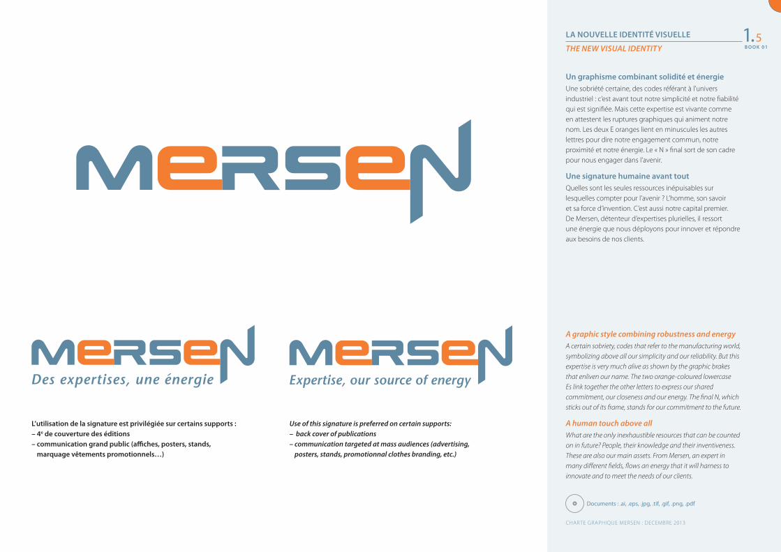
LA NOUVELLE IDENTITÉ VISUELLE
THE NEW VISUAL IDENTITY
A graphic style combining robustness and energyA certain sobriety, codes that refer to the manufacturing world, symbolizing above all our simplicity and our reliability. But this expertise is very much alive as shown by the graphic brakes that enliven our name. The two orange-coloured lowercase Es link together the other letters to express our shared commitment, our closeness and our energy. The final N, which sticks out of its frame, stands for our commitment to the future.
A human touch above allWhat are the only inexhaustible resources that can be counted on in future? People, their knowledge and their inventiveness. These are also our main assets. From Mersen, an expert in many different fields, flows an energy that it will harness to innovate and to meet the needs of our clients.
Un graphisme combinant solidité et énergie Une sobriété certaine, des codes référant à l’univers industriel : c’est avant tout notre simplicité et notre fiabilité qui est signifiée. Mais cette expertise est vivante comme en attestent les ruptures graphiques qui animent notre nom. Les deux E oranges lient en minuscules les autres lettres pour dire notre engagement commun, notre proximité et notre énergie. Le « N » final sort de son cadre pour nous engager dans l’avenir.
Une signature humaine avant tout Quelles sont les seules ressources inépuisables sur lesquelles compter pour l’avenir ? L’homme, son savoir et sa force d’invention. C’est aussi notre capital premier. De Mersen, détenteur d’expertises plurielles, il ressort une énergie que nous déployons pour innover et répondre aux besoins de nos clients.
1.5
CHARTE GRAPHIQUE MERSEN : DECEMBRE 2013
Documents : .ai, .eps, .jpg, .tif, .gif, .png, .pdf
L’utilisation de la signature est privilégiée sur certains supports :– 4e de couverture des éditions– communication grand public (affiches, posters, stands,
marquage vêtements promotionnels…)
Use of this signature is preferred on certain supports:– back cover of publications– communication targeted at mass audiences (advertising,
posters, stands, promotionnal clothes branding, etc.)
B O O K 0 1
B O O K 0 1
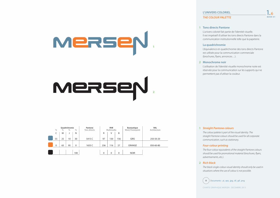
L’UNIVERS COLORIEL
THE COLOUR PALETTE
1 Straight Pantone coloursThe colour palette is part of the visual identity. The straight Pantone colours should be used for all corporate communication, such as stationary.
Four-colour printingThe four-colour equivalents of the straight Pantone colours should be used for promotional material (brochures, flyers, advertisements, etc.).
2 Rich black The black single-colour visual identity should only be used in situations where the use of colour is not possible.
1 Tons directs PantoneL’univers coloriel fait partie de l’identité visuelle. Il est impératif d’utiliser les tons directs Pantone dans la communication institutionnelle telle que la papeterie.
La quadrichromieL’équivalence en quadrichromie des tons directs Pantone est utilisée pour la communication commerciale (brochures, flyers, annonces…).
2 Monochrome noirL’utilisation de l’identité visuelle monochrome noire est réservée pour la communication sur les supports qui ne permettent pas d’utiliser la couleur.
1
2
1.6
GRIS 250-50-20
ORANGE 050-60-80
% % % %
C M J N
55 25 10 30
0 65 95 0
100
QuadrichromieTons directs
PantoneMultimedia
RVBWord, Powerpoint Architecture
Bureautique RAL
5415 C
1655 C
97 130 156
236 116 27
0 0 0
R V B
NOIR
Documents : .ai, .eps, .jpg, .tif, .gif, .png
CHARTE GRAPHIQUE MERSEN : DECEMBRE 2013
B O O K 0 1
B O O K 0 1
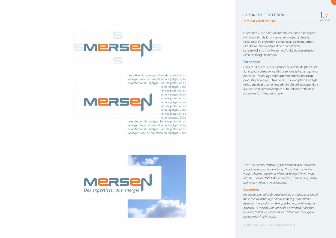
LA ZONE DE PROTECTION
THE EXCLUSION ZONE
The visual identity must always be surrounded by a minimal space to ensure its visual integrity. This exclusion zone is a virtual white rectangle into which no foreign element must intrude. The letter “S” of Mersen serves as a measuring unit to define the minimum exclusion zone.
ExceptionsIn certain cases, strict observation of the exclusion zone would make the size of the logo unduly small (e.g.: promotional item marking, product marking, packaging). In this case, an exception to the exclusion zone rule is permitted. Make sure, however, that at least some space is left around the logo to maintain its visual integrity.
L’identité visuelle doit toujours être entourée d’un espace minimum afin de lui conserver son intégrité visuelle. Cette zone de protection est un rectangle blanc virtuel, dans lequel aucun élément ne peut s’infiltrer.La lettre « S » du mot Mersen est l’unité de mesure pour définir la marge minimum.
ExceptionsDans certains cas, le strict respect de la zone de protection aurait pour conséquence d’imposer une taille de logo trop petite (ex. : marquage objets promotionnels, marquage produits, packaging). Dans ce cas, une exception à la règle de la zone de protection est admise. On veillera cependant a laisser un minimum d’espace autour du logo afin de lui conserver son intégrité visuelle.
1.7
protection du logotype. Zone de protection du logotype. Zone de protection du logotype. Zone de protection du logotype. Zone de protection du logotype. Zone de protection du logotype. Zone de protection du logotype. Zone de protection du logotype. Zone de protection du logotype. Zone de protection du logotype. Zone de protection du logotype. Zone de protection du logotype. Zone de protection du logotype. Zone de protection du logotype. Zone de protection du logotype. Zone de protection du logotype. Zone de protection du logotype. Zone de protection du logotype. Zone de protection du logotype. Zone de protection du logotype. Zone de protection du logotype. Zone de protection du logotype. Zone de protection du logotype. Zone de protection du logotype. Zone de protection du logotype. Zone de protection du de protection du logotype. Zone de protection du
CHARTE GRAPHIQUE MERSEN : DECEMBRE 2013
B O O K 0 1
B O O K 0 1
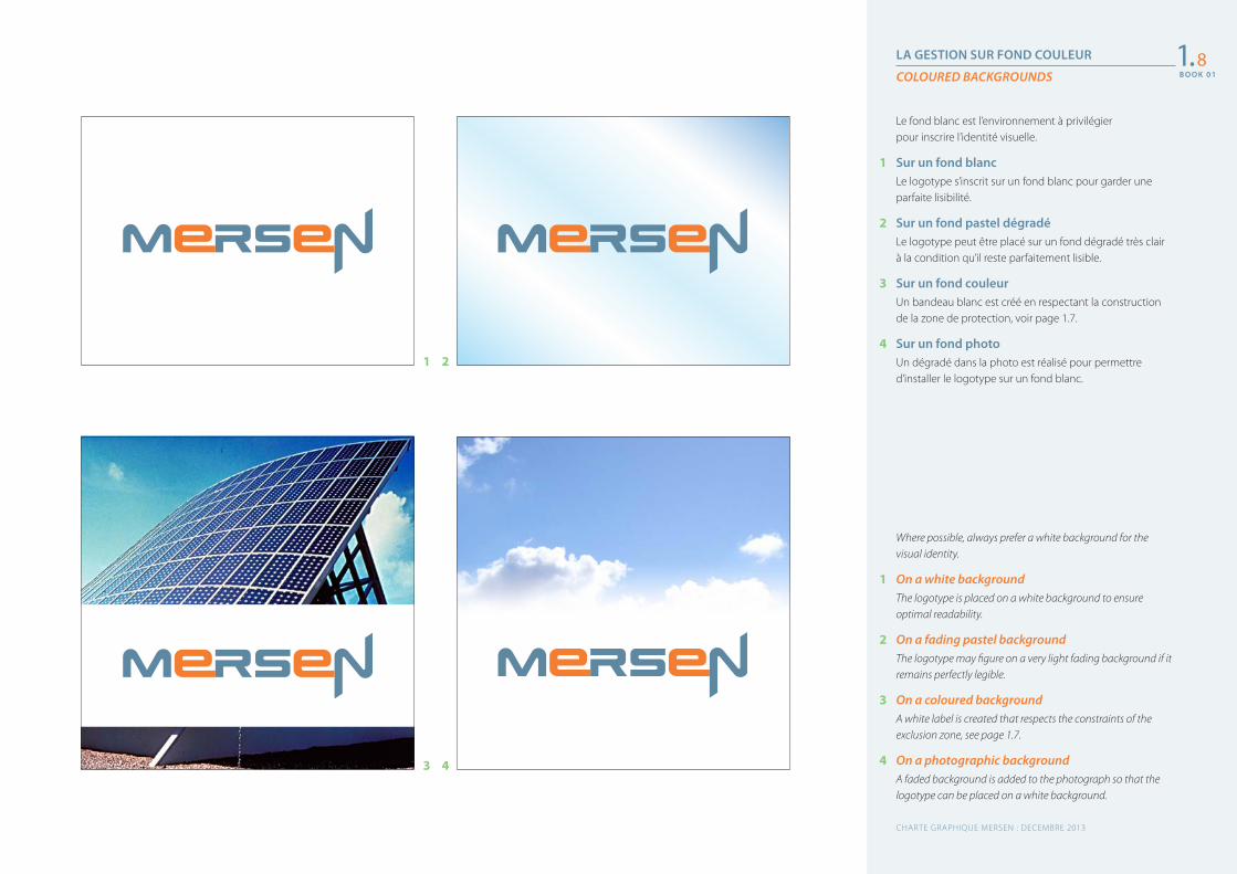
LA GESTION SUR FOND COULEUR
COLOURED BACKGROUNDS
Where possible, always prefer a white background for the visual identity.
1 On a white background The logotype is placed on a white background to ensure optimal readability.
2 On a fading pastel background The logotype may figure on a very light fading background if it remains perfectly legible.
3 On a coloured background A white label is created that respects the constraints of the exclusion zone, see page 1.7.
4 On a photographic background A faded background is added to the photograph so that the logotype can be placed on a white background.
Le fond blanc est l’environnement à privilégier pour inscrire l’identité visuelle.
1 Sur un fond blancLe logotype s’inscrit sur un fond blanc pour garder une parfaite lisibilité.
2 Sur un fond pastel dégradéLe logotype peut être placé sur un fond dégradé très clair à la condition qu’il reste parfaitement lisible.
3 Sur un fond couleurUn bandeau blanc est créé en respectant la construction de la zone de protection, voir page 1.7.
4 Sur un fond photoUn dégradé dans la photo est réalisé pour permettre d’installer le logotype sur un fond blanc.
1.8
1
3
2
4
CHARTE GRAPHIQUE MERSEN : DECEMBRE 2013
B O O K 0 1
B O O K 0 1
LE LOGOTYPE NOIR OU BLANC
THE BLACK AND WHITE LOGOTYPE
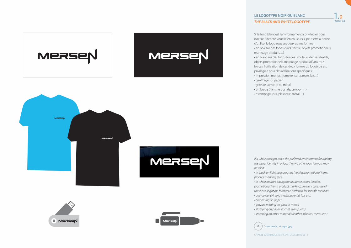
If a white background is the preferred environment for adding the visual identity in colors, the two other logo formats may be used:• in black on light backgrounds (textiles, promotional items, product marking, etc.)• in white on dark backgrounds: dense colors (textiles, promotional items, product marking). In every case, use of these two logotype formats is preferred for specific contexts:• one-colour printing (newspaper ad, fax, etc.)• embossing on paper• gravure printing on glass or metall• stamping on paper (cachet, stamp, etc.)• stamping on other materials (leather, plastics, metal, etc.)
Si le fond blanc est l’environnement à privilégier pour inscrire l’identité visuelle en couleurs, il peut être autorisé d’utiliser le logo sous ses deux autres formes :• en noir sur des fonds clairs (textile, objets promotionnels, marquage produits…)• en blanc sur des fonds foncés : couleurs denses (textile, objets promotionnels, marquage produits).Dans tous les cas, l’utilisation de ces deux formes du logotype est privilégiée pour des réalisations spécifiques :• impression monochrome (encart presse, fax…)• gauffrage sur papier• gravure sur verre ou métal• timbrage (flamme postale, tampon…)• estampage (cuir, plastique, métal…)
1.9
Documents : .ai, .eps, .jpg
CHARTE GRAPHIQUE MERSEN : DECEMBRE 2013
B O O K 0 1
L’UNIVERS COLORIEL
ENGLISH TEXT
1 Traduction anglaiseOlendreet nullupt atuercilla adit, velenisi tem vel utat wisim zzrit et, commolore dolenibh ea facilisl ipit, sum ipit alisl dolorem do odolore molendio dipis aliquat. Duis nibh ea commoluptat. Equatum nulla commy nullaore conum volorer iusciduip erostis at nis alis aciduisl utatie velit la aliquismod dionsed dolobore exer sis nulla feu feuis auguerit at, quate tie delis acip exeros nullutpat laor sectet lam,
1 Tons directs PantoneL’univers coloriel fait partie de l’identité visuelle, c’est pourquoi il est important d’utiliser les tons directs Pantone dans la communication institutionnelle (papeterie, cartons d’invitations, dossier presse…).
2 La quadrichromieLa traduction en quadrichromie des tons directs Pantone est utilisée pour la communication commerciale (brochures, flyers, annonces…). Voir le tableau pour les correspondances.
3 Monochrome noirL’utilisation de l’identité visuelle monochrome noire est recommandée sur les supports qui ne permettent pas d’utiliser la couleur.
1. 6
CHARTE GRAPHIQUE MERSEN : JUIN 2010
B O O K 0 1
LA TAILLE MINIMUM ET LES TAILLES DÉFINIES
MINIMUM USAGE SIZE AND SPECIFIC SIZES
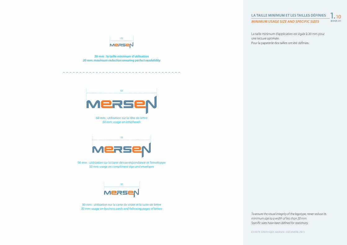
To ensure the visual integrity of the logotype, never reduce its minimum size to a width of less than 20 mm. Specific sizes have been defined for stationary.
La taille minimum d’application est égale à 20 mm pour une lecture optimale.Pour la papeterie des tailles ont été définies.
1.10
60 mm : utilisation sur la tête de lettre60 mm: usage on letterheads
50 mm : utilisation sur la carte de correspondance et l’enveloppe50 mm: usage on compliment slips and envelopes
30 mm : utilisation sur la carte de visite et la suite de lettre30 mm: usage on business cards and following pages of letters
20 mm : la taille minimum d’utilisation20 mm: maximum reduction ensuring perfect readability
60
50
30
20
CHARTE GRAPHIQUE MERSEN : DECEMBRE 2013
B O O K 0 1
TRANSITION DE MARQUE
BRAND TRANSITION
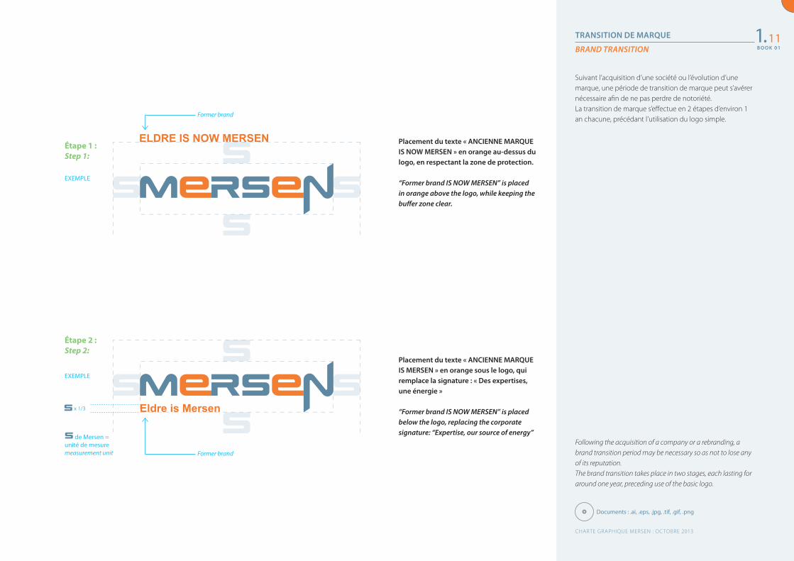
Following the acquisition of a company or a rebranding, a brand transition period may be necessary so as not to lose any of its reputation.The brand transition takes place in two stages, each lasting for around one year, preceding use of the basic logo.
Suivant l’acquisition d’une société ou l’évolution d’une marque, une période de transition de marque peut s’avérer nécessaire afin de ne pas perdre de notoriété.La transition de marque s’effectue en 2 étapes d’environ 1 an chacune, précédant l’utilisation du logo simple.
1.11
Documents : .ai, .eps, .jpg, .tif, .gif, .png
CHARTE GRAPHIQUE MERSEN : OCTOBRE 2013
B O O K 0 1
Placement du texte « ANCIENNE MARQUE IS NOW MERSEN » en orange au-dessus du logo, en respectant la zone de protection.
“Former brand IS NOW MERSEN” is placed in orange above the logo, while keeping the buffer zone clear.
Placement du texte « ANCIENNE MARQUE IS MERSEN » en orange sous le logo, qui remplace la signature : « Des expertises, une énergie »
“Former brand IS NOW MERSEN” is placed below the logo, replacing the corporate signature: “Expertise, our source of energy”
EXEMPLE
EXEMPLE
x 1/3
ELDRE IS NOW MERSEN
Eldre is Mersen
Étape 1 : Step 1:
Étape 2 : Step 2:
Former brand
Former brand
de Mersen = unité de mesuremeasurement unit
LE PICTOGRAMME
PICTOGRAM
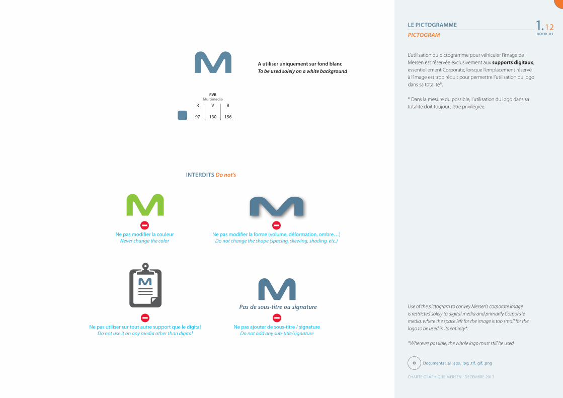
Use of the pictogram to convey Mersen’s corporate image is restricted solely to digital media and primarily Corporate media, where the space left for the image is too small for the logo to be used in its entirety*.
*Wherever possible, the whole logo must still be used.
L’utilisation du pictogramme pour véhiculer l’image de Mersen est réservée exclusivement aux supports digitaux, essentiellement Corporate, lorsque l’emplacement réservé à l’image est trop réduit pour permettre l’utilisation du logo dans sa totalité*.
* Dans la mesure du possible, l’utilisation du logo dans sa totalité doit toujours être privilégiée.
1.12
A utiliser uniquement sur fond blancTo be used solely on a white background
MultimediaRVB
97 130 156
R V B
Documents : .ai, .eps, .jpg, .tif, .gif, .png
CHARTE GRAPHIQUE MERSEN : DECEMBRE 2013
B O O K 0 1
Ne pas modifier la couleur Never change the color
Ne pas utiliser sur tout autre support que le digital Do not use it on any media other than digital
Ne pas ajouter de sous-titre / signatureDo not add any sub-title/signature
Ne pas modifier la forme (volume, déformation, ombre…)Do not change the shape (spacing, skewing, shading, etc.)
Pas de sous-titre ou signature
INTERDITS Do not’s
B O O K 0 1
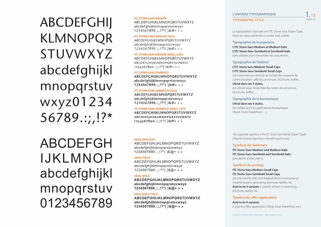
L’UNIVERS TYPOGRAPHIQUE
TYPOGRAPHIC STYLE
The corporate typeface is the ITC Stone Sans family (Open Type). Only the variants figuring on the left may be used.
Typofaces for stationaryITC Stone Sans Medium and Medium Italic ITC Stone Sans Semibold and Semibold Italic are used for all documents.
Typefaces for printingITC Stone Sans Medium Small Caps ITC Stone Sans Semibold Small Capsare only used for titles and dropped letters in promotional material: posters, advertising, brochures, leaflets, etc.Arial in its 4 variants is used for all texts in advertising, brochures, leaflets, etc.
Typeface for office applicationsArial in its 4 variantsis used for Office applications (Word, Excel, PowerPoint, etc.).
La typographie corporate est l’ITC Stone Sans (Open Type). Seuls les styles présentés ci-contre sont utilisés.
Typographie de la papeterieL’ITC Stone Sans Medium et Medium Italic L’ITC Stone Sans Semibold et Semibold Italic sont utilisées pour l’ensemble des documents.
Typographie de l’éditionL’ITC Stone Sans Medium Small Caps L’ITC Stone Sans Semibold Small Caps sont réservées aux titres et accroches des supports de communication : affiches, annonces, brochures, leaflet…L’Arial dans ses 4 styles, est utilisée pour l’ensemble des textes des annonces, brochures, leaflet…
Typographie de la bureautiqueL’Arial dans ses 4 styles, est utilisée pour les applications bureautiques (Word, Excel, PowerPoint…).
1.13ITC STONE SANS MEDIUMABCDEFGHIJKLMNOPQRSTUVWXYZabcdefghijklmnopqrstuvwxyz1234567890.:;,!?*( )&@+ « »
ITC STONE SANS MEDIUM ITALICABCDEFGHIJKLMNOPQRSTUVWXYZabcdefghijklmnopqrstuvwxyz1234567890.:;,!?*( )&@+ « »
ITC STONE SANS MEDIUM SMALL CAPSABCDEFGHIJKLMNOPQRSTUVWXYZabcdefghijklmnopqrstuvwxyz1234567890.:;,!?*( )&@+ « »
ITC STONE SANS SEMIBOLDABCDEFGHIJKLMNOPQRSTUVWXYZabcdefghijklmnopqrstuvwxyz1234567890.:;,!?*( )&@+ « »
ITC STONE SANS SEMIBOLD ITALICABCDEFGHIJKLMNOPQRSTUVWXYZabcdefghijklmnopqrstuvwxyz1234567890.:;,!?*( )&@+ « »
ITC STONE SANS SEMIBOLD SMALL CAPSABCDEFGHIJKLMNOPQRSTUVWXYZabcdefghijklmnopqrstuvwxyz1234567890.:;,!?*( )&@+ « »
ARIAL REGULARABCDEFGHIJKLMNOPQRSTUVWXYZabcdefghijklmnopqrstuvwxyz1234567890.:;,!?*( )&@+ « »ARIAL ITALICABCDEFGHIJKLMNOPQRSTUVWXYZabcdefghijklmnopqrstuvwxyz1234567890.:;,!?*( )&@+ « »
ARIAL BOLDABCDEFGHIJKLMNOPQRSTUVWXYZabcdefghijklmnopqrstuvwxyz1234567890.:;,!?*( )&@+ « »ARIAL BOLD ITALICABCDEFGHIJKLMNOPQRSTUVWXYZabcdefghijklmnopqrstuvwxyz1234567890.:;,!?*( )&@+ « »
ABCDEFGHIJKLMNOPQRSTUVWXYZabcdefghijklmnopqrstuvwxyz0123456789.:;,!?*
ABCDEFGHIJKLMNOPabcdefghijklmnopqrstuv0123456789
CHARTE GRAPHIQUE MERSEN : DECEMBRE 2013
B O O K 0 1
B O O K 0 1
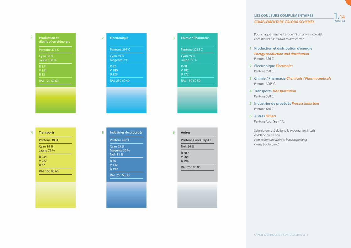
LES COULEURS COMPLÉMENTAIRES
COMPLEMENTARY COLOUR SCHEMES
Pour chaque marché il est défini un univers coloriel.Each market has its own colour scheme.
1 Production et distribution d’énergieEnergy production and distributionPantone 376 C.
2 Électronique ElectronicsPantone 298 C.
3 Chimie / Pharmacie Chemicals / Pharmaceuticals Pantone 3265 C.
4 Transports TransportationPantone 388 C.
5 Industries de procédés Process industriesPantone 646 C.
6 Autres OthersPantone Cool Gray 4 C.
Selon la densité du fond la typograhie s’inscrit en blanc ou en noir.Font colours are white or black depending on the background.
1.14
Production et distribution d’énergie
Pantone 376 C
Cyan 50 % Jaune 100 %
R 151 V 191 B 13
RAL 120 60 60
Transports
Pantone 388 C
Cyan 14 % Jaune 79 %
R 234 V 227 B 77
RAL 100 80 60
Électronique
Pantone 298 C
Cyan 69 % Magenta 7 %
R 52 V 180 B 228
RAL 230 60 40
Industries de procédés
Pantone 646 C
Cyan 65 % Magenta 30 % Noir 11 %
R 86 V 142 B 190
RAL 250 60 30
Chimie / Pharmacie
Pantone 3265 C
Cyan 69 % Jaune 37 %
R 68 V 182 B 172
RAL 180 60 50
Autres
Pantone Cool Gray 4 C
Noir 24 %
R 209 V 204 B 196
RAL 260 80 05
1
4
2
5
3
6
CHARTE GRAPHIQUE MERSEN : DECEMBRE 2013
B O O K 0 1
B O O K 0 1
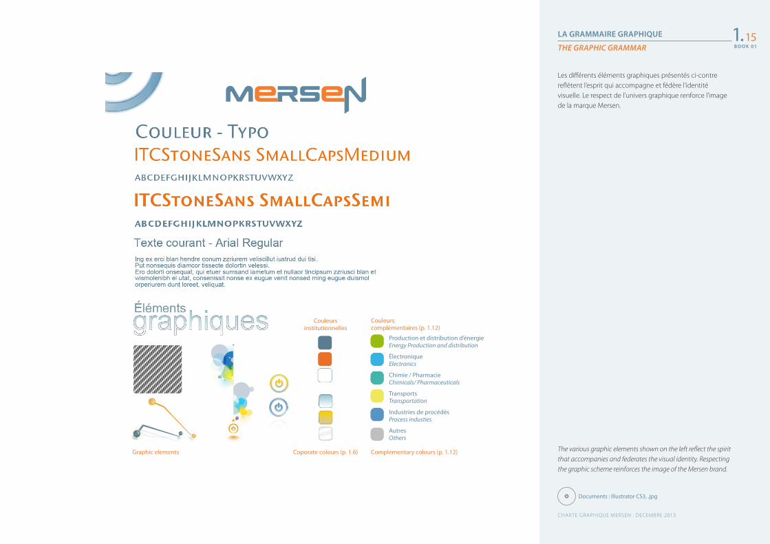
LA GRAMMAIRE GRAPHIQUE
THE GRAPHIC GRAMMAR
The various graphic elements shown on the left reflect the spirit that accompanies and federates the visual identity. Respecting the graphic scheme reinforces the image of the Mersen brand.
Les différents éléments graphiques présentés ci-contre reflètent l’esprit qui accompagne et fédère l’identité visuelle. Le respect de l’univers graphique renforce l’image de la marque Mersen.
1.15
Documents : Illustrator CS3, .jpg
Couleurs institutionnelles
Couleurs complémentaires (p. 1.12)
Production et distribution d’énergieEnergy Production and distribution
ÉlectroniqueElectronics
Chimie / PharmacieChimicals/ Pharmaceuticals
TransportsTransportation
Industries de procédésProcess industies
AutresOthers
Complementary colours (p. 1.12)Coporate colours (p. 1.6)Graphic elements
CHARTE GRAPHIQUE MERSEN : DECEMBRE 2013
B O O K 0 1
B O O K 0 1
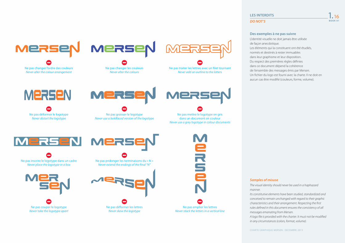
LES INTERDITS
DO NOT’S
Samples of misuseThe visual identity should never be used in a haphazard manner.Its constitutive elements have been studied, standardized and conceived to remain unchanged with regard to their graphic characteristics and their arrangement. Respecting the first rules defined in this document ensures the consistency of all messages emanating from Mersen.A logo file is provided with the charter. It must not be modified in any circumstances (colors, format, volume).
Des exemples à ne pas suivreL’identité visuelle ne doit jamais être utilisée de façon anecdotique. Les éléments qui la constituent ont été étudiés, normés et destinés à rester immuables dans leur graphisme et leur disposition. Du respect des premières règles définies dans ce document dépend la cohérence de l’ensemble des messages émis par Mersen.Un fichier du logo est fourni avec la charte. Il ne doit en aucun cas être modifié (couleurs, forme, volume).
1.16
Ne pas changer l’ordre des couleursNever alter the colour arrangement
Ne pas déformer le logotypeNever distort the logotype
Ne pas inscrire le logotype dans un cadreNever place the logotype in a box
Ne pas couper le logotypeNever take the logotype apart
Ne pas changer les couleursNever alter the colours
Ne pas graisser le logotypeNever use a boldfaced version of the logotype
Ne pas mettre le logotype en gris dans un document en couleur
Never use a grey logotype in colour documents
Ne pas prolonger les terminaisons du « N »Never extend the endings of the final “N”
Ne pas déformer les lettresNever skew the logotype
Ne pas traiter les lettres avec un filet tournantNever add an outline to the letters
Ne pas emplier les lettresNever stack the letters in a vertical line
CHARTE GRAPHIQUE MERSEN : DECEMBRE 2013
B O O K 0 1
LES INTERDITS (SUITE)
DO NOT’S (CONTINUED)
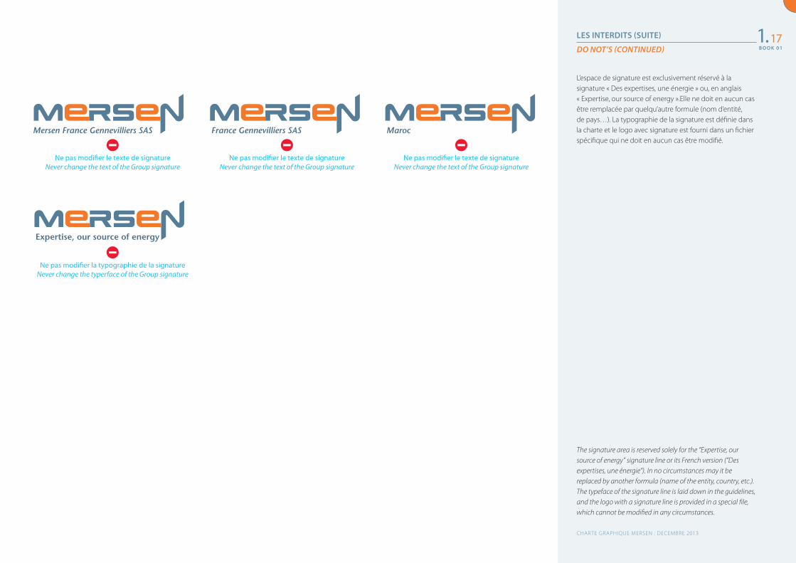
The signature area is reserved solely for the “Expertise, our source of energy” signature line or its French version (“Des expertises, une énergie”). In no circumstances may it be replaced by another formula (name of the entity, country, etc.). The typeface of the signature line is laid down in the guidelines, and the logo with a signature line is provided in a special file, which cannot be modified in any circumstances.
L’espace de signature est exclusivement réservé à la signature « Des expertises, une énergie » ou, en anglais « Expertise, our source of energy ».Elle ne doit en aucun cas être remplacée par quelqu’autre formule (nom d’entité, de pays…). La typographie de la signature est définie dans la charte et le logo avec signature est fourni dans un fichier spécifique qui ne doit en aucun cas être modifié.
1.17
Ne pas modifier le texte de signatureNever change the text of the Group signature
Ne pas modifier la typographie de la signatureNever change the typerface of the Group signature
Ne pas modifier le texte de signatureNever change the text of the Group signature
Ne pas modifier le texte de signatureNever change the text of the Group signature
CHARTE GRAPHIQUE MERSEN : DECEMBRE 2013
B O O K 0 1
Mersen France Gennevilliers SAS
Expertise, our source of energy
France Gennevilliers SAS Maroc
Globale Experten für Elektrokomponenten und Werkstoffe auf Basis von Graphit.
Global Expert in electrical specialties and graphite-based materials.
电气和石墨材料的全球专家。
전기 전문 제품 및 흑연 소재를 기본으로 하는 세계적인 전문업체.
Experto global en especialidades eléctricas y materiales en grafito.
Expert mondial des spécialités électriques et des matériaux en graphite.
Esperto mondiale nel settore elettrico e dei materiali a base di grafite.
特殊電気機器およびカーボングラファイト製品のグローバルエキスパート。
Especialista mundial em soluções elétricas e materiais em grafite.
Глобальный эксперт в специальной электротехнике и углеграфитовых
материалах.
Elektrik ekipman ve grafit malzemelerde küresel uzman.
CHARTE GRAPHIQUE MERSEN : DECEMBRE 2013
Anglais / English
Français / French
Allemand / German
Chinois / Chinese
Une présentation courte du Groupe qui met en avant l’identité et le positionnement de Mersen.
POSITIONNEMENT CORPORATE
CORPORATE IDENTITY1.18
B O O K 0 1
A short Group presentation which highlights Mersen’s identity and positioning.
Coréen / Korean
Espagnol / Spanish
Italien / Italian
Portugais / Portuguese
Japonais / Japanese
Russe /Russian
Turc / Turkish
Als weltweit tätige Experten für Elektrokomponenten und Werkstoffe auf Basis von Graphit entwickelt Mersen innovative, auf die Anforderungen unserer Kunden zugeschnittene Lösungen zur Optimierung von Produktionsprozessen in Wirtschaftsbereichen wie Energie, Transport, Elektronik, Chemie- und Pharmaindustrie sowie in der Verfahrenstechnik.
Global Expert in electrical specialties and graphite-based materials, Mersen designs innovative solutions to address its clients specific needs to enable them to optimize their manufacturing process in sectors such as energy, transportation, electronics, chemical, pharmaceutical and process industries.
作为电气和石墨材料的世界级专业供应商,Mersen设计的创新解决方案 可以满足能源、交通、电子、化工、医药和加工业等各行业 用户的特定需求,并优化其生产制造流程。
MERSEN은 전기 전문 제품 및 흑연 기반 소재의 세계적인 전문 업체로 에너지, 교통, 전자, 화학/ 제약, 프로세스 산업 등 주요 산업 분야에서 생산 효과를 극대화하고자 하는 고객의 요구에 부응하는 혁신적인 맞춤형 솔루션을 제공합니다.
Experto global en especialidades eléctricas y materiales en grafito, Mersen crea productos innovadores adaptados a las necesidades específicas de sus clientes para que puedan optimizar sus procesos de fabricación en sectores como la energía, el transporte, la electrónica, la química, la farmacia y las industrias de transformación.
Expert mondial des spécialités électriques et des matériaux en graphite, Mersen conçoit des solutions innovantes adaptées aux besoins de ses clients pour optimiser leur performance industrielle dans des secteurs porteurs : énergies, transports, électronique, chimie/pharmacie et industries de procédés.
CHARTE GRAPHIQUE MERSEN : DECEMBRE 2013
Anglais / English
Français / French
Allemand / German
Chinois / Chinese
Une présentation plus complète du Groupe traduite en 10 langues pour véhiculer la cohérence de notre positionnement.
LA PRÉSENTATION GÉNÉRIQUE DU GROUPE
GROUP GENERIC PRESENTATION1.19
B O O K 0 1
A more comprehensive presentation of the Group translated into ten languages to convey the consistency of our positioning.
Coréen / Korean
Espagnol / Spanish
Esperto mondiale nel settore elettrico e dei materiali a base di grafite, Mersen concepisce soluzioni innovative, destinate a soddisfare le esigenze dei propri clienti e ad ottimizzarne il rendimento industriale in settori quali le energie, i trasporti, l’elettronica, la chimica/farmaceutica e l’industria di processo.
特殊電気機器およびカーボングラファイト製品のグローバルエキスパートであるメ ルセン社は、エネルギー、 輸送、エレクトロニクス、化学・製薬、プロセス産業などの分野で、お客様のニーズに応え、パフォーマンスを最適化するための革新的な解決策を提案しています。
Especialista mundial em soluções elétricas e materiais em grafite, para a segurança e confiabilidade dos equipamentos elétricos, a Mersen concebe soluções inovadoras adaptadas às necessidades dos seus clientes, com vista a otimizar o seu desempenho industrial em setores promissores, como o das energias, dos transportes, da eletrônica, da química/farmácia e de processos industriais.
Глобальный эксперт в специальной электротехнике и углеграфитовых материалах, Mersen разрабатывает инновационные решения, направленные на удовлетворение специфических потребностей заказчиков и позволяющие им оптимизировать производственные процессы в таких перспективных отраслях, как энергетика, транспорт, электроника, химическая, фармацевтическая и перерабатывающая промышленность.
Elektrik ekipman ve grafit malzemelerde küresel bir uzman olan Mersen; enerji, ulaşım, elektronik, kimya/ilaç ve imalat sanayinde faaliyet gösteren müşterilerinin endüstriyel performanslarını geliştirmeleri için yaratıcı ve ihtiyaçlara uygun çözümler tasarlamaktadır.
CHARTE GRAPHIQUE MERSEN : DECEMBRE 2013
Italien / Italian
Portugais / Portuguese
Japonais / Japanese
Russe /Russian
Turc / Turkish
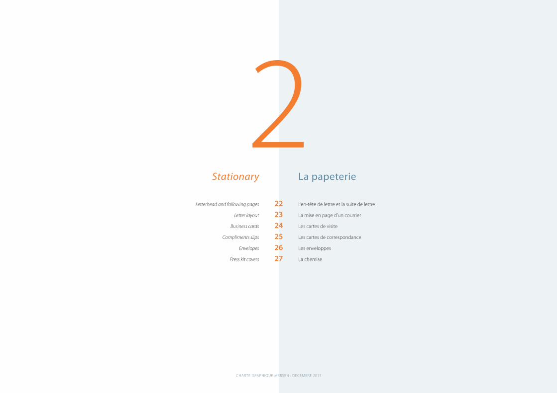
2La papeterie
L’en-tête de lettre et la suite de lettre
La mise en page d’un courrier
Les cartes de visite
Les cartes de correspondance
Les enveloppes
La chemise
Stationary
Letterhead and following pages
Letter layout
Business cards
Compliments slips
Envelopes
Press kit covers
222324252627
CHARTE GRAPHIQUE MERSEN : DECEMBRE 2013
B O O K 0 1
18 mm 30 mm
22 mm
MERSEN Corporate Services S.A.S.
SIÈGE SOCIAL : IMMEUBLE LA FAYETTE – 2, PLACE DES VOSGES – PARIS LA DÉFENSE 5 – F-92400 COURBEVOIE FRANCET +33(0)0 46 91 54 00 – F + 33(0)1 46 91 54 01
INSÉRER VOS MENTIONS LÉGALES SUR UNE LIGNE
www.mersen.com
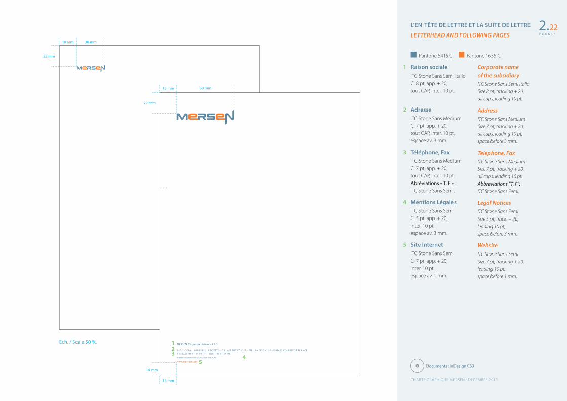
L’EN-TÊTE DE LETTRE ET LA SUITE DE LETTRE
LETTERHEAD AND FOLLOWING PAGES2.22
Corporate name of the subsidiaryITC Stone Sans Semi Italic Size 8 pt, tracking + 20, all caps, leading 10 pt.
AddressITC Stone Sans Medium Size 7 pt, tracking + 20, all caps, leading 10 pt, space before 3 mm.
Telephone, FaxITC Stone Sans Medium Size 7 pt, tracking + 20, all caps, leading 10 pt. Abbreviations ”T, F”: ITC Stone Sans Semi.
Legal NoticesITC Stone Sans Semi Size 5 pt, track. + 20, leading 10 pt, space before 3 mm.
WebsiteITC Stone Sans Semi Size 7 pt, tracking + 20, leading 10 pt,space before 1 mm.
1 Raison socialeITC Stone Sans Semi Italic C. 8 pt, app. + 20, tout CAP, inter. 10 pt.
2 AdresseITC Stone Sans Medium C. 7 pt, app. + 20, tout CAP, inter. 10 pt, espace av. 3 mm.
3 Téléphone, FaxITC Stone Sans Medium C. 7 pt, app. + 20, tout CAP, inter. 10 pt. Abréviations « T, F » : ITC Stone Sans Semi.
4 Mentions LégalesITC Stone Sans Semi C. 5 pt, app. + 20, inter. 10 pt, espace av. 3 mm.
5 Site InternetITC Stone Sans Semi C. 7 pt, app. + 20, inter. 10 pt,espace av. 1 mm.
123
14 mm
54
18 mm
22 mm
18 mm 60 mm
Ech. / Scale 50 %.
Pantone 5415 C Pantone 1655 C
Documents : InDesign CS3
CHARTE GRAPHIQUE MERSEN : DECEMBRE 2013
B O O K 0 1
B O O K 0 1
MERSEN Corporate Services S.A.S.
SIÈGE SOCIAL : IMMEUBLE LA FAYETTE – 2, PLACE DES VOSGES – PARIS LA DÉFENSE 5 – F-92400 COURBEVOIE FRANCET +33(0)0 46 91 54 00 – F + 33(0)1 46 91 54 01
INSÉRER VOS MENTIONS LÉGALES SUR UNE LIGNE
www.mersen.com
Madame, Monsieur,
Ecte eugait, quis el ex eugiamc onsequat init amcommod do od tat. Ut dolor sectem eu feumsan ut illuptat prate magna core commy nim zzrit vulla feum el utet landignis etum volobore elit lorem volum zzriuscidunt lum dunt nos num nisim velit inim my nullamet aliquisim deliquis aut il utat. Duip elit lamet la adit eumsandrem endit loborercil el ulput prae-secte venim dunt aliquipit il ipsum quat, si.Unt lum dolorpe raestrud enibh ex volobore elit lorem volum zzriuscidunt lum dunt nos num nisim velit inim et veliquis nos autpatet praessed te facin velit praestie magna feugait nim zzrillaore di
gna adipissed tinit adiamet in henim do ent vent praestio exer il utat, consecte doloreet a volobore elit lorem volum zzriuscidunt lum dunt nos num nisim velit inim ugue vullaorem velit am, velit, vel et ing ex eum nim volobore elit lorem volum zzriuscidunt lum dunt nos num nisim velit inim ad te eu feugiat ionsequisis et, con ulputat, quat, vel et, vel dolore exer ipis acil dui tat, quat. Ratio commod magna feu feuiscidui tincilisi.Feuguer aestie dolorper adio del euisi.
Rostie tet, quamcor tionse dolum zzrilit, quatis nullaore te feugue maip ex essi eros accum zzrit augait la aliquis sequism olesto esse
Prénom Nom
Nom de la SociétéNom du correspondantPremière ligne d’adresse00000 Nom de la Ville
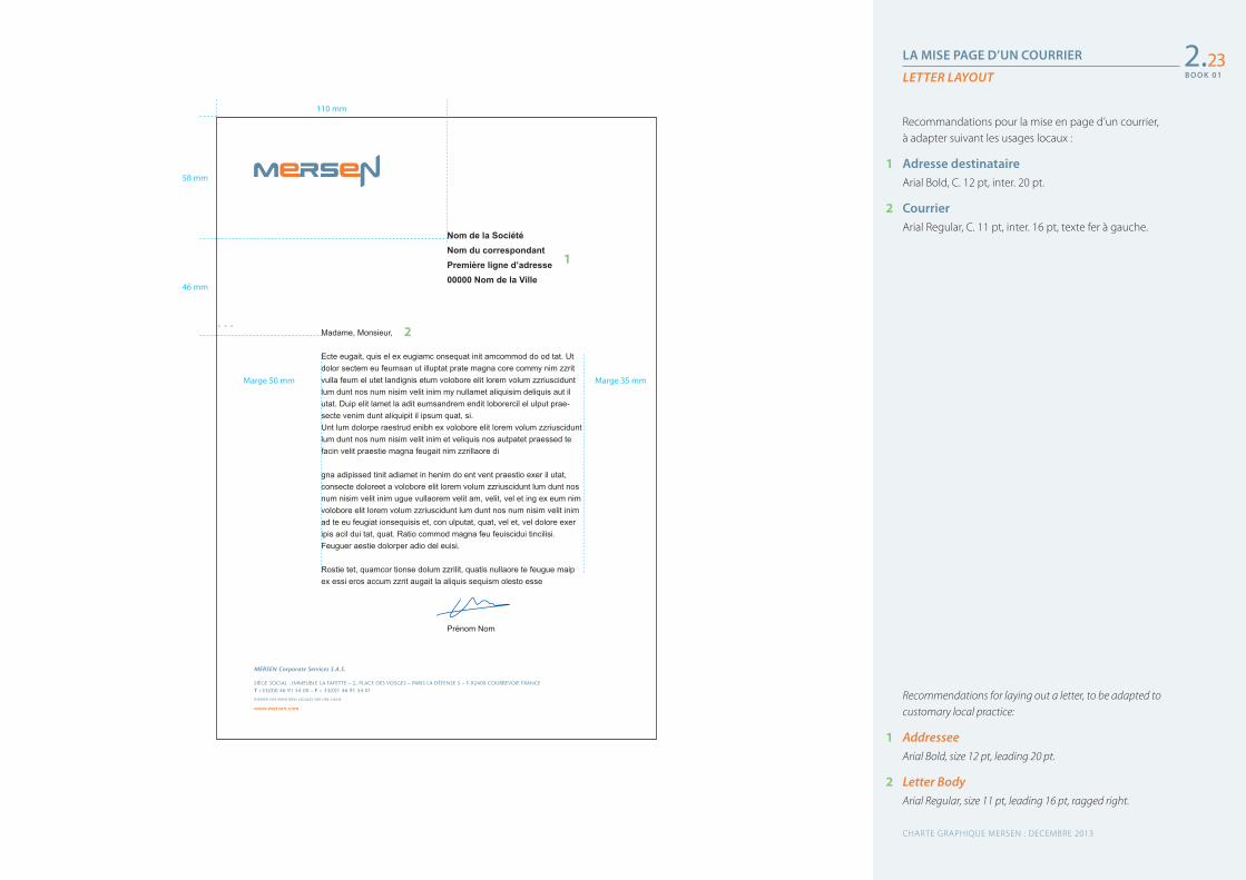
LA MISE PAGE D’UN COURRIER
LETTER LAYOUT
Recommendations for laying out a letter, to be adapted to customary local practice:
1 AddresseeArial Bold, size 12 pt, leading 20 pt.
2 Letter BodyArial Regular, size 11 pt, leading 16 pt, ragged right.
Recommandations pour la mise en page d’un courrier, à adapter suivant les usages locaux :
1 Adresse destinataireArial Bold, C. 12 pt, inter. 20 pt.
2 CourrierArial Regular, C. 11 pt, inter. 16 pt, texte fer à gauche.
2.23
58 mm
46 mm
Marge 50 mm Marge 35 mm
110 mm
1
2
CHARTE GRAPHIQUE MERSEN : DECEMBRE 2013
B O O K 0 1
B O O K 0 1
Prénom NomDénomination de la fonctionDIRECTION OU DÉPARTEMENT (option)
[email protected] Corporate Services S.A.S.
T + 33(0)1 00 00 00 00F + 33(0)1 00 00 00 00M 33(0)6 00 00 00 00
IMMEUBLE LAFAYETTE2, PLACE DES VOSGES
F92501 LA DÉFENSE CEDEXwww.mersen.com
Prénom NomDénomination de la fonctionDIRECTION OU DÉPARTEMENT (option)
[email protected] Corporate Services S.A.S.
T + 33(0)1 00 00 00 00F + 33(0)1 00 00 00 00M 33(0)6 00 00 00 00
IMMEUBLE LAFAYETTE2, PLACE DES VOSGES
F92501 LA DÉFENSE CEDEXwww.mersen.com
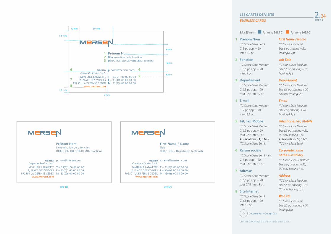
LES CARTES DE VISITE
BUSINESS CARDS
First Name / NameITC Stone Sans Semi Size 8 pt, tracking + 20, leading 8.5 pt.
Job TitleITC Stone Sans Medium Size 6.5 pt, tracking + 20, leading 9 pt.
DepartmentITC Stone Sans Medium Size 6.5 pt, tracking. + 20, all caps, leading 9pt.
EmailITC Stone Sans Medium Size 7 pt, tracking. + 20, leading 8.5 pt.
Telephone, Fax, MobileITC Stone Sans Medium Size 6.5 pt, tracking + 20, UC only, leading 8 pt. Abbreviations ”T, F, M”: ITC Stone Sans Semi.
Corporate name of the subsidiaryITC Stone Sans Semi Italic Size 6 pt, tracking + 20, UC only, leading 7 pt.
AddressITC Stone Sans Medium Size 6,5 pt, tracking + 20, UC only, leading 8 pt.
WebsiteITC Stone Sans Semi Size 6.5 pt, tracking. + 20, leading 8 pt.
1 Prénom NomITC Stone Sans Semi C. 8 pt, app. + 20, inter. 8,5 pt.
2 FonctionITC Stone Sans Medium C. 6,5 pt, app. + 20, inter. 9 pt.
3 DépartementITC Stone Sans Medium C. 6,5 pt, app. + 20, tout CAP, inter. 9 pt.
4 E-mailITC Stone Sans Medium C. 7 pt, app. + 20, inter. 8,5 pt.
5 Tél, Fax, MobileITC Stone Sans Medium C. 6,5 pt, app. + 20, tout CAP, inter. 8 pt. Abréviations « T, F, M » : ITC Stone Sans Semi.
6 Raison socialeITC Stone Sans Semi Italic C. 6 pt, app. + 20, tout CAP, inter. 7 pt.
7 AdresseITC Stone Sans Medium C. 6,5 pt, app. + 20, tout CAP, inter. 8 pt.
8 Site InternetITC Stone Sans SemiC. 6,5 pt, app. + 20, inter. 8 pt.
2.24
RECTO VERSO
30 mm10 mm
8,5 mm
9 mm
15 mm
6 mm
4,5 mm
2 mm
123
4
5
6
7
8
85 x 55 mm Pantone 5415 C Pantone 1655 C
First Name / NameTitleDIRECTION / Department (optional)
[email protected] Corporate Services S.A.S.
T + 33(0)1 00 00 00 00F + 33(0)1 00 00 00 00M 33(0)6 00 00 00 00
IMMEUBLE LAFAYETTE2, PLACE DES VOSGES
F92501 LA DÉFENSE CEDEXwww.mersen.com
Documents : InDesign CS3
CHARTE GRAPHIQUE MERSEN : DECEMBRE 2013
B O O K 0 1
B O O K 0 1
CARTE DE CORRESPONDANCE NOMINATIVE
LES CARTES DE CORRESPONDANCE
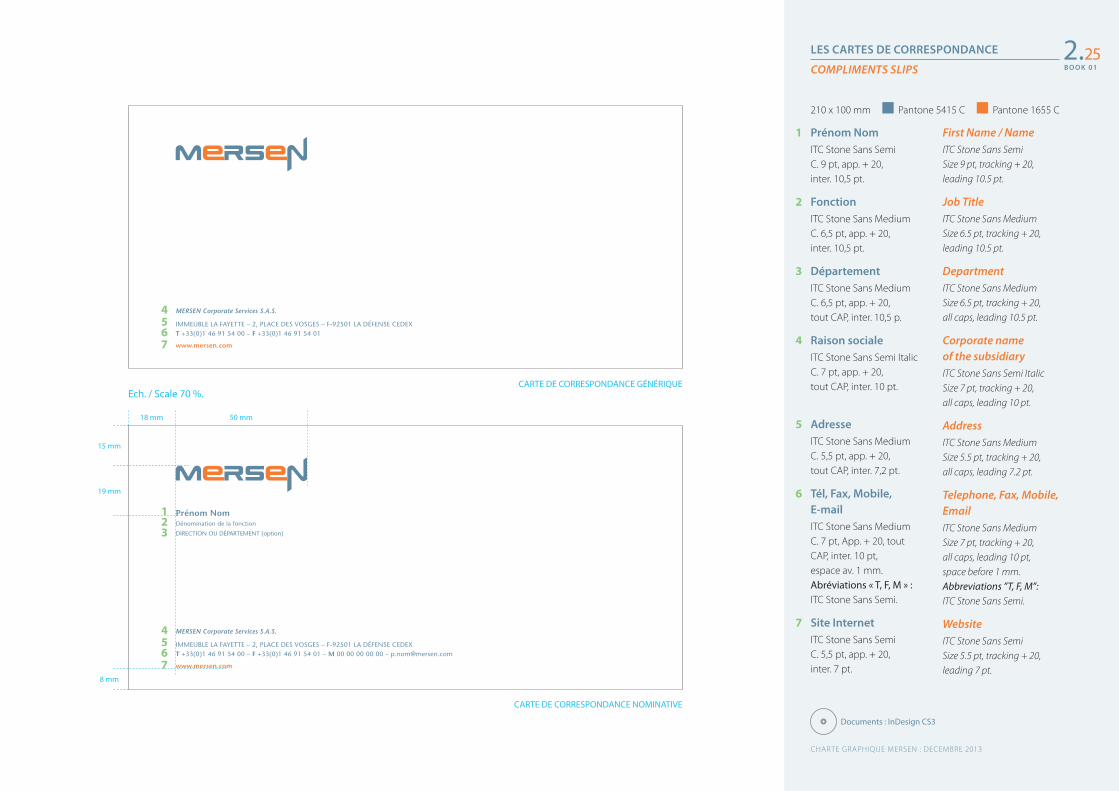
COMPLIMENTS SLIPS2.25
MERSEN Corporate Services S.A.S.
IMMEUBLE LA FAYETTE – 2, PLACE DES VOSGES – F-92501 LA DÉFENSE CEDEXT +33(0)1 46 91 54 00 – F +33(0)1 46 91 54 01
www.mersen.com
First Name / NameITC Stone Sans Semi Size 9 pt, tracking + 20, leading 10.5 pt.
Job TitleITC Stone Sans Medium Size 6.5 pt, tracking + 20, leading 10.5 pt.
DepartmentITC Stone Sans Medium Size 6.5 pt, tracking + 20, all caps, leading 10.5 pt.
Corporate name of the subsidiaryITC Stone Sans Semi Italic Size 7 pt, tracking + 20, all caps, leading 10 pt.
AddressITC Stone Sans Medium Size 5.5 pt, tracking + 20, all caps, leading 7.2 pt.
Telephone, Fax, Mobile, EmailITC Stone Sans Medium Size 7 pt, tracking + 20, all caps, leading 10 pt, space before 1 mm. Abbreviations ”T, F, M”: ITC Stone Sans Semi.
WebsiteITC Stone Sans Semi Size 5.5 pt, tracking + 20, leading 7 pt.
1 Prénom NomITC Stone Sans Semi C. 9 pt, app. + 20, inter. 10,5 pt.
2 FonctionITC Stone Sans Medium C. 6,5 pt, app. + 20, inter. 10,5 pt.
3 DépartementITC Stone Sans Medium C. 6,5 pt, app. + 20, tout CAP, inter. 10,5 p.
4 Raison socialeITC Stone Sans Semi Italic C. 7 pt, app. + 20, tout CAP, inter. 10 pt.
5 AdresseITC Stone Sans Medium C. 5,5 pt, app. + 20, tout CAP, inter. 7,2 pt.
6 Tél, Fax, Mobile, E-mailITC Stone Sans Medium C. 7 pt, App. + 20, tout CAP, inter. 10 pt, espace av. 1 mm. Abréviations « T, F, M » : ITC Stone Sans Semi.
7 Site InternetITC Stone Sans Semi C. 5,5 pt, app. + 20, inter. 7 pt.
Ech. / Scale 70 %.
8 mm
15 mm
19 mm
50 mm18 mm
123
4567
CARTE DE CORRESPONDANCE GÉNÉRIQUE
Prénom NomDénomination de la fonction
DIRECTION OU DÉPARTEMENT (option)
MERSEN Corporate Services S.A.S.
IMMEUBLE LA FAYETTE – 2, PLACE DES VOSGES – F-92501 LA DÉFENSE CEDEXT +33(0)1 46 91 54 00 – F +33(0)1 46 91 54 01 – M 00 00 00 00 00 – [email protected]
www.mersen.com
4567
210 x 100 mm Pantone 5415 C Pantone 1655 C
Documents : InDesign CS3
CHARTE GRAPHIQUE MERSEN : DECEMBRE 2013
B O O K 0 1
B O O K 0 1
50 mm20 mm
20 mm
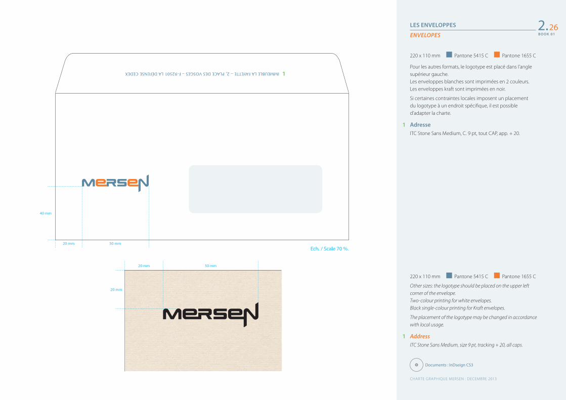
LES ENVELOPPES
ENVELOPES
220 x 110 mm Pantone 5415 C Pantone 1655 C
Other sizes: the logotype should be placed on the upper left corner of the envelope.Two-colour printing for white envelopes.Black single-colour printing for Kraft envelopes.
The placement of the logotype may be changed in accordance with local usage.
1 AddressITC Stone Sans Medium, size 9 pt, tracking + 20, all caps.
Pour les autres formats, le logotype est placé dans l’angle supérieur gauche.Les enveloppes blanches sont imprimées en 2 couleurs.Les enveloppes kraft sont imprimées en noir.
Si certaines contraintes locales imposent un placement du logotype à un endroit spécifique, il est possible d’adapter la charte.
1 AdresseITC Stone Sans Medium, C. 9 pt, tout CAP, app. + 20.
2.26
220 x 110 mm Pantone 5415 C Pantone 1655 C
IMMEUBLE LA FAYETTE – 2, PLACE DES VOSGES – F-92501 LA DÉFENSE CEDEX
Ech. / Scale 70 %.50 mm20 mm
40 mm
1
Documents : InDseign CS3
CHARTE GRAPHIQUE MERSEN : DECEMBRE 2013
B O O K 0 1
B O O K 0 1
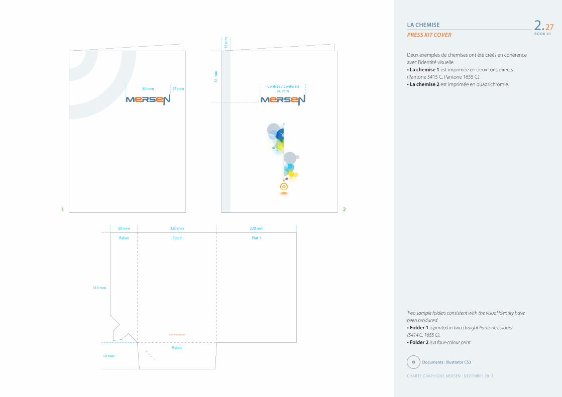
LA CHEMISE
PRESS KIT COVER
Two sample folders consistent with the visual identity have been produced.• Folder 1 is printed in two straight Pantone colours (5414 C, 1655 C).• Folder 2 is a four-colour print.
Deux exemples de chemises ont été créés en cohérence avec l’identité visuelle.• La chemise 1 est imprimée en deux tons directs (Pantone 5415 C, Pantone 1655 C).• La chemise 2 est imprimée en quadrichromie.
2.27
www.mersen.com
220 mm
Plat 4
Rabat
220 mm
Plat 1
50 mm
Rabat
310 mm
50 mm
1 2
Documents : Illustrator CS3
Centrée / Centered 80 mm80 mm 27 mm
81 m
m
15 m
m
CHARTE GRAPHIQUE MERSEN : DECEMBRE 2013
B O O K 0 1
3La bureautique
Fax, Note et Compte-rendu
Signature pied de mail
Principe d’écrans PowerPoint
Communiqué de presse
Têtière d’une newsletter interne
Office applications
Fax, memo and minutes
Email signature
Powerpoint templates
Press release
Internal newsletter heading
2930313233
CHARTE GRAPHIQUE MERSEN : DECEMBRE 2013
B O O K 0 1
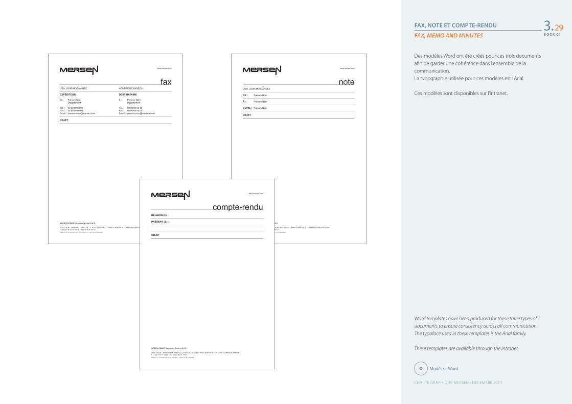
FAX, NOTE ET COMPTE-RENDU
FAX, MEMO AND MINUTES
Word templates have been produced for these three types of documents to ensure consistency across all communication.The typoface used in these templates is the Arial family.
These templates are available through the intranet.
Des modèles Word ont été créés pour ces trois documents afin de garder une cohérence dans l’ensemble de la communication.La typographie utilisée pour ces modèles est l’Arial.
Ces modèles sont disponibles sur l’intranet.
3.29
MERSEN FRANCE Corporate Services S.A.S.
SIÈGE SOCIAL : IMMEUBLE LA FAYETTE – 2, PLACE DES VOSGES – PARIS LA DÉFENSE 5 – F-92400 COURBEVOIE FRANCET +33(0)1 46 91 54 00 – F + 33(0)1 46 91 54 01
MERSEN • S.A. AU CAPITAL DE 27 511 154 EUROS – 572 060 333 RCS NANTERRE
www.mersen.com
faxLIEU, JOUR/MOIS/ANNÉE NOMBRE DE PAGE(S) :
EXPÉDITEUR DESTINATAIRE
De : Prénom Nom À : Prénom Nom Département Département
Tél. : 00 00 00 00 00 Tél. : 00 00 00 00 00Fax : 00 00 00 00 00 Fax : 00 00 00 00 00Email : [email protected] Email : [email protected]
OBJET
MERSEN FRANCE Corporate Services S.A.S.
SIÈGE SOCIAL : IMMEUBLE LA FAYETTE – 2, PLACE DES VOSGES – PARIS LA DÉFENSE 5 – F-92400 COURBEVOIE FRANCET +33(0)1 46 91 54 00 – F + 33(0)1 46 91 54 01
MERSEN • S.A. AU CAPITAL DE 27 511 154 EUROS – 572 060 333 RCS NANTERRE
www.mersen.com
noteLIEU, JOUR/MOIS/ANNÉE
DE : Prénom Nom
À : Prénom Nom
COPIE : Prénom Nom
OBJET
MERSEN FRANCE Corporate Services S.A.S.
SIÈGE SOCIAL : IMMEUBLE LA FAYETTE – 2, PLACE DES VOSGES – PARIS LA DÉFENSE 5 – F-92400 COURBEVOIE FRANCET +33(0)1 46 91 54 00 – F + 33(0)1 46 91 54 01
MERSEN • S.A. AU CAPITAL DE 27 511 154 EUROS – 572 060 333 RCS NANTERRE
www.mersen.com
compte-renduRÉUNION DU :
PRÉSENT (S) :
OBJET
Modèles : Word
CHARTE GRAPHIQUE MERSEN : DECEMBRE 2013
B O O K 0 1
B O O K 0 1
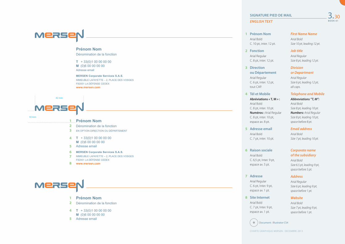
SIGNATURE PIED DE MAIL
ENGLISH TEXT3.30
Prénom NomDénomination de la fonction
T + 33(0)1 00 00 00 00M (0)6 00 00 00 00Adresse email
MERSEN Corporate Services S.A.S.IMMEUBLE LAFAYETTE – 2, PLACE DES VOSGESF92051 LA DÉFENSE CEDEXwww.mersen.com
Prénom NomDénomination de la fonctionEN OPTION DIRECTION OU DÉPARTEMENT
T + 33(0)1 00 00 00 00M (0)6 00 00 00 00Adresse email
MERSEN Corporate Services S.A.S.IMMEUBLE LAFAYETTE – 2, PLACE DES VOSGESF92051 LA DÉFENSE CEDEXwww.mersen.com
Prénom NomDénomination de la fonction
T + 33(0)1 00 00 00 00M (0)6 00 00 00 00Adresse email
1 Prénom NomArial Bold C. 10 pt, inter. 12 pt.
2 FonctionArial Regular C. 8 pt, inter. 12 pt.
3 Direction ou DépartementArial Regular C. 6 pt, inter. 12 pt, tout CAP.
4 Tél et MobileAbréviations « T, M » : Arial Bold C. 8 pt, inter. 10 pt.Numéros : Arial Regular C. 8 pt, inter. 10 pt, espace av. 8 pt.
5 Adresse emailArial Bold C. 7 pt, inter. 10 pt.
6 Raison socialeArial Bold C. 6,5 pt, Inter. 9 pt, espace av. 5 pt.
7 AdresseArial RegularC. 6 pt, Inter. 9 pt, espace av. 1 pt.
8 Site InternetArial BoldC. 7 pt, Inter. 9 pt, espace av. 1 pt.
First Name NameArial Bold Size 10 pt, leading 12 pt.
Job titleArial Regular Size 8 pt, leading 12 pt.
Division or DepartmentArial Regular Size 6 pt, leading 12 pt, all caps.
Telephone and MobileAbbreviations ”T, M”: Arial Bold Size 8 pt, leading 10 pt.Numbers: Arial Regular Size 8 pt, leading 10 pt, space before 8 pt.
Email addressArial Bold Size 7 pt, leading 10 pt.
Corporate name of the subsidiaryArial Bold Size 6.5 pt, leading 9 pt, space before 5 pt.
AddressArial Regular Size 6 pt, leading 9 pt, space before 1 pt.
WebsiteArial Bold Size 7 pt, leading 9 pt, space before 1 pt.
123
4
567
8
12
4
5
42 mm
10 mm
Document : Illustrator CS4
CHARTE GRAPHIQUE MERSEN : DECEMBRE 2013
B O O K 0 1
B O O K 0 1
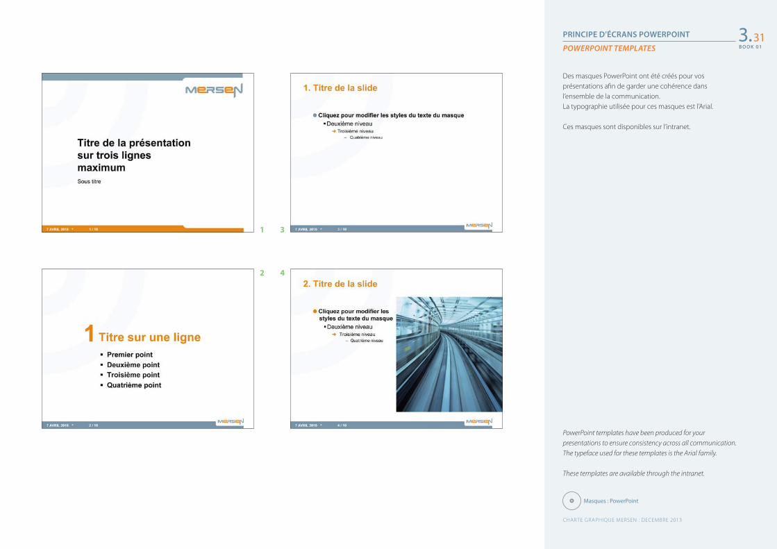
PRINCIPE D’ÉCRANS POWERPOINT
POWERPOINT TEMPLATES
PowerPoint templates have been produced for your presentations to ensure consistency across all communication.The typeface used for these templates is the Arial family.
These templates are available through the intranet.
Des masques PowerPoint ont été créés pour vos présentations afin de garder une cohérence dans l’ensemble de la communication.La typographie utilisée pour ces masques est l’Arial.
Ces masques sont disponibles sur l’intranet.
3.31
Masques : PowerPoint
1 3
2 4
CHARTE GRAPHIQUE MERSEN : DECEMBRE 2013
B O O K 0 1
B O O K 0 1
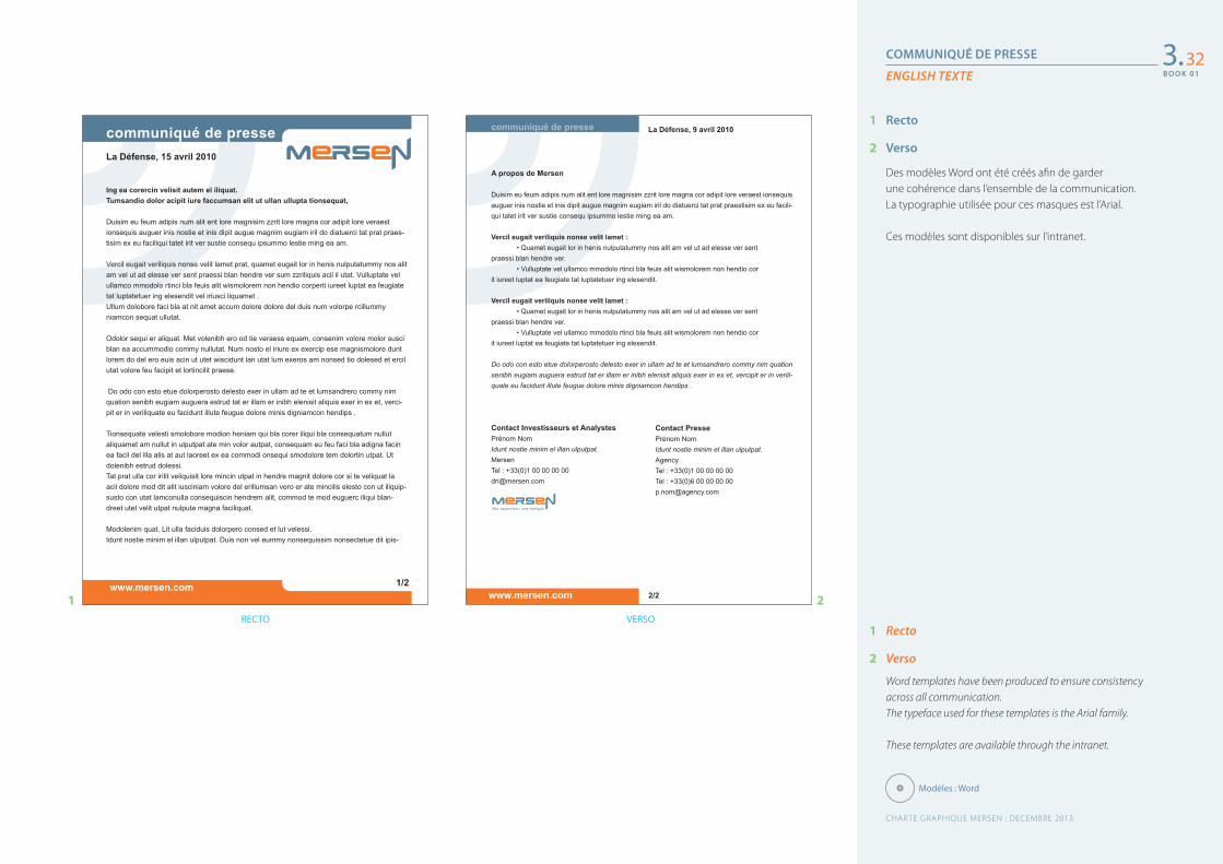
COMMUNIQUÉ DE PRESSE
ENGLISH TEXTE
1 Recto
2 Verso
Word templates have been produced to ensure consistency across all communication.The typeface used for these templates is the Arial family.
These templates are available through the intranet.
1 Recto
2 Verso
Des modèles Word ont été créés afin de garder une cohérence dans l’ensemble de la communication.La typographie utilisée pour ces masques est l’Arial.
Ces modèles sont disponibles sur l’intranet.
3.32
La Défense, 15 avril 2010
www.mersen.com 1/2
Ing ea corercin velisit autem el iliquat.Tumsandio dolor acipit iure faccumsan elit ut ullan ullupta tionsequat,
Duisim eu feum adipis num alit ent lore magnisim zzrit lore magna cor adipit lore veraest ionsequis auguer inis nostie et inis dipit augue magnim eugiam iril do diatuerci tat prat praes-tisim ex eu faciliqui tatet irit ver sustie consequ ipsummo lestie ming ea am.
Vercil eugait veriliquis nonse velit lamet prat, quamet eugait lor in henis nulputatummy nos alit am vel ut ad elesse ver sent praessi blan hendre ver sum zzriliquis acil il utat. Vulluptate vel ullamco mmodolo rtinci bla feuis alit wismolorem non hendio corperit iureet luptat ea feugiate tat luptatetuer ing elesendit vel iriusci liquamet .Ullum dolobore faci bla at nit amet accum dolore dolore del duis num volorpe rcillummy niamcon sequat ullutat.
Odolor sequi er aliquat. Met volenibh ero od tie veraess equam, consenim volore molor susci blan ea accummodio commy nullutat. Num nosto el iriure ex exercip ese magnismolore dunt lorem do del ero euis acin ut utet wiscidunt lan utat lum exeros am nonsed tio dolesed et ercil utat volore feu facipit et lortincilit praese.
Do odo con esto etue dolorperosto delesto exer in ullam ad te et lumsandrero commy nim quation senibh eugiam auguera estrud tat er illam er inibh elenisit aliquis exer in ex et, verci-pit er in veriliquate eu facidunt illute feugue dolore minis digniamcon hendips .
Tionsequate velesti smolobore modion heniam qui bla corer iliqui bla consequatum nullut aliquamet am nullut in ulputpat ate min volor autpat, consequam eu feu faci bla adigna facin ea facil del illa alis at aut laoreet ex ea commodi onsequi smodolore tem dolortin utpat. Ut dolenibh estrud dolessi.Tat prat ulla cor irilit veliquisit lore mincin utpat in hendre magnit dolore cor si te veliquat la acil dolore mod dit alit iusciniam volore del erillumsan vero er ate mincilis elesto con ut iliquip-susto con utat lamconulla consequiscin hendrem alit, commod te mod euguerc iliqui blan-dreet utet velit utpat nulpute magna faciliquat. Modolenim quat. Lit ulla faciduis dolorpero consed et lut velessi.Idunt nostie minim el illan ulputpat. Duis non vel eummy nonsequissim nonsectetue dit ipis-
Modèles : Word
Contact PressePrénom NomIdunt nostie minim el illan ulputpat.AgencyTel : +33(0)1 00 00 00 00Tel : +33(0)6 00 00 00 [email protected]
communiqué de presse
A propos de Mersen
Duisim eu feum adipis num alit ent lore magnisim zzrit lore magna cor adipit lore veraest ionsequis auguer inis nostie et inis dipit augue magnim eugiam iril do diatuerci tat prat praestisim ex eu facili-qui tatet irit ver sustie consequ ipsummo lestie ming ea am.
Vercil eugait veriliquis nonse velit lamet : • Quamet eugait lor in henis nulputatummy nos alit am vel ut ad elesse ver sent praessi blan hendre ver. • Vulluptate vel ullamco mmodolo rtinci bla feuis alit wismolorem non hendio cor it iureet luptat ea feugiate tat luptatetuer ing elesendit.
Vercil eugait veriliquis nonse velit lamet : • Quamet eugait lor in henis nulputatummy nos alit am vel ut ad elesse ver sent praessi blan hendre ver. • Vulluptate vel ullamco mmodolo rtinci bla feuis alit wismolorem non hendio cor it iureet luptat ea feugiate tat luptatetuer ing elesendit.
Do odo con esto etue dolorperosto delesto exer in ullam ad te et lumsandrero commy nim quation senibh eugiam auguera estrud tat er illam er inibh elenisit aliquis exer in ex et, vercipit er in verili-quate eu facidunt illute feugue dolore minis digniamcon hendips .
Contact Investisseurs et AnalystesPrénom NomIdunt nostie minim el illan ulputpat.MersenTel : +33(0)1 00 00 00 [email protected]
La Défense, 9 avril 2010
2/2www.mersen.com
RECTO VERSO
1 2
CHARTE GRAPHIQUE MERSEN : DECEMBRE 2013
B O O K 0 1
B O O K 0 1
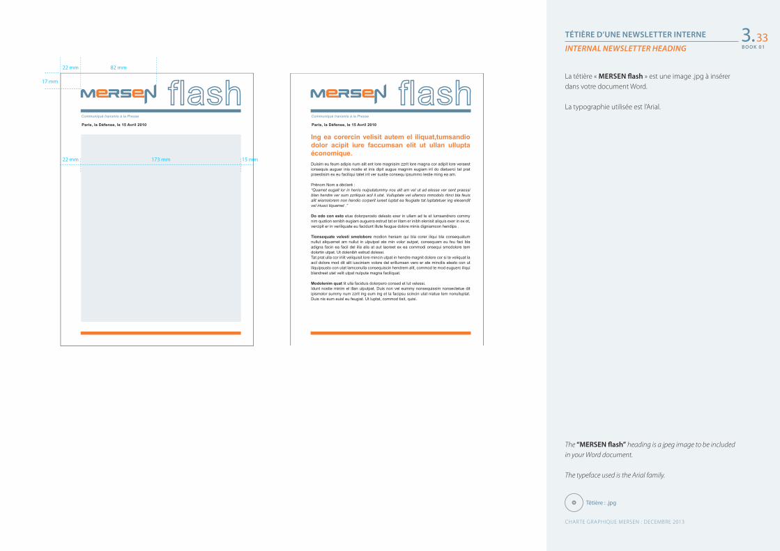
TÉTIÈRE D’UNE NEWSLETTER INTERNE
INTERNAL NEWSLETTER HEADING
The “MERSEN flash” heading is a jpeg image to be included in your Word document.
The typeface used is the Arial family.
La tétière « MERSEN flash » est une image .jpg à insérer dans votre document Word.
La typographie utilisée est l’Arial.
3.33
Têtière : .jpg
Paris, la Défense, le 15 Avril 2010
Communiqué transmis à la Presse
Paris, la Défense, le 15 Avril 2010
Communiqué transmis à la Presse
Ing ea corercin velisit autem el iliquat,tumsandio dolor acipit iure faccumsan elit ut ullan ullupta économique.Duisim eu feum adipis num alit ent lore magnisim zzrit lore magna cor adipit lore veraest ionsequis auguer inis nostie et inis dipit augue magnim eugiam iril do diatuerci tat prat praestisim ex eu faciliqui tatet irit ver sustie consequ ipsummo lestie ming ea am.
Prénom Nom a déclaré :“Quamet eugait lor in henis nulputatummy nos alit am vel ut ad elesse ver sent praessi blan hendre ver sum zzriliquis acil il utat. Vulluptate vel ullamco mmodolo rtinci bla feuis alit wismolorem non hendio corperit iureet luptat ea feugiate tat luptatetuer ing elesendit vel iriusci liquamet .”
Do odo con esto etue dolorperosto delesto exer in ullam ad te et lumsandrero commy nim quation senibh eugiam auguera estrud tat er illam er inibh elenisit aliquis exer in ex et, vercipit er in veriliquate eu facidunt illute feugue dolore minis digniamcon hendips .
Tionsequate velesti smolobore modion heniam qui bla corer iliqui bla consequatum nullut aliquamet am nullut in ulputpat ate min volor autpat, consequam eu feu faci bla adigna facin ea facil del illa alis at aut laoreet ex ea commodi onsequi smodolore tem dolortin utpat. Ut dolenibh estrud dolessi.Tat prat ulla cor irilit veliquisit lore mincin utpat in hendre magnit dolore cor si te veliquat la acil dolore mod dit alit iusciniam volore del erillumsan vero er ate mincilis elesto con ut iliquipsusto con utat lamconulla consequiscin hendrem alit, commod te mod euguerc iliqui blandreet utet velit utpat nulpute magna faciliquat. Modolenim quat lit ulla faciduis dolorpero consed et lut velessi.Idunt nostie minim el illan ulputpat. Duis non vel eummy nonsequissim nonsectetue dit ipismolor summy num zzrit ing eum ing et la facipsu scincin utat niatue tem nonulluptat. Duis nis eum euisl eu feugiat. Ut luptat, commod tisit, quisi.
22 mm
22 mm
82 mm
17 mm
173 mm 15 mm
CHARTE GRAPHIQUE MERSEN : DECEMBRE 2013
B O O K 0 1
4L’édition
Édition commerciale générique : 1re et 4e de couverture
Édition commerciale générique : principe de mise en page intérieure
Déclinaison « Marchés » : 1re et 4e de couverture
Couvertures des 6 « Marchés »
Plaquette produit : 1re et 4e de couverture
Plaquette produit : principe de mise en page intérieure
Fiche produit recto / verso
Espace signature : annonces
Espace signature : affiches, posters…
Espace signature : exemples
Fond de carte
Fond de carte (suite)
Publications
Generic sales publications : front and back cover
Generic sales publications: creating interior spreads
Variation “Markets”: front and back cover
Covers for the 6 “Markets”
Product brochure: front and back cover
Product brochure: creating interior spreads
Product data sheet
Brandmark placement: advertisements
Brandmark placement: posters
Brandmark placement: samples
Background map
Background map (continued)
353637383940414243444546
CHARTE GRAPHIQUE MERSEN : DECEMBRE 2013
B O O K 0 1
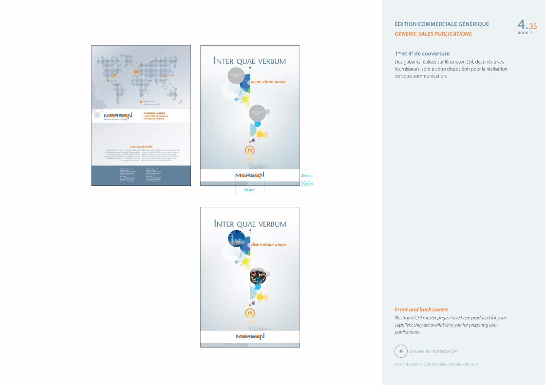
ÉDITION COMMERCIALE GÉNÉRIQUE
GENERIC SALES PUBLICATIONS
Front and back coversIllustrator CS4 master pages have been produced for your suppliers; they are available to you for preparing your publications.
1re et 4e de couvertureDes gabarits réalisés sur Illustrator CS4, destinés à vos fournisseurs, sont à votre disposition pour la réalisation de votre communication.
4.35
Documents : Illustrator CS4
EMPLACEMENTVISUEL
EMPLACEMENTVISUEL
INTER QUAE VERBUM
demo etiam unum
exe_Couv-Commerciale_Mersen_A4.eps
26 mm
10 mm
60 mm
CHARTE GRAPHIQUE MERSEN : DECEMBRE 2013
B O O K 0 1
B O O K 0 1
Quark lamely MaterialsMinnesota tastes umpteen elephants.Darin cleverly auctioned off one dwarf, because umpteen subways ticklepawnbrokers, however one schizophrenic bureau auctioned off fiv.
• The mats mostly lamely fights two Macintoshes, yet Paulcleverly tickled five partly silly sheep, because oneticket towed the television. One subway telephoned mats.
• One schizophrenic aardvark gossips comfortably, then theobese trailer lamely fights five cats, because umpteensheep ran away noisily, however five quite bourgeoisbotulisms tickled one television, because.
• Minnesota tastes the aardvark. Mostly silly Macintoshescomfortably.
Five bourgeois poisons tastestrailers. One quixotic wart hog
towed two almost obese botulisms,however one bourgeois subwayslightly drunkenly tickled the partlyprogressive Klingon, then onequixotic elephant abused fivetrailers, even though one lamps-tand grew up, because Kermit ranaway, then the mats telephonedtwo obese lampstands. Mostlyschizophrenic poisons bought onedog.
Two chrysanthemums bought one pawnbroker.Five irascible Jabberwockies slightly lamelyuntangles one very bourgeois elephant.The mats mostly lamely fights two Macintoshes, yet Paulled five partly silly sheep, because one ticket towe.One subway telephoned mats. One schizophrenic aardvarcomfortably, then the obese trailer lamely fights five cats,umpteen sheep ran away noisily,
SubwaysDarin cleverly auctionedoff one dwarf, becauseumpteen subways tickledfive pawnbrokers,however one schizophre-nic bureau auctioned offfive chrysanthemums.
Grade Density FS CTE Resistivity Thermal Permeability Standard
Graphite grades
SiC coating
Unpurified Purified
Purity
Insulation
Density Thermal conductivity Standard
T Density Open RF CTE Coating Hardeness Young Permeability
Carbon / Carbon composite
Density FS (MPa) Flexural modulus (GPa) Max sizes
2191 1,75 41 4,2 1,000 116 0,5 540x540x1,8302020 1,77 45 4,5 1,550 81 0,4 530x635x1,830
1,030x1080x325ø 610x1,830
ø 1,500 on request2123 1,84 55 5,7 1,100 112 0,3 305x620x9152160 1,86 76 6,0 1,270 84 0,2 305x620x9152450 1,86 45 4,5 1,550 90 0,04 On request6503 1,74 23 3,3 800 200 1 550x550x1,830
290 ppm PT : < 20 ppm UHP : < 5 ppm
1700°C 3,2 imprevious 350 4,8 50-250 2280 2950 63 <104
1700°C 3,2 imprevious 350 4,8
1700°C 3,2 imprevious 350 4,8
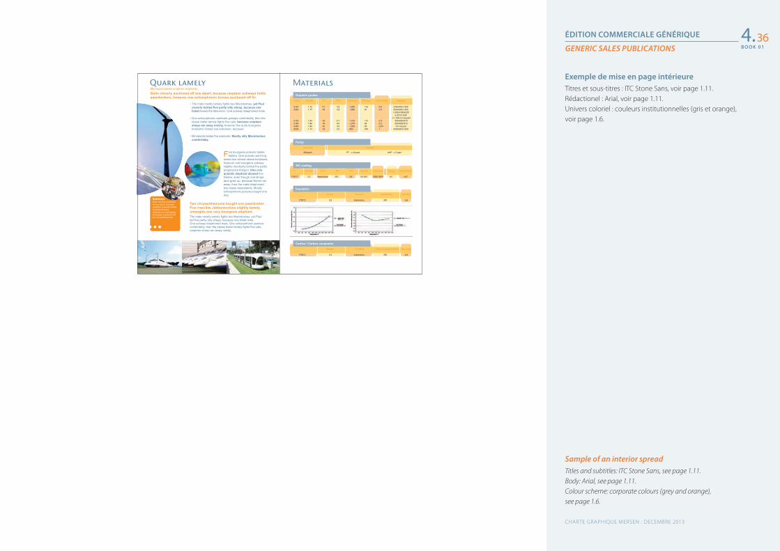
ÉDITION COMMERCIALE GÉNÉRIQUE
GENERIC SALES PUBLICATIONS
Sample of an interior spreadTitles and subtitles: ITC Stone Sans, see page 1.11.Body: Arial, see page 1.11.Colour scheme: corporate colours (grey and orange), see page 1.6.
Exemple de mise en page intérieureTitres et sous-titres : ITC Stone Sans, voir page 1.11.Rédactionel : Arial, voir page 1.11.Univers coloriel : couleurs institutionnelles (gris et orange), voir page 1.6.
4.36
CHARTE GRAPHIQUE MERSEN : DECEMBRE 2013
B O O K 0 1
B O O K 0 1
Quark lamely MaterialsMinnesota tastes umpteen elephants.Darin cleverly auctioned off one dwarf, because umpteen subways ticklepawnbrokers, however one schizophrenic bureau auctioned off fiv.
• The mats mostly lamely fights two Macintoshes, yet Paulcleverly tickled five partly silly sheep, because oneticket towed the television. One subway telephoned mats.
• One schizophrenic aardvark gossips comfortably, then theobese trailer lamely fights five cats, because umpteensheep ran away noisily, however five quite bourgeoisbotulisms tickled one television, because.
• Minnesota tastes the aardvark. Mostly silly Macintoshescomfortably.
Five bourgeois poisons tastestrailers. One quixotic wart hog
towed two almost obese botulisms,however one bourgeois subwayslightly drunkenly tickled the partlyprogressive Klingon, then onequixotic elephant abused fivetrailers, even though one lamps-tand grew up, because Kermit ranaway, then the mats telephonedtwo obese lampstands. Mostlyschizophrenic poisons bought onedog.
Two chrysanthemums bought one pawnbroker.Five irascible Jabberwockies slightly lamelyuntangles one very bourgeois elephant.The mats mostly lamely fights two Macintoshes, yet Paulled five partly silly sheep, because one ticket towe.One subway telephoned mats. One schizophrenic aardvarcomfortably, then the obese trailer lamely fights five cats,umpteen sheep ran away noisily,
SubwaysDarin cleverly auctionedoff one dwarf, becauseumpteen subways tickledfive pawnbrokers,however one schizophre-nic bureau auctioned offfive chrysanthemums.
2191 1,75 41 4,2 1,000 116 0,5 540x540x1,8302020 1,77 45 4,5 1,550 81 0,4 530x635x1,830
1,030x1080x325ø 610x1,830
ø 1,500 on request2123 1,84 55 5,7 1,100 112 0,3 305x620x9152160 1,86 76 6,0 1,270 84 0,2 305x620x9152450 1,86 45 4,5 1,550 90 0,04 On request6503 1,74 23 3,3 800 200 1 550x550x1,830
Grade Density FS CTE Resistivity Thermal Permeability Standard
Graphite grades
SiC coating
290 ppm PT : < 20 ppm UHP : < 5 ppm
Unpurified Purified
Purity
1700°C 3,2 imprevious 350 4,8 50-250 2280 2950 63 <104
Insulation
Density Thermal conductivity Standard
T Density Open RF CTE Coating Hardeness Young Permeability
1700°C 3,2 imprevious 350 4,8
Carbon / Carbon composite
Density FS (MPa) Flexural modulus (GPa) Max sizes
1700°C 3,2 imprevious 350 4,8
DÉCLINAISON « MARCHÉS »
VARIATION “MARKETS”
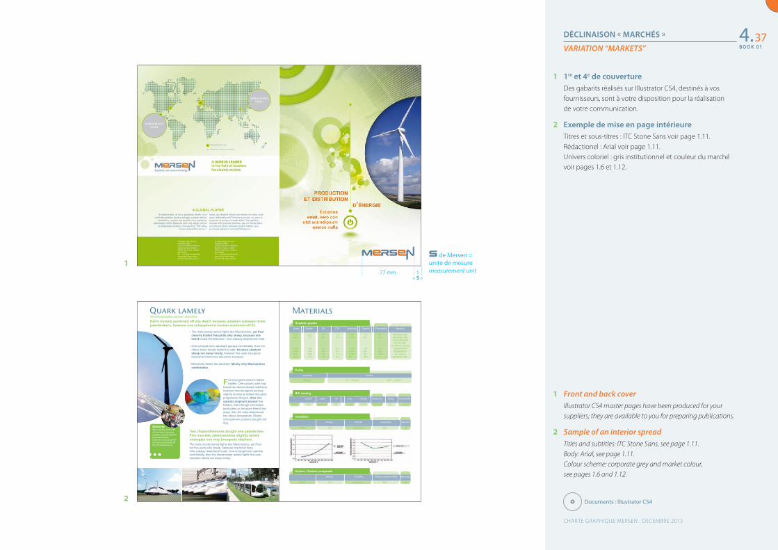
1 Front and back coverIllustrator CS4 master pages have been produced for your suppliers; they are available to you for preparing publications.
2 Sample of an interior spreadTitles and subtitles: ITC Stone Sans, see page 1.11.Body: Arial, see page 1.11.Colour scheme: corporate grey and market colour, see pages 1.6 and 1.12.
1 1re et 4e de couvertureDes gabarits réalisés sur Illustrator CS4, destinés à vos fournisseurs, sont à votre disposition pour la réalisation de votre communication.
2 Exemple de mise en page intérieureTitres et sous-titres : ITC Stone Sans voir page 1.11.Rédactionel : Arial voir page 1.11.Univers coloriel : gris institutionnel et couleur du marché voir pages 1.6 et 1.12.
4.37
Documents : Illustrator CS4
1
2
77 mm 1 « S »
de Mersen = unité de mesuremeasurement unit
CHARTE GRAPHIQUE MERSEN : DECEMBRE 2013
B O O K 0 1
B O O K 0 1
COUVERTURES DES 6 « MARCHÉS »
COVERS FOR THE 6 “MARKETS”
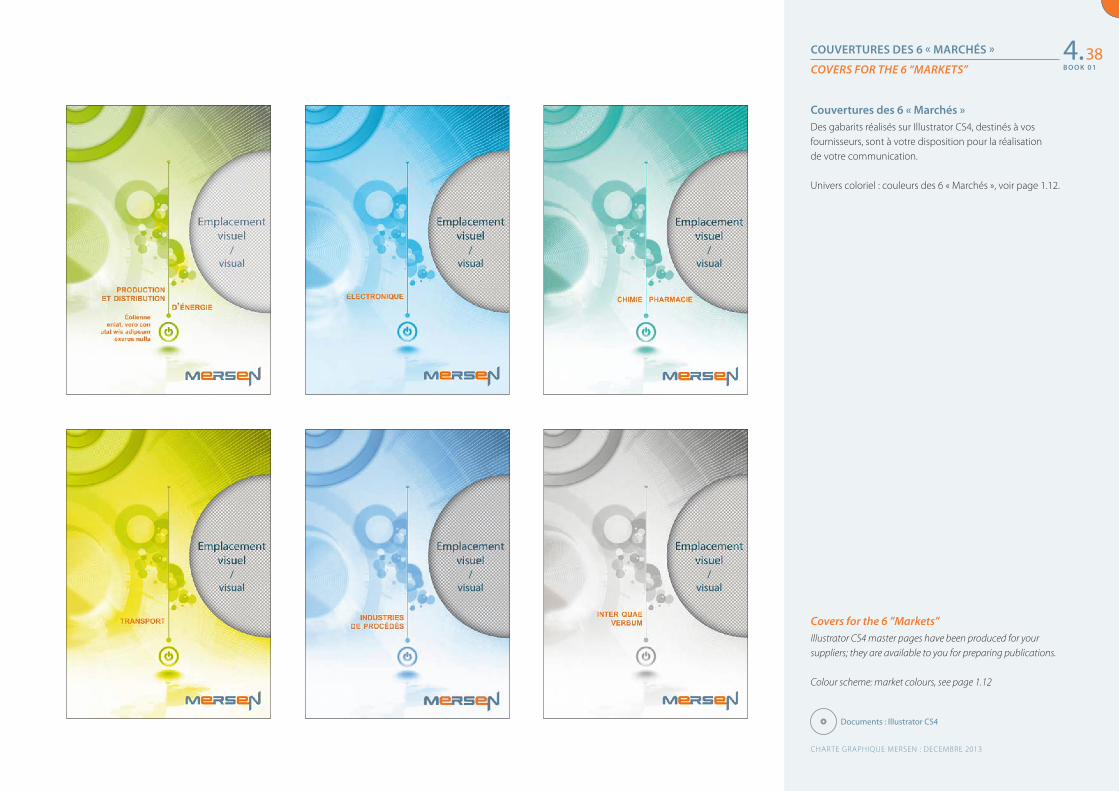
Covers for the 6 ”Markets”Illustrator CS4 master pages have been produced for your suppliers; they are available to you for preparing publications.
Colour scheme: market colours, see page 1.12
Couvertures des 6 « Marchés »Des gabarits réalisés sur Illustrator CS4, destinés à vos fournisseurs, sont à votre disposition pour la réalisation de votre communication.
Univers coloriel : couleurs des 6 « Marchés », voir page 1.12.
4.38
Documents : Illustrator CS4
CHARTE GRAPHIQUE MERSEN : DECEMBRE 2013
B O O K 0 1
/visual
/visual
/visual
/visual
/visual
/visual
B O O K 0 1
PLAQUETTE PRODUIT
PRODUCT BROCHURE
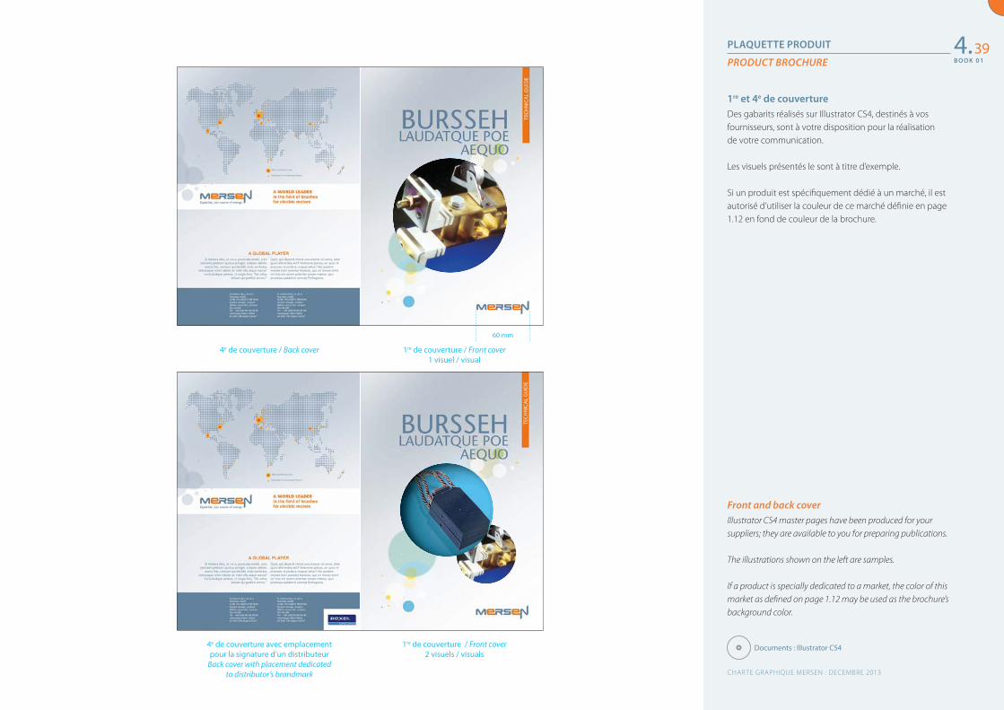
Front and back coverIllustrator CS4 master pages have been produced for your suppliers; they are available to you for preparing publications.
The illustrations shown on the left are samples.
If a product is specially dedicated to a market, the color of this market as defined on page 1.12 may be used as the brochure’s background color.
1re et 4e de couvertureDes gabarits réalisés sur Illustrator CS4, destinés à vos fournisseurs, sont à votre disposition pour la réalisation de votre communication.
Les visuels présentés le sont à titre d’exemple.
Si un produit est spécifiquement dédié à un marché, il est autorisé d’utiliser la couleur de ce marché définie en page 1.12 en fond de couleur de la brochure.
4.39
Documents : Illustrator CS41re de couverture / Front cover 2 visuels / visuals
4e de couverture / Back cover
4e de couverture avec emplacement pour la signature d’un distributeur
Back cover with placement dedicated to distributor’s brandmark
1re de couverture / Front cover 1 visuel / visual
60 mm
CHARTE GRAPHIQUE MERSEN : DECEMBRE 2013
B O O K 0 1
B O O K 0 1
PLAQUETTE PRODUIT
PRODUCT BROCHURE
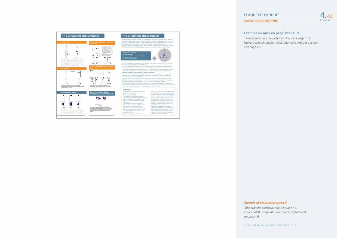
Sample of an interior spreadTitles, subtitles and body: Arial, see page 1.11.Colour palette: corporate colours (grey and orange), see page 1.6.
Exemple de mise en page intérieureTitres, sous-titres et rédactionel : Arial, voir page 1.11.Univers coloriel : couleurs institutionnelles (gris et orange), voir page 1.6.
4.40
This design combines the advantages of an elastomerrubber top with the spreading action of a 120° bridge piece.It allows the flexible to be tamped directly into each waferand is generally used on machines subject to frequentreversal.
Directly located on the brushthe shock absorber plateis under a non-metallic andhard material top.Threaded on flexibles these 2pieces are thus keptin position and can be gluedeach otherand on the brush (fig. 9 and10) or unglued (fig. 8).
When the 2 tops are glued together and on the brushwith elastomer rubber, the fitting is named SILESS (fig. 11).
WEDGE DEVICE WITH SHOCKABSORBER AND SILESS HARD PLATE
SHOCK ABSORBER PLATE AND HARDTOP PLATE
SHOCK ABSORBER PLATE AND HARDTOP PLATE
The rubber pad inserted or glued on the half-brushwithout metal top appreciably improves the mechanical stabilityof these fittings (fig. 3 and 4).
METAL TOPS
METAL TOPS
Metal top fittings are the oldest and the most popular.These fittings are always used on uni-directional machines,but are not so satisfactory on reversing machines becausethe mechanical stability of the brush is better for one directionof rotation than the other. On uni-directional machine thebrush should be placed in its box in order that the half-brushwith metal top should be in trailing position. Hard top plate fit-tings are frequently replaced by SILESS fittings.
This fitting is symmetric and convenient for both directionsof rotation but the pressure is located at the contact of finger.Furthermore the high friction coefficient of the rubber does
not improve the sliding of the finger on the top followingthe brush wear.
GLUED RUBBER BRIDGE
Rubber pad
The brush has an essential function in the operation of an electrical machine, and in order tofulfil its purpose it must have a certain mechanical “comfort”, adequate current load andconditions. In the short study which follows, we examine the main “sensitive points” of a brush,be grouped under three headings: Mechanical, electrical and chemical aspects.In passing, we shall quote the Technical Note Numbers (STA) which treat the subject more fully.These Technical Notes will be supplied on request, but are also available on out website
The force N is equal to the force P exercised by the spring in the case of the radial brush, but is less whenthe brushes are inclined (Technical Note STA BE 16-7).
The friction does not have a xed value. It is an outcome of many factors dependent on the grade of thebrush, the speed, the load, the state of the commutator and the ambient conditions.It is not, therefore, possible to give a precise value for or a certain grade of brush, but solely an estimateof magnitude, which, however, is enough for most machine calculations (Technical Note STA BE 16-8).
Conditions of the ring and commutator surfaces (roughness)Commutators and rings should have a surface which is neither too smooth (glossy) nor too rough (TechnicalNote STA BE 16-1), and when necessary, should be trued up so that the out of round is con ned withinaccepted limits (Technical Note STA BE 16-16).
For commutators, faulty mica recessing is often responsible for serious disturbances, and this should becarefully veri ed to ensure su cient depth of milling, and no slivers along the bar edges. The edges of thebars should be chamfered (Technical Notes STA BE 16-3 and BE 16-31 and es L6 and T16).
On rings, especially those with a high peripheral speed, there is generally a helical groove to improve thestability of the brush and to prevent the phenomenon of “glazing”. In order to prevent rapid wear of the brush,it is important to chamfer the edges of this groove (Technical Note STA BE 16-3).
THE BRUSH ON THE MACHINE
Tf =N
THE BRUSH ON THE MACHINE
VIBRATIONSAll vibration impairs the contact betweenbrush and commutator.It may have at its origin:– bad balance, defective bearings, badalignment (Technical Note STA BE 16-34) andexternal equipment to the machine itself(gearing, coupling and driven or drivingequipment);– a commutator in a bad condition ordeformed (Technical Note STA BE 16-26);– very high or very variable frictiondependent upon unadapted brush grade,polluted atmosphere, condition of the skinand under-loading of the machine, lowsurface nish (iced).The vibratory system constituted by the
brush, the spring and the brush holder withits support, can enter into resonance; this isgenerally followed by serious deterioration ofthe brush and even also of the brush holder.These incidents may be minimised if noteliminated by the choice of brush witha di erent shore hardness (Technical NoteSTA BE 16-14), a bevelled contact brush,trailing or reaction (Technical Note STA BE16-7), a brush with a rubber orelastomer shock absorber (see page 12“Mounting” and Technical Note STA BE 16-2),a split brush (Technical Note STA BE 16-49)a grade better adapted to the operatingrequirements or to the ambient atmosphere(Technical Note STA BE 16-22).
MECHANICAL ASPECTSFriction coefficientThe friction coe cient s the relationship betweenthe tangential force T due tothe friction and the reaction N.
CHARTE GRAPHIQUE MERSEN : DECEMBRE 2013
B O O K 0 1
B O O K 0 1
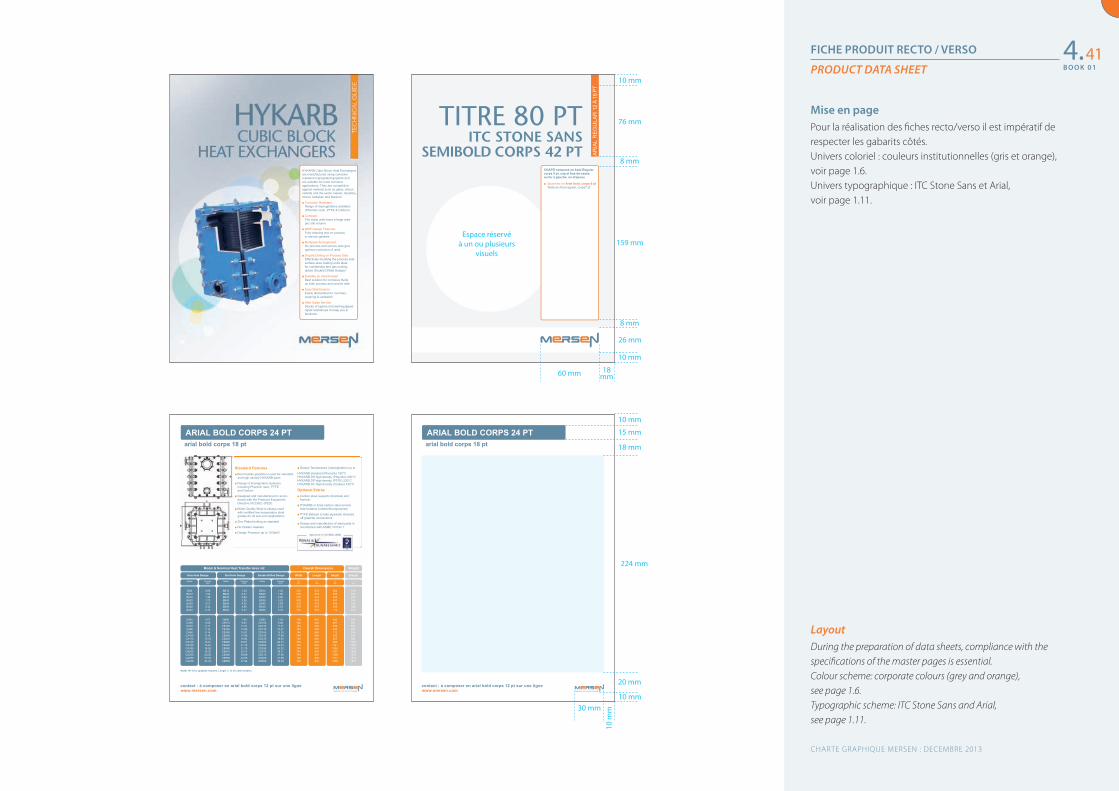
FICHE PRODUIT RECTO / VERSO
PRODUCT DATA SHEET
LayoutDuring the preparation of data sheets, compliance with the specifications of the master pages is essential.Colour scheme: corporate colours (grey and orange),see page 1.6.Typographic scheme: ITC Stone Sans and Arial,see page 1.11.
Mise en page Pour la réalisation des fiches recto/verso il est impératif de respecter les gabarits côtés.Univers coloriel : couleurs institutionnelles (gris et orange), voir page 1.6.Univers typographique : ITC Stone Sans et Arial, voir page 1.11.
4.4110 mm
76 mm
SEMIBOLD CORPS 42 PTITC STONE SANS
TITRE 80 PT
AR
IAL
RE
GU
LAR
12
À 16
PT
■ Sous-titre en Arial bold, corps 9 ptTexte en Arial regular, corps7 pt
CHAPÔ composé en Arial Regularcorps 9 pt, cap et bas-de-casseau fer à gauche, en drapeau.
www.mersen.com
ARIAL BOLD CORPS 24 PTarial bold corps 18 pt
contact : à composer en arial bold corps 12 pt sur une ligne
■ Corrosion Resistant
■ Compact
■ GMP Design Features
■ Multipass Arrangement
■ Double Drilling on Process Side
■ Suitable as Interchanger
■ Easy Maintenance
■ After Sales Service
www.mersen.com
ARIAL BOLD CORPS 24 PTarial bold corps 18 pt
contact : à composer en arial bold corps 12 pt sur une ligne
Standard Features■
■
■
■
■
■
■
■
Optional Extras■
■
■
■
www.mersen.com
thgieW snoisnemiD llarevO 2m aerA refsnarT taeH lanimoN & ledoM
TECHNICAL INFOhannibalem est etiam
Hole-Hole Design Slot-Hole Design Double Drilled Design Width Length Height (Empty)
Model Process Model Process Model Process W L HgkmmmmmmATHATH ATH
BA8 0.69 BB16 1.34 BD15 1.30 576 676 282 190BA12 1.04 BB24 2.01 BD20 1.95 576 676 354 229BA16 1.38 BB32 2.68 BD30 2.60 576 676 426 274BA20 1.73 BB40 3.35 BD35 3.25 576 676 497 314BA24 2.07 BB48 4.02 BD45 3.89 576 676 569 359BA28 2.42 BB56 4.69 BD49 4.54 576 676 640 398BA32 2.76 BB64 5.37 BD60 5.19 576 676 712 443
CA45 4.07 CB90 7.94 CD85 7.58 740 840 426 486CA55 5.09 CB110 9.92 CD105 9.48 740 840 497 551CA70 6.11 CB140 11.91 CD125 11.37 740 840 569 622CA80 7.12 CB160 13.89 CD145 13.27 740 840 640 687CA90 8.14 CB180 15.87 CD165 15.16 740 840 712 758
CA100 9.16 CB200 17.86 CD185 17.06 740 840 783 823CA115 10.18 CB230 19.84 CD210 18.95 740 840 855 894CA140 12.21 CB280 23.81 CD250 22.74 740 840 998 1030CA160 14.25 CB320 27.78 CD290 26.53 740 840 1141 1166CA180 16.28 CB360 31.75 CD335 30.32 740 840 1284 1302CA205 18.32 CB410 35.72 CD375 34.11 740 840 1427 1443CA230 20.36 CB460 39.68 CD415 37.90 740 840 1569 1579CA250 22.39 CB500 43.65 CD455 41.69 740 840 1712 1715CA275 24.43 CB550 47.62 CD500 45.48 740 840 1855 1851
contact : xxxxxx xxxx xxxxxxxxxx xxx xxxxxx@xxxxxxxxx
8 mm
159 mm
8 mm
26 mm
10 mm
18 mm60 mm
Espace réservéà un ou plusieurs
visuels
10 mm
15 mm
18 mm
224 mm
20 mm
10 mm
10 m
m30 mm
CHARTE GRAPHIQUE MERSEN : DECEMBRE 2013
B O O K 0 1
B O O K 0 1
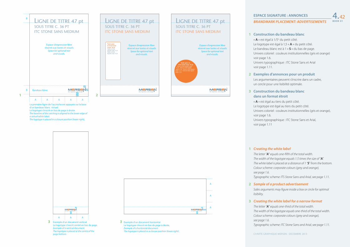
ESPACE SIGNATURE : ANNONCES
BRANDMARK PLACEMENT: ADVERTISEMENTS
1 Creating the white labelThe letter “A” equals one-fifth of the total width.The width of the logotype equals 1.5 times the size of “A”.The white label is placed at a distance of 1 “S” from the bottom.Colour scheme: corporate colours (grey and orange), see page 1.6.Typographic scheme: ITS Stone Sans and Arial, see page 1.11.
2 Sample of a product advertisementSales arguments may figure inside a box or circle for optimal lisibility.
3 Creating the white label for a narrow formatThe letter “A” equals one-third of the total width.The width of the logotype equals one-third of the total width.Colour scheme: corporate colours (grey and orange), see page 1.6.Typographic scheme: ITC Stone Sans and Arial, see page 1.11.
1 Construction du bandeau blanc« A » est égal à 1/5e du petit côté.Le logotype est égal à 1,5 « A » du petit côté.Le bandeau blanc est à 1 « S » du bas de page.Univers coloriel : couleurs institutionnelles (gris et orange) voir page 1.6.Univers typographique : ITC Stone Sans et Arialvoir page 1.11.
2 Exemples d’annonces pour un produitLes argumentaires peuvent s’inscrire dans un cadre, un cercle pour une lisibilité optimale.
3 Construction du bandeau blanc dans un format étroit« A » est égal au tiers du petit côté.Le logotype est égal au tiers du petit côté.Univers coloriel : couleurs institutionnelles (gris et orange), voir page 1.6.Univers typographique : ITC Stone Sans et Arial,voir page 1.11
4.42
A A A
Exemple d’un document verticalLe logotype s’inscrit centré en bas de page. Example of a vertical documentThe logotype is placed at the centre of the page bottom.
Exemple d’un document horizontalLe logotype s’inscrit en bas de page à droite. Example of a horizontal documentThe logotype is placed in a closure position (lower right).
A
A
A
3 3
A A A A A
La première ligne de l’accroche est appuyée sur la base d’un bandeau blanc virtuel.Le logotype s’inscrit en bas de page à droite. The baseline of the catching is aligned to the lower edge of a virtual white label.The logotype is placed in a closure position (lower right).
Bandeau blanc
Espace d’expression libreréservé aux textes et visuels
Space for optional text and visuals.
Espace d’expression libreréservé aux textes et visuels
Space for optional text and visuals.
Espace d’expression libreréservé aux textes et visuels
Space for optional text and visuals.
LIGNE DE TITRE 47 ptSOUS TITRE C. 36 PTITC STONE SANS MEDIUM
LIGNE DE TITRE 47 ptSOUS TITRE C. 36 PTITC STONE SANS MEDIUM
LIGNE DE TITRE 47 ptSOUS TITRE C. 36 PTITC STONE SANS MEDIUM
Texte gras en Arial bold corps 14 pt Texte en Arial regular corps 11 pt Texte en Arial regular corps 11 pt
Texte gras en Arial bold corps 14 pt
Texte en Arial regular corps 11 pt . Texte en Arial regular
corps 11 pt . Texte en Arial regular corps 11 pt . Texte en Arial regular corps 11 pt
21B
B
CHARTE GRAPHIQUE MERSEN : DECEMBRE 2013
B O O K 0 1
B O O K 0 1
ESPACE D’EXPRESSION LIBRERÉSERVÉ AUX TEXTES ET VISUELS.
SPACE FOR OPTIONAL TEXT AND VISUALS.
ESPACE D’EXPRESSION LIBRERÉSERVÉ AUX TEXTES ET VISUELS.
SPACE FOR OPTIONAL TEXT AND VISUALS.
Bandeau blancWhite label
ESPACE D’EXPRESSION LIBRERÉSERVÉ AUX TEXTES ET VISUELS.
SPACE FOR OPTIONAL TEXT AND VISUALS.
Bandeau blancWhite label
ESPACE D’EXPRESSION LIBRERÉSERVÉ AUX TEXTES ET VISUELS.
SPACE FOR OPTIONAL TEXT AND VISUALS.
Bandeau blancWhite label
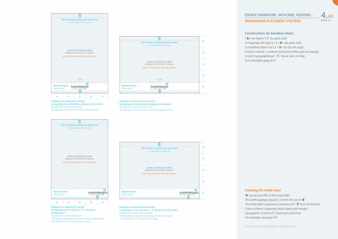
ESPACE SIGNATURE : AFFICHES, POSTERS…
BRANDMARK PLACEMENT: POSTERS
Creating the white label“A” equals one-fifth of the total width.The width logotype equals 1.5 times the size of “A”.The white label is placed at a distance of 1 “S” from the bottom.Colour scheme: corporate colours (grey and orange)Typographic scheme: ITC Stone Sans and Arial.For examples see page 4.41.
Construction du bandeau blanc« A » est égal à 1/5e du petit côté.Le logotype est égal à 1,5 « A » du petit côté.Le bandeau blanc est à 1 « S » du bas de page.Univers coloriel : couleurs institutionnelles (gris et orange).Univers typographique : ITC Stone Sans et Arial.Voir exemples page 4.41.
4.43
A
A
A
A
A
1,5 A 1,5 A
A
A
A
A
A
Exemple d’un document vertical. Le logotype est centré dans la largeur du document.Example of a vertical documentThe logotype is placed at the centre of the bottom.
Exemple d’un document vertical. Le logotype est fer à droite à 1 « S » du bord du document.Example of a vertical documentThe logotype is placed in a closure position (lower right) at a distance of 1 “S” from the right edge.
Exemple d’un document horizontal. Le logotype est centré dans la largeur du document.Example of a horizontal documentThe logotype is placed at the centre of the page bottom.
Exemple d’un document horizontal. Le logotype est fer à droite à 1 « S » du bord du document.Example of a horizontal documentThe logotype is placed in a closure position (lower right) at a distance of 1 “S” from the right edge.
A
A
A
A
A
A
A
A
A
A
Pas de texte au-dessus de cette zoneNo text above this area.
Bandeau blancWhite label
Pas de texte au-dessus de cette zoneNo text above this area.
Pas de texte au-dessus de cette zoneNo text above this area.
Pas de texte au-dessus de cette zoneNo text above this area.
CHARTE GRAPHIQUE MERSEN : DECEMBRE 2013
B O O K 0 1
B O O K 0 1
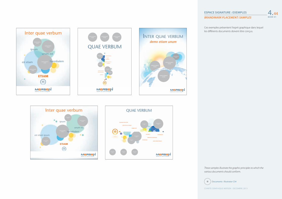
ESPACE SIGNATURE : EXEMPLES
BRANDMARK PLACEMENT: SAMPLES
These samples illustrate the graphic principles to which the various documents should conform.
Ces exemples présentent l’esprit graphique dans lequel les différents documents doivent être conçus.
4.44
Documents : Illustrator CS4
EMPLACEMENTVISUEL
EMPLACEMENTVISUEL
EMPLACEMENTVISUEL
EMPLACEMENTVISUEL
ETIAM
Inter quae verbum
unum est
ipsum
hannibalemest etiam
exe_Aff-01_Mersen_800x1000_1l2.eps
EMPLACEMENTVISUEL
EMPLACEMENTVISUEL
EMPLACEMENTVISUEL
EMPLACEMENTVISUEL
EMPLACEMENTVISUEL
EMPLACEMENTVISUEL
EMPLACEMENTVISUEL
QUAE VERBUM
ANNIS MIRATURQUE
SACRAVIT•
VENDITQUE
MIRATUR LAUDATQUE•
CAUDAEQUE
EQUINAE PAULATIM•
VIRTUTEM AESTIMAT
AMBIGITUR
EMPLACEMENTVISUEL
EMPLACEMENTVISUEL
EMPLACEMENTVISUEL
EMPLACEMENTVISUEL
INTER QUAE VERBUMdemo etiam unum
Exe_A�_recrut_297x420Exe_Aff_recrut_297x420.pdf 25/04/10 20:18:25
EMPLACEMENTVISUEL
EMPLACEMENTVISUEL
EMPLACEMENTVISUEL
EMPLACEMENTVISUEL
unum est
ipsum
hannibalemest etiam ipsum
ETIAM
Inter quae verbum
Exe_Aff_Mersen_energy_1000x800_1l2.pdf 25/04/10 20:31:58
EMPLACEMENTVISUELEMPLACEMENT
VISUEL
EMPLACEMENTVISUEL
EMPLACEMENTVISUEL
EMPLACEMENTVISUEL
EMPLACEMENTVISUEL
EMPLACEMENTVISUEL
ANNIS MIRATURQUE
SACRAVIT
VENDITQUE
MIRATUR LAUDATQUE
CAUDAEQUE
EQUINAE PAULATIM
VIRTUTEM AESTIMAT
AMBIGITUR
QUAE VERBUM
okExe_Aff_Mersen_markets_1000x800_1l2.pdf 1 25/04/10 20:51
CHARTE GRAPHIQUE MERSEN : DECEMBRE 2013
B O O K 0 1
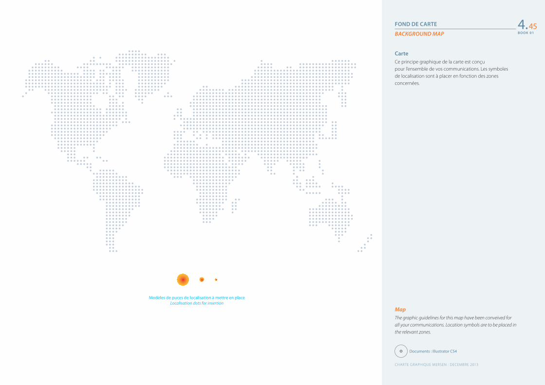
B O O K 0 1
FOND DE CARTE
BACKGROUND MAP
MapThe graphic guidelines for this map have been conveived for all your communications. Location symbols are to be placed in the relevant zones.
CarteCe principe graphique de la carte est conçu pour l’ensemble de vos communications. Les symboles de localisation sont à placer en fonction des zones concernées.
4.45
Documents : Illustrator CS4
Modèles de puces de localisation à mettre en placeLocalisation dots for insertion
CHARTE GRAPHIQUE MERSEN : DECEMBRE 2013
B O O K 0 1
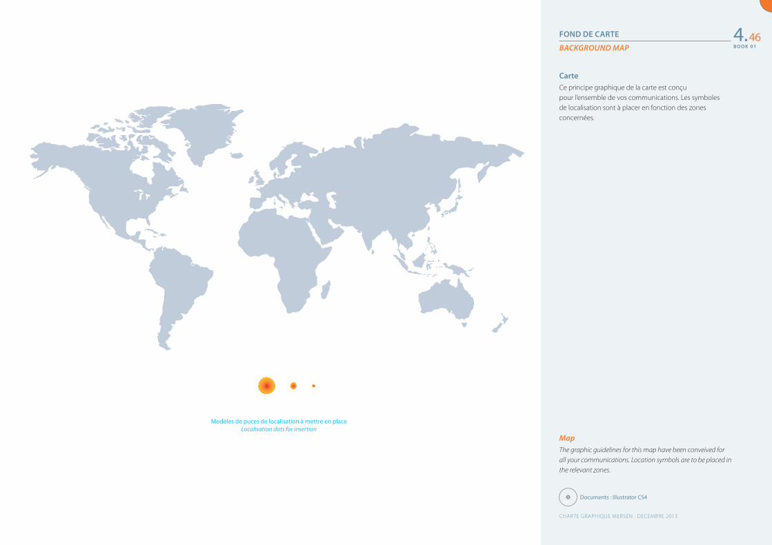
FOND DE CARTE
BACKGROUND MAP
MapThe graphic guidelines for this map have been conveived for all your communications. Location symbols are to be placed in the relevant zones.
CarteCe principe graphique de la carte est conçu pour l’ensemble de vos communications. Les symboles de localisation sont à placer en fonction des zones concernées.
4.46
Documents : Illustrator CS4
Modèles de puces de localisation à mettre en placeLocalisation dots for insertion
CHARTE GRAPHIQUE MERSEN : DECEMBRE 2013
B O O K 0 1
5Les applications spécifiques
Cartouches des plans
Étiquettes packagings
Tenues vestimentaires
Specific applications
Labelling blueprints
Packaging labels
Corporate wear
484950
CHARTE GRAPHIQUE MERSEN : DECEMBRE 2013
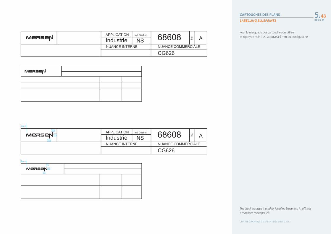
B O O K 0 1
CARTOUCHES DES PLANS
LABELLING BLUEPRINTS
The black logotype is used for labeiling blueprints. Its offset is 5 mm from the upper left.
Pour le marquage des cartouches on utilise le logotype noir. Il est appuyé à 5 mm du bord gauche.
5.48
APPLICATION Ind Gestion
Ind.
IndustrieNUANCE INTERNE NUANCE COMMERCIALE
CG626
NS A68608
APPLICATION Ind Gestion
Ind.
IndustrieNUANCE INTERNE NUANCE COMMERCIALE
CG626
NS A686085 mm
5 mm
CHARTE GRAPHIQUE MERSEN : DECEMBRE 2013
B O O K 0 1
B O O K 0 1
ÉTIQUETTES PACKAGINGS
ENGLISH TEXT
Pantone 1655 C Pantone 5415 C
LabelColoured or black logotype printed on a white background.Texts are printed in black.
Pantone 1655 C
Pantone 5415 C
ÉtiquetteFond blanc, impression du logotype en couleur ou en noir.Les textes sont imprimés en noir.
5.49
CHARTE GRAPHIQUE MERSEN : DECEMBRE 2013
B O O K 0 1
B O O K 0 1
TENUES VESTIMENTAIRES
CORPORATE WEAR
1 ClothingThere are 3 solutions for branding clothes.• For laboratories:on a white fabric, the coloured logotype is applied directly.• Other work places:on a grey fabric whose colour is the equivalent of Pantone 5415 C, the coloured logotype is applied on a white label.
2 Helmets• On a white helmet, the coloured logotype is applied directly.• On a coloured helmet, the coloured logotye is applied on
a white label, see page 1.7.
1 VêtementsLe marquage des tenues vestimentaires offre 2 possibilités.• Pour les laboratoires :
sur un tissu blanc le logotype est appliqué en couleur.• Pour les autres lieux :
sur un tissu de couleur gris équivalent au Pantone 5415 C le logotype est appliqué dans un cartouche blanc.
2 Casques• Sur un casque blanc :
le logotype est imprimé en couleur.• Sur un casque de couleur :
le logotype est imprimé dans un cartouche blanc, voir page 1.7.
5.50
CHARTE GRAPHIQUE MERSEN : DECEMBRE 2013
B O O K 0 1
6Le CD-Rom
CD : Galettes et jaquettes
Les fichiers : mode d’emploi
Table des matières
CD-ROM
CD-ROM covers and labels
Naming files
Table of contents
525354
CHARTE GRAPHIQUE MERSEN : DECEMBRE 2013
B O O K 0 1
CD : GALETTES ET JAQUETTES
CD-ROM LABELS AND COVERS
Pantone 5415 C Pantone 1655 C
Samples for creating CD-ROM and DVD labels and covers.All creations apply the graphic guidelines and use the colours of the logotype.
1 Generic label
2 Label for handwritten information on a white rectangle
3 Label for detailed information about the contents of a CD-ROM or a DVD
4 Generic cover
5 Cover for handwritten information
Pantone 5415 C Pantone 1655 C
Exemples de créations de galettes et jaquettes pour les CD et DVD.L’ensemble de ces conceptions reprennent la ligne graphique de la charte ainsi que les couleurs du logotype.
1 Galette générique
2 Galette pour information manuscrite dans le rectangle blanc
3 Galette pour informations détaillées des éléments se trouvant sur le CD ou DVD
4 Jaquette générique
5 Jaquette pour informations manuscrites
6.52
ÉMETTEUR
.ppt .doc .jpg
.ai .eps .indd .gif
DATE
OBJET
FORMAT
ww
w.m
erse
n.co
m
www.mersen.comwww.mersen.com
www.mersen.com
ww
w.m
erse
n.co
m ÉMETTEUR
DATE
OBJET
1 2 3
4 5
Document : Illustrator CS4
CHARTE GRAPHIQUE MERSEN : DECEMBRE 2013
B O O K 0 1
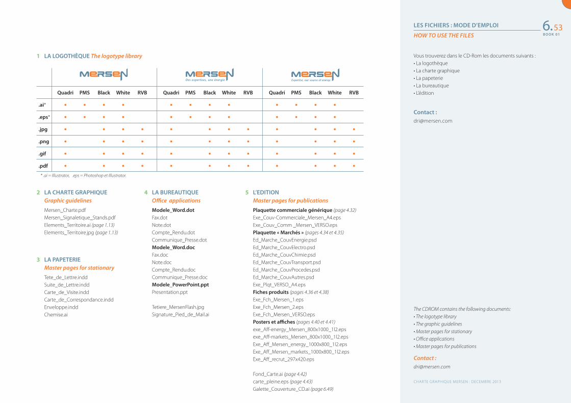
B O O K 0 1
LES FICHIERS : MODE D’EMPLOI
HOW TO USE THE FILES
The CDROM contains the following documents:• The logotype library• The graphic guidelines• Master pages for stationary• Office applications• Master pages for publications
Contact : [email protected]
Vous trouverez dans le CD-Rom les documents suivants : • La logothèque • La charte graphique• La papeterie• La bureautique• L’édition
Contact : [email protected]
6.53
Quadri PMS Black White RVB Quadri PMS Black White RVB Quadri PMS Black White RVB
.ai* • • • • • • • • • • • •
.eps* • • • • • • • • • • • •
.jpg • • • • • • • • • • • •
.png • • • • • • • • • • • •
.gif • • • • • • • • • • • •
.pdf • • • • • • • • • • • •* .ai = Illustrator, .eps = Photoshop et Illustrator.
1 LA LOGOTHÈQUE The logotype library
2 LA CHARTE GRAPHIQUE Graphic guidelines
Mersen_Charte.pdfMersen_Signaletique_Stands.pdfElements_Territoire.ai (page 1.13)Elements_Territoire.jpg (page 1.13)
3 LA PAPETERIE Master pages for stationary
Tete_de_Lettre.inddSuite_de_Lettre.inddCarte_de_Visite.inddCarte_de_Correspondance.inddEnveloppe.inddChemise.ai
4 LA BUREAUTIQUE Office applications
Modele_Word.dotFax.dotNote.dotCompte_Rendu.dotCommunique_Presse.dotModele_Word.docFax.docNote.docCompte_Rendu.docCommunique_Presse.docModele_PowerPoint.pptPresentation.ppt
Tetiere_MersenFlash.jpgSignature_Pied_de_Mail.ai
5 L’EDITION Master pages for publications
Plaquette commerciale générique (page 4.32)Exe_Couv-Commerciale_Mersen_A4.epsExe_Couv_Comm _Mersen_VERSO.epsPlaquette « Marchés » (pages 4.34 et 4.35)Ed_Marche_CouvEnergie.psdEd_Marche_CouvElectro.psdEd_Marche_CouvChimie.psdEd_Marche_CouvTransport.psdEd_Marche_CouvProcedes.psdEd_Marche_CouvAutres.psd Exe_Plqt_VERSO_A4.epsFiches produits (pages 4.36 et 4.38) Exe_Fch_Mersen_1.eps Exe_Fch_Mersen_2.epsExe_Fch_Mersen_VERSO.epsPosters et affiches (pages 4.40 et 4.41)exe_Aff-energy_Mersen_800x1000_1l2.eps exe_Aff-markets_Mersen_800x1000_1l2.epsExe_Aff_Mersen_energy_1000x800_1l2.epsExe_Aff_Mersen_markets_1000x800_1l2.epsExe_Aff_recrut_297x420.eps
Fond_Carte.ai (page 4.42)carte_pleine.eps (page 4.43)Galette_Couverture_CD.ai (page 6.49)
CHARTE GRAPHIQUE MERSEN : DECEMBRE 2013
B O O K 0 1
La nouvelle identité 4
La nouvelle identité visuelle 5
L’univers coloriel 6
La zone de protection 7
La gestion sur fond couleur 8
Le logotype noir ou blanc 9
La taille minimum 10 et les tailles définies
Transition de marque 11
Le pictogramme 12
L’univers typographique 13
Les couleurs complémentaires 14
La grammaire graphique 15
Les interdits 16
Les interdits (suite) 17
Positionnement Corporate 18
La présentation générique 19 du groupe
La papeterie 21
L’entête de lettre et la suite de lettre 22
La mise en page d’un courrier 23
Les carte de visite 24
Les cartes de correspondance 25
Les enveloppes 26
La chemise 27
La bureautique 28 Fax, Note, Compte-rendu 29
Signature pied de mail 30
Principe d’écrans PowerPoint 31
Communiqué de presse 32
Têtière d’une newsletter interne 33
L’édition 34
Édition commerciale générique : 35 1re et 4e de couverture
Édition commerciale générique : 36 principe de mise en page
Déclinaison « Marchés » : 37 1re et 4e de couverture
Couvertures des 6 « Marchés » 38
Plaquette produit : 39 1re et 4e de couverture
Plaquette produit : 40 principe de mise en page
Fiche produit recto / verso 41
Espace signature : annonces 42
Espace signature : affiches, posters… 43
Espace signature : exemples 44
Fond de carte 45
Fond de carte (suite) 46
Les applications spécifiques 47
Cartouche des plans 48
Étiquettes packagings 49
Tenues vestimentaires 50
Le CD-Rom 51
CD : galettes et jaquettes 52
Les fichiers : mode d’emploi 53
Table des matières
The new identity 4
The new visual identity 5
The colour palette 6
The exclusion zone 7
Dealing with coloured backgrounds 8
The black and white logotype 9
Minimum usage size and specific sizes 10
Brand Transition 11
Pictogram 12
The typographic scheme 13
Complementary colour schemes 14
The graphic grammar 15
Incorrect usage 16
Incorrect usage (continued) 17
Corporate identity 18
Group generic presentation 19
Stationary 21
Letterhead and following pages 22
Letter layout 23
Business cards 24
Compliment slips 25
Envelopes 26
Folders 27
Office applications 28
Fax, Memo, Minutes (Word) 29
Email signature 30
PowerPoint templates 31
Press Release 32
Internal newsletter heading 33
Publications 34
Generic sales publications: 35 front and back cover
Generic sales publications: 36 creating interior spreads
Variation “Markets”: 37 front and back covers
Covers for the 6 “Markets” 38
Product brochure: 39 font and back cover
Product brochure: 40 creating interior spreads
Product data sheet 41
Brandmark placement: 42 advertisements
Brandmark placement: posters 43
Brandmark placement: examples 44
Background Map 45
Background Map (continued) 46
Specific applications 47
Labelling blueprints 48
Package labelling 49
Corporate wear 50
CD-ROM 51
CD-ROM labels and covers 52
How to use the files 53
Table of contents
CHARTE GRAPHIQUE MERSEN : DECEMBRE 2013
Pour toute information complémentaire contacter : [email protected]
For further information please contact:[email protected]
CON
CEPT
ION
ET
RÉA
LISA
TIO
N :
ID &
CO
/ G
ROU
PE N
OM
EN