Embed Size (px)
Citation preview
___________________________________________________________________________ SIGMA PLUS - L’approche « 6-Sigma » avec STATGRAPHICS Page 1
SIGMA PLUS
14-16, rue Clément-Bayard
92300 Levallois-Perret
Tél : 01 47 30 37 30
Fax : 01 47 30 37 31
WWW.SIGMAPLUS.FR
L’Approche « 6-Sigma » Un grand nombre d'outils sont disponibles dans STATGRAPHICS pour mettre en oeuvre la méthode "6-Sigma".
Découvrez dans les deux documents « Web-Enabled Statistical Software For Six-Sigma » et « Integrating STATGRAPHICS into a Six-Sigma Program » comment STATGRAPHICS peut vous permettre de mettre en place cette approche de la qualité.
Explorez les exemples mis au point par le Professeur Neil W. Polhemus, auteur du logiciel STATGRAPHICS :
• Analyse d'aptitude d'un procédé • Limites statistiques de tolérances • Tests de normalité • Analyse de données non-normales • Cartes de contrôle • Cartes de contrôle spéciales • Analyse de fiabilité • Méthode de vieillissement accéléré • Comparer deux méthodes • Analyse de la variance • Analyse d'attributs • Méthode de régression et ajustement de courbes • Détermination de la taille d'un échantillon • Plan d'expériences • Analyse de la variance à facteurs imbriqués • Analyse R&R • Analyse de Pareto • Diagramme Causes et Effet • Contrôle de réception
___________________________________________________________________________ SIGMA PLUS - L’approche « 6-Sigma » avec STATGRAPHICS Plus Page 2
Analyse d'aptitude d'un procédé
Un élément important de la notion de qualité est la définition et le maintien de spécifications raisonnables pour un produit. L'analyse d'aptitude de STATGRAPHICS est conçue pour aider les ingénieurs à définir ces spécifications et à s'assurer qu'elles sont atteintes.
Graphique d'aptitude
Un des premiers outils pour évaluer l'aptitude est le graphique d'aptitude.
Ce graphique montre un histogramme d'un échantillon de données observées, auquel est ajouté une loi normale ajustée (sauf si une loi différente a été choisie). Les longues lignes verticales indiquent les positions des spécifications, alors que les courtes lignes verticales indiquent la valeur moyenne + et - 3 écarts-types.
DPM (Défauts par million)
En se basant sur la distribution ajustée à un échantillon de données, les fréquences à long-terme des défauts peuvent être calculées.
Les scores Z dans le tableau ci-après indiquent à combien d'écarts-types chaque limite des spécifications est de la moyenne de la loi normale ajustée. Pour atteindre le but des 6-sigmas de moins de 3.4 défauts par million, les deux scores Z doivent être supérieurs ou égaux à 4.5.
___________________________________________________________________________ SIGMA PLUS - L’approche « 6-Sigma » avec STATGRAPHICS Plus Page 3
Indices d'aptitude
Les indices d'aptitude sont utilisés pour quantifier la conformité des données aux spécifications. Parmi les indices les plus courants, le Cpk, est calculé en divisant la distance entre la moyenne des données et la plus proche des spécifications par trois fois l'écart-type. Un Cpk de 1.5 ou plus indique que le DPM est inférieur ou égal à 3.4. Si le calcul du Cpk est basé sur un petit échantillon de données, il peut être éloigné de sa vraie valeur. Pour vous aider à apprécier la qualité de cette statistique, STATGRAPHICS calcule des limites de confiance pour cet indice et les autres indices d'aptitude:
___________________________________________________________________________ SIGMA PLUS - L’approche « 6-Sigma » avec STATGRAPHICS Plus Page 4
Limites statistiques de tolérances
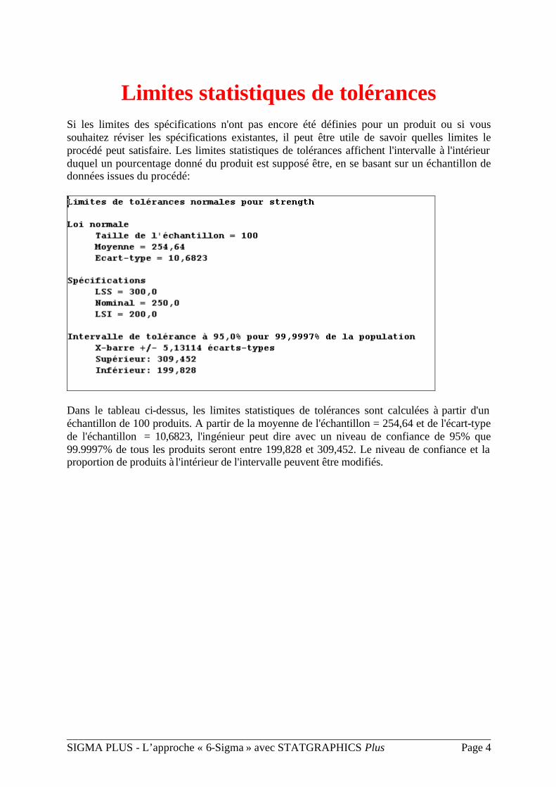
Si les limites des spécifications n'ont pas encore été définies pour un produit ou si vous souhaitez réviser les spécifications existantes, il peut être utile de savoir quelles limites le procédé peut satisfaire. Les limites statistiques de tolérances affichent l'intervalle à l'intérieur duquel un pourcentage donné du produit est supposé être, en se basant sur un échantillon de données issues du procédé:
Dans le tableau ci-dessus, les limites statistiques de tolérances sont calculées à partir d'un échantillon de 100 produits. A partir de la moyenne de l'échantillon = 254,64 et de l'écart-type de l'échantillon = 10,6823, l'ingénieur peut dire avec un niveau de confiance de 95% que 99.9997% de tous les produits seront entre 199,828 et 309,452. Le niveau de confiance et la proportion de produits à l'intérieur de l'intervalle peuvent être modifiés.
___________________________________________________________________________ SIGMA PLUS - L’approche « 6-Sigma » avec STATGRAPHICS Plus Page 5
Tests de normalité
Beaucoup de procédures statistiques supposent que les données analysées suivent une loi normale. Si ce n'est pas le cas, les statistiques calculées comme par exemple le Cpk peuvent être fausses.
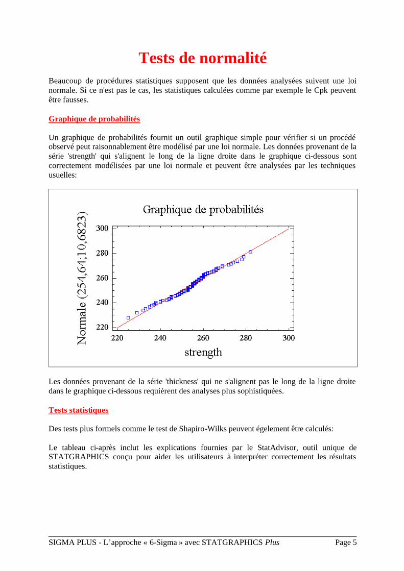
Graphique de probabilités
Un graphique de probabilités fournit un outil graphique simple pour vérifier si un procédé observé peut raisonnablement être modélisé par une loi normale. Les données provenant de la série 'strength' qui s'alignent le long de la ligne droite dans le graphique ci-dessous sont correctement modélisées par une loi normale et peuvent être analysées par les techniques usuelles:
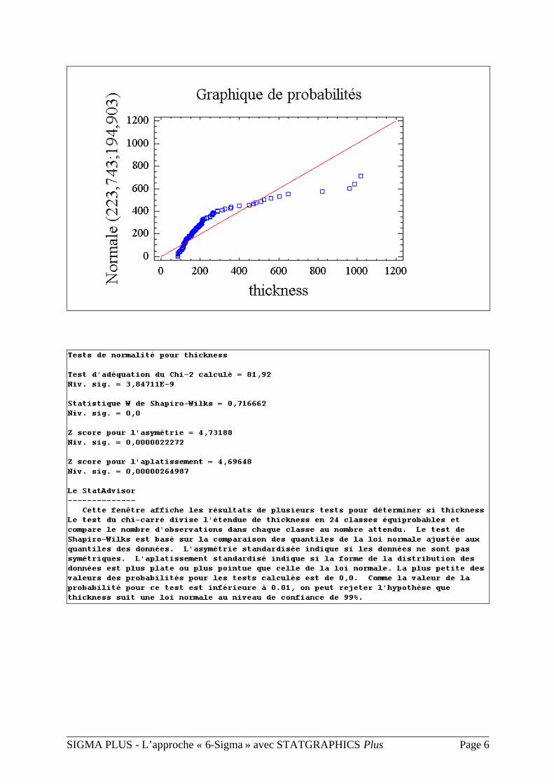
Les données provenant de la série 'thickness' qui ne s'alignent pas le long de la ligne droite dans le graphique ci-dessous requièrent des analyses plus sophistiquées.
Tests statistiques
Des tests plus formels comme le test de Shapiro-Wilks peuvent égelement être calculés:
Le tableau ci-après inclut les explications fournies par le StatAdvisor, outil unique de STATGRAPHICS conçu pour aider les utilisateurs à interpréter correctement les résultats statistiques.
___________________________________________________________________________ SIGMA PLUS - L’approche « 6-Sigma » avec STATGRAPHICS Plus Page 6
___________________________________________________________________________ SIGMA PLUS - L’approche « 6-Sigma » avec STATGRAPHICS Plus Page 7
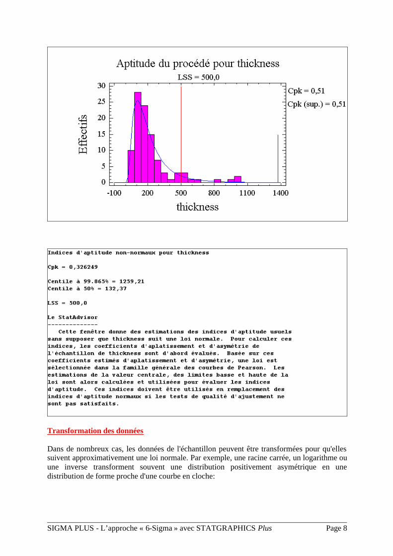
Analyse de données non normales
Lorsque les données à analyser ne sont pas modélisées correctement par une loi normale, les résultats usuels peuvent être faux. Dans de tels cas, soit une autre loi de probabilités doit être choisie, soit les données doivent être transformées de façon à suivre une loi normale.
Ajustement d'autres lois de probabilités
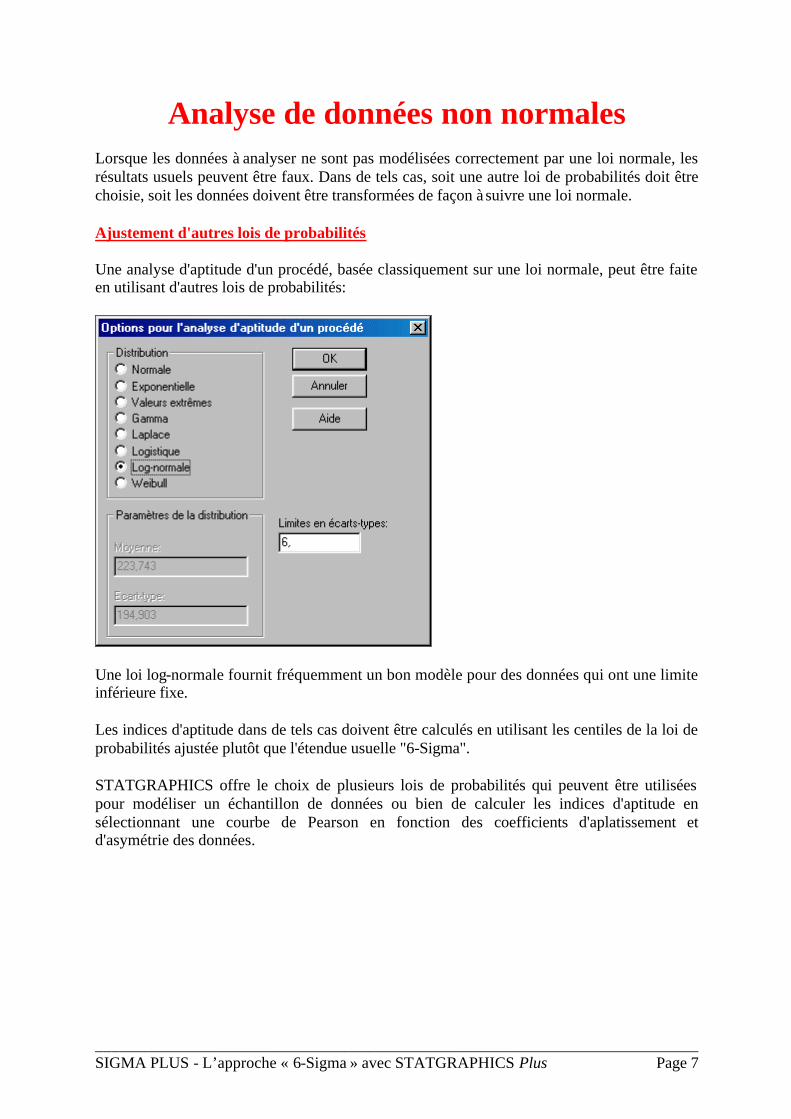
Une analyse d'aptitude d'un procédé, basée classiquement sur une loi normale, peut être faite en utilisant d'autres lois de probabilités:
Une loi log-normale fournit fréquemment un bon modèle pour des données qui ont une limite inférieure fixe.
Les indices d'aptitude dans de tels cas doivent être calculés en utilisant les centiles de la loi de probabilités ajustée plutôt que l'étendue usuelle "6-Sigma".
STATGRAPHICS offre le choix de plusieurs lois de probabilités qui peuvent être utilisées pour modéliser un échantillon de données ou bien de calculer les indices d'aptitude en sélectionnant une courbe de Pearson en fonction des coefficients d'aplatissement et d'asymétrie des données.
___________________________________________________________________________ SIGMA PLUS - L’approche « 6-Sigma » avec STATGRAPHICS Plus Page 8
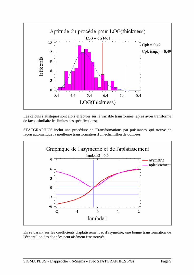
Transformation des données
Dans de nombreux cas, les données de l'échantillon peuvent être transformées pour qu'elles suivent approximativement une loi normale. Par exemple, une racine carrée, un logarithme ou une inverse transforment souvent une distribution positivement asymétrique en une distribution de forme proche d'une courbe en cloche:
___________________________________________________________________________ SIGMA PLUS - L’approche « 6-Sigma » avec STATGRAPHICS Plus Page 9
Les calculs statistiques sont alors effectués sur la variable transformée (après avoir transformé de façon similaire les limites des spécifications).
STATGRAPHICS inclut une procédure de 'Transformations par puissances' qui trouve de façon automatique la meilleure transformation d'un échantillon de données:
En se basant sur les coefficients d'aplatissement et d'asymétrie, une bonne transformation de l'échantillon des données peut aisément être trouvée.
___________________________________________________________________________ SIGMA PLUS - L’approche « 6-Sigma » avec STATGRAPHICS Plus Page 10
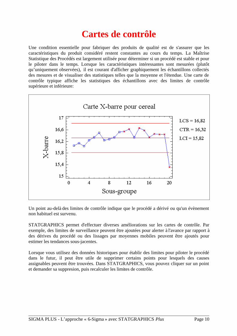
Cartes de contrôle
Une condition essentielle pour fabriquer des produits de qualité est de s'assurer que les caractéristiques du produit considéré restent constantes au cours du temps. La Maîtrise Statistique des Procédés est largement utilisée pour déterminer si un procédé est stable et pour le piloter dans le temps. Lorsque les caractéristiques intéressantes sont mesurées (plutôt qu’uniquement observées), il est courant d'afficher graphiquement les échantillons collectés des mesures et de visualiser des statistiques telles que la moyenne et l'étendue. Une carte de contrôle typique affiche les statistiques des échantillons avec des limites de contrôle supérieure et inférieure:
Un point au-delà des limites de contrôle indique que le procédé a dérivé ou qu'un évènement non habituel est survenu.
STATGRAPHICS permet d'effectuer diverses améliorations sur les cartes de contrôle. Par exemple, des limites de surveillance peuvent être ajoutées pour alerter à l'avance par rapport à des dérives du procédé ou des lissages par moyennes mobiles peuvent être ajoutés pour estimer les tendances sous-jacentes.
Lorsque vous utilisez des données historiques pour établir des limites pour piloter le procédé dans le futur, il peut être utile de supprimer certains points pour lesquels des causes assignables peuvent être trouvées. Dans STATGRAPHICS, vous pouvez cliquer sur un point et demander sa suppresion, puis recalculer les limites de contrôle.
___________________________________________________________________________ SIGMA PLUS - L’approche « 6-Sigma » avec STATGRAPHICS Plus Page 11
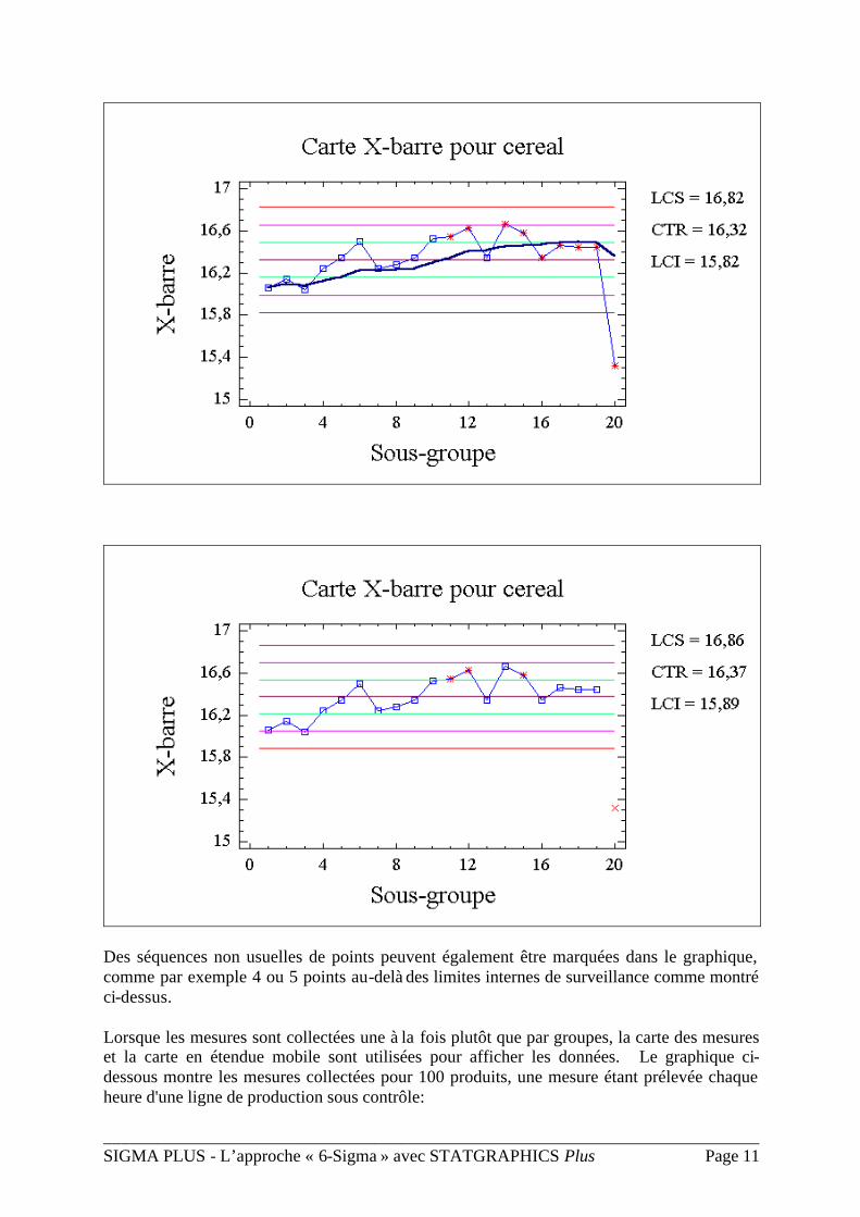
Des séquences non usuelles de points peuvent également être marquées dans le graphique, comme par exemple 4 ou 5 points au-delà des limites internes de surveillance comme montré ci-dessus.
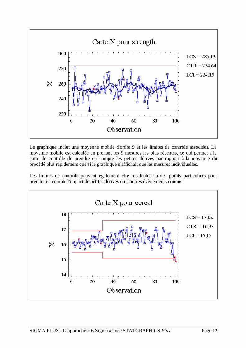
Lorsque les mesures sont collectées une à la fois plutôt que par groupes, la carte des mesures et la carte en étendue mobile sont utilisées pour afficher les données. Le graphique ci-dessous montre les mesures collectées pour 100 produits, une mesure étant prélevée chaque heure d'une ligne de production sous contrôle:
___________________________________________________________________________ SIGMA PLUS - L’approche « 6-Sigma » avec STATGRAPHICS Plus Page 12
Le graphique inclut une moyenne mobile d'ordre 9 et les limites de contrôle associées. La moyenne mobile est calculée en prenant les 9 mesures les plus récentes, ce qui permet à la carte de contrôle de prendre en compte les petites dérives par rapport à la moyenne du procédé plus rapidement que si le graphique n'affichait que les mesures individuelles.
Les limites de contrôle peuvent également être recalculées à des points particuliers pour prendre en compte l'impact de petites dérives ou d'autres évènements connus:
___________________________________________________________________________ SIGMA PLUS - L’approche « 6-Sigma » avec STATGRAPHICS Plus Page 13
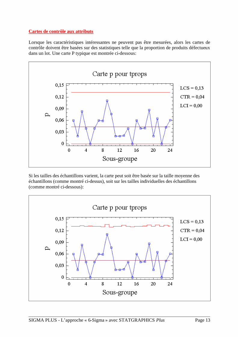
Cartes de contrôle aux attributs
Lorsque les caractéristiques intéressantes ne peuvent pas être mesurées, alors les cartes de contrôle doivent être basées sur des statistiques telle que la proportion de produits défectueux dans un lot. Une carte P typique est montrée ci-dessous:
Si les tailles des échantillons varient, la carte peut soit être basée sur la taille moyenne des échantillons (comme montré ci-dessus), soit sur les tailles individuelles des échantillons (comme montré ci-dessous):
___________________________________________________________________________ SIGMA PLUS - L’approche « 6-Sigma » avec STATGRAPHICS Plus Page 14
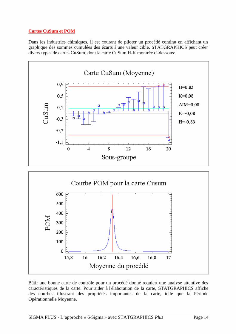
Cartes CuSum et POM
Dans les industries chimiques, il est courant de piloter un procédé continu en affichant un graphique des sommes cumulées des écarts à une valeur cible. STATGRAPHICS peut créer divers types de cartes CuSum, dont la carte CuSum H-K montrée ci-dessous:
Bâtir une bonne carte de contrôle pour un procédé donné requiert une analyse attentive des caractéristiques de la carte. Pour aider à l'élaboration de la carte, STATGRAPHICS affiche des courbes illustrant des propriétés importantes de la carte, telle que la Période Opérationnelle Moyenne.
___________________________________________________________________________ SIGMA PLUS - L’approche « 6-Sigma » avec STATGRAPHICS Plus Page 15
Cartes de contrôle spéciales
Les cartes de contrôle classiques peuvent être modifiées de diverses façons. STATGRAPHICS offre des cartes de contrôle spéciales qui prennent en compte de façon simultanée plusieurs caractéristiques, des données corrélées dans le temps, les limites des spécifications du produit ou l'usure de l'outil.
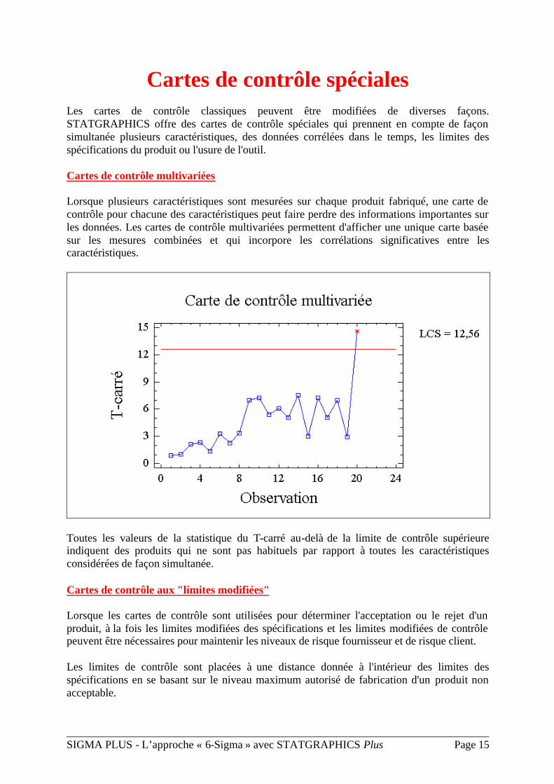
Cartes de contrôle multivariées
Lorsque plusieurs caractéristiques sont mesurées sur chaque produit fabriqué, une carte de contrôle pour chacune des caractéristiques peut faire perdre des informations importantes sur les données. Les cartes de contrôle multivariées permettent d'afficher une unique carte basée sur les mesures combinées et qui incorpore les corrélations significatives entre les caractéristiques.
Toutes les valeurs de la statistique du T-carré au-delà de la limite de contrôle supérieure indiquent des produits qui ne sont pas habituels par rapport à toutes les caractéristiques considérées de façon simultanée.
Cartes de contrôle aux "limites modifiées"
Lorsque les cartes de contrôle sont utilisées pour déterminer l'acceptation ou le rejet d'un produit, à la fois les limites modifiées des spécifications et les limites modifiées de contrôle peuvent être nécessaires pour maintenir les niveaux de risque fournisseur et de risque client.
Les limites de contrôle sont placées à une distance donnée à l'intérieur des limites des spécifications en se basant sur le niveau maximum autorisé de fabrication d'un produit non acceptable.
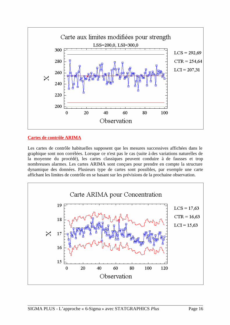
___________________________________________________________________________ SIGMA PLUS - L’approche « 6-Sigma » avec STATGRAPHICS Plus Page 16
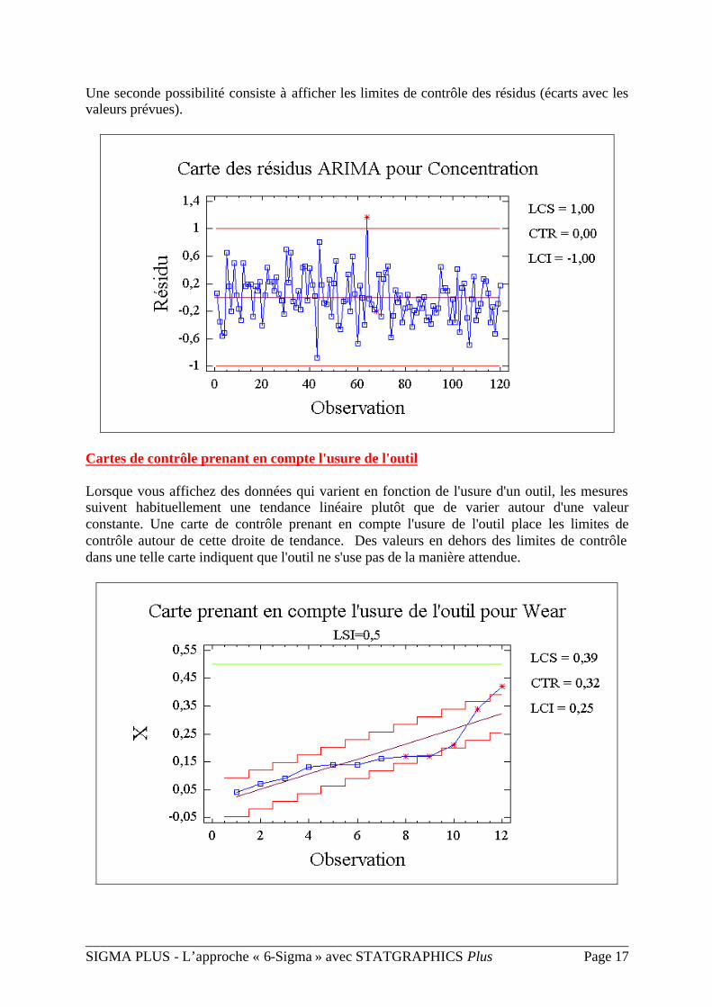
Cartes de contrôle ARIMA
Les cartes de contrôle habituelles supposent que les mesures successives affichées dans le graphique sont non corrélées. Lorsque ce n'est pas le cas (suite à des variations naturelles de la moyenne du procédé), les cartes classiques peuvent conduire à de fausses et trop nombreuses alarmes. Les cartes ARIMA sont conçues pour prendre en compte la structure dynamique des données. Plusieurs type de cartes sont possibles, par exemple une carte affichant les limites de contrôle en se basant sur les prévisions de la prochaine observation.
___________________________________________________________________________ SIGMA PLUS - L’approche « 6-Sigma » avec STATGRAPHICS Plus Page 17
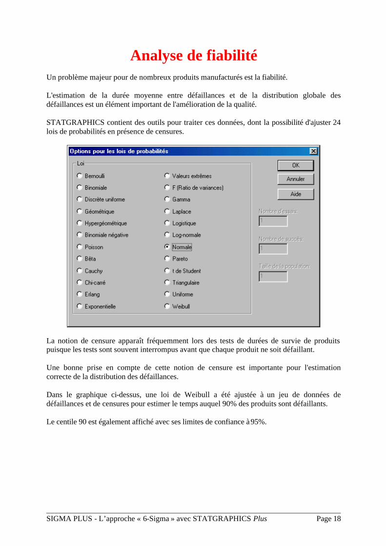
Une seconde possibilité consiste à afficher les limites de contrôle des résidus (écarts avec les valeurs prévues).
Cartes de contrôle prenant en compte l'usure de l'outil
Lorsque vous affichez des données qui varient en fonction de l'usure d'un outil, les mesures suivent habituellement une tendance linéaire plutôt que de varier autour d'une valeur constante. Une carte de contrôle prenant en compte l'usure de l'outil place les limites de contrôle autour de cette droite de tendance. Des valeurs en dehors des limites de contrôle dans une telle carte indiquent que l'outil ne s'use pas de la manière attendue.
___________________________________________________________________________ SIGMA PLUS - L’approche « 6-Sigma » avec STATGRAPHICS Plus Page 18
Analyse de fiabilité
Un problème majeur pour de nombreux produits manufacturés est la fiabilité.
L'estimation de la durée moyenne entre défaillances et de la distribution globale des défaillances est un élément important de l'amélioration de la qualité.
STATGRAPHICS contient des outils pour traiter ces données, dont la possibilité d'ajuster 24 lois de probabilités en présence de censures.
La notion de censure apparaît fréquemment lors des tests de durées de survie de produits puisque les tests sont souvent interrompus avant que chaque produit ne soit défaillant.
Une bonne prise en compte de cette notion de censure est importante pour l'estimation correcte de la distribution des défaillances.
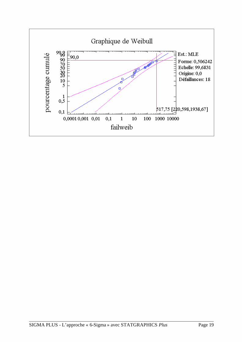
Dans le graphique ci-dessus, une loi de Weibull a été ajustée à un jeu de données de défaillances et de censures pour estimer le temps auquel 90% des produits sont défaillants.
Le centile 90 est également affiché avec ses limites de confiance à 95%.
___________________________________________________________________________ SIGMA PLUS - L’approche « 6-Sigma » avec STATGRAPHICS Plus Page 19
___________________________________________________________________________ SIGMA PLUS - L’approche « 6-Sigma » avec STATGRAPHICS Plus Page 20
Méthode de vieillissement accéléré
Si un produit est conçu pour durer une longue période de temps, estimer le temps avant une défaillance peut ne pas être possible dans des conditions normales d'opération. Souvent, une variable telle que la température doit être utilisée pour accélérer le taux de défaillance.
___________________________________________________________________________ SIGMA PLUS - L’approche « 6-Sigma » avec STATGRAPHICS Plus Page 21
Les centiles qui en résultent peuvent alors être extrapolés pour des conditions normales d'opération de façon à estimer les distributions des temps des défaillances qui ne peuvent pas normalement être observés.
Un modèle d'Arrhenius est habituellement utilisé pour faire de telles extrapolations.
___________________________________________________________________________ SIGMA PLUS - L’approche « 6-Sigma » avec STATGRAPHICS Plus Page 22
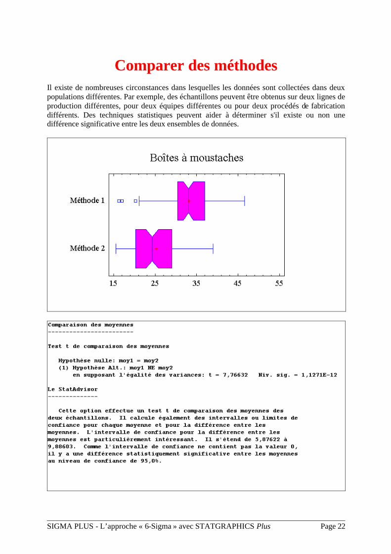
Comparer des méthodes
Il existe de nombreuses circonstances dans lesquelles les données sont collectées dans deux populations différentes. Par exemple, des échantillons peuvent être obtenus sur deux lignes de production différentes, pour deux équipes différentes ou pour deux procédés de fabrication différents. Des techniques statistiques peuvent aider à déterminer s'il existe ou non une différence significative entre les deux ensembles de données.
___________________________________________________________________________ SIGMA PLUS - L’approche « 6-Sigma » avec STATGRAPHICS Plus Page 23
Des représentations graphiques, comme les boîtes à moustaches, et des tests statistiques, comme les tests t, peuvent déterminer le niveau de signification d'une différence apparente.
Une fonctionnalité unique de STATGRAPHICS est le StatAdvisor, qui comme le montre le tableau ci-dessus, ajoute une explication simple des résultats à chacune des analyses statistiques pour aider l'utilisateur à interpréter correctement les résultats.
___________________________________________________________________________ SIGMA PLUS - L’approche « 6-Sigma » avec STATGRAPHICS Plus Page 24
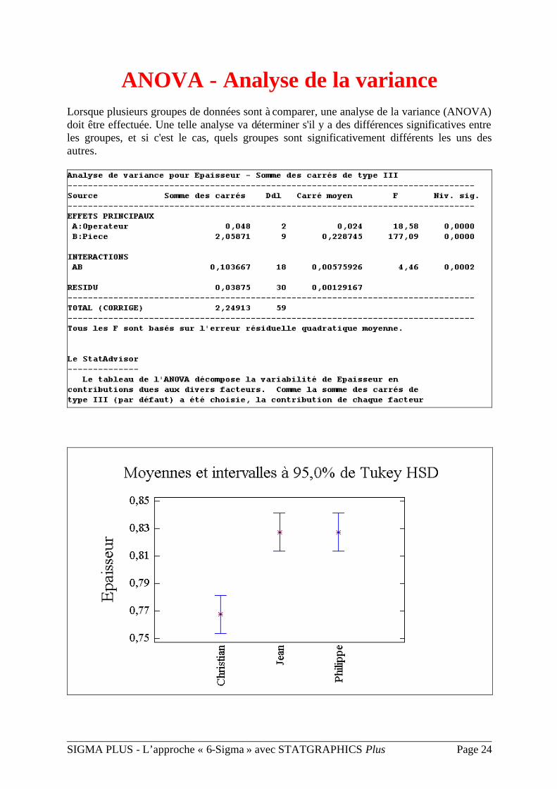
ANOVA - Analyse de la variance
Lorsque plusieurs groupes de données sont à comparer, une analyse de la variance (ANOVA) doit être effectuée. Une telle analyse va déterminer s'il y a des différences significatives entre les groupes, et si c'est le cas, quels groupes sont significativement différents les uns des autres.
___________________________________________________________________________ SIGMA PLUS - L’approche « 6-Sigma » avec STATGRAPHICS Plus Page 25
Des représentations graphiques, comme celle des intervalles HSD (différences honnêtes significatives) montrée ci-dessous, permettent à l'analyste de déterminer si les différences entre les groupes sont statistiquement significatives en fonction de la présence ou de l'absence de chevauchements des intervalles.
STATGRAPHICS permet de définir et d'étudier des analyses de la variance mettant en oeuvre un ou plusieurs facteurs.
___________________________________________________________________________ SIGMA PLUS - L’approche « 6-Sigma » avec STATGRAPHICS Plus Page 26
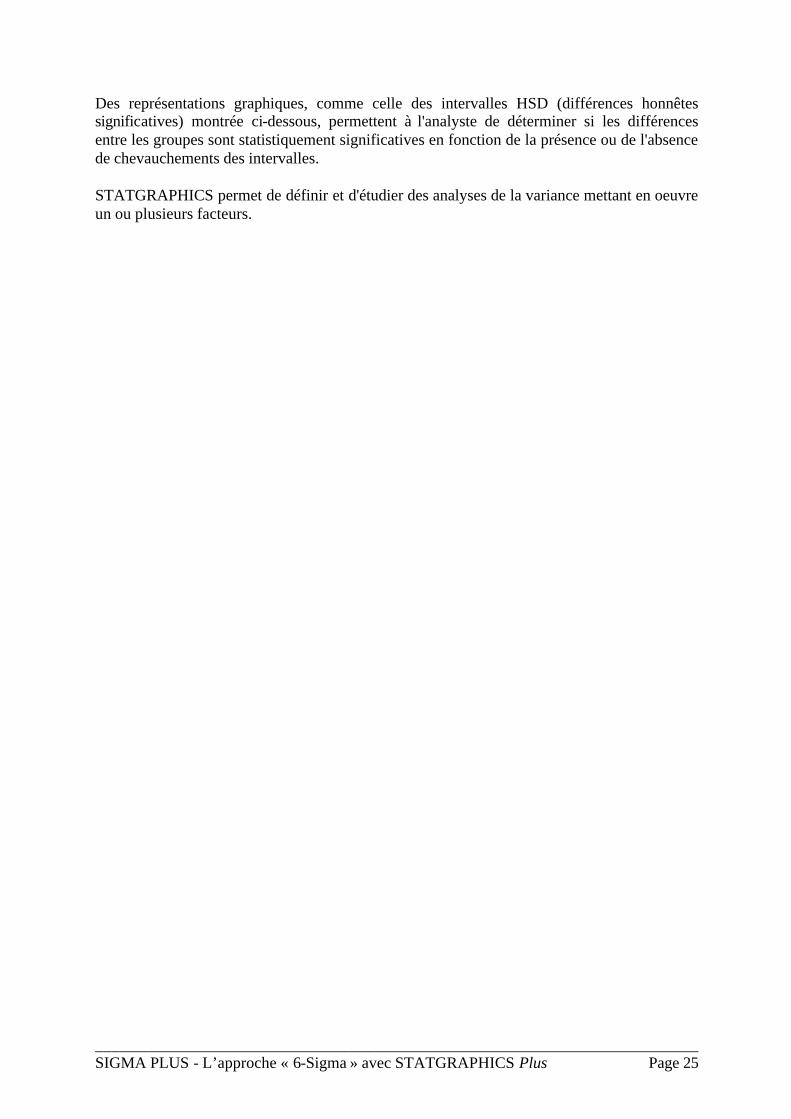
Analyse d'attributs Alors que beaucoup de techniques statistiques sont conçues pour utiliser des données mesurées, les données collectées dans les processus d'amélioration de la qualité sont fréquemment des attributs. STATGRAPHICS contient une grande variété de procédures pour visualiser, tester et comparer à la fois des taux et des proportions.
Des techniques comme l'analyse des moyennes permettent à l'analyste de déterminer si certains échantillons sont significativement différents des autres.
___________________________________________________________________________ SIGMA PLUS - L’approche « 6-Sigma » avec STATGRAPHICS Plus Page 27
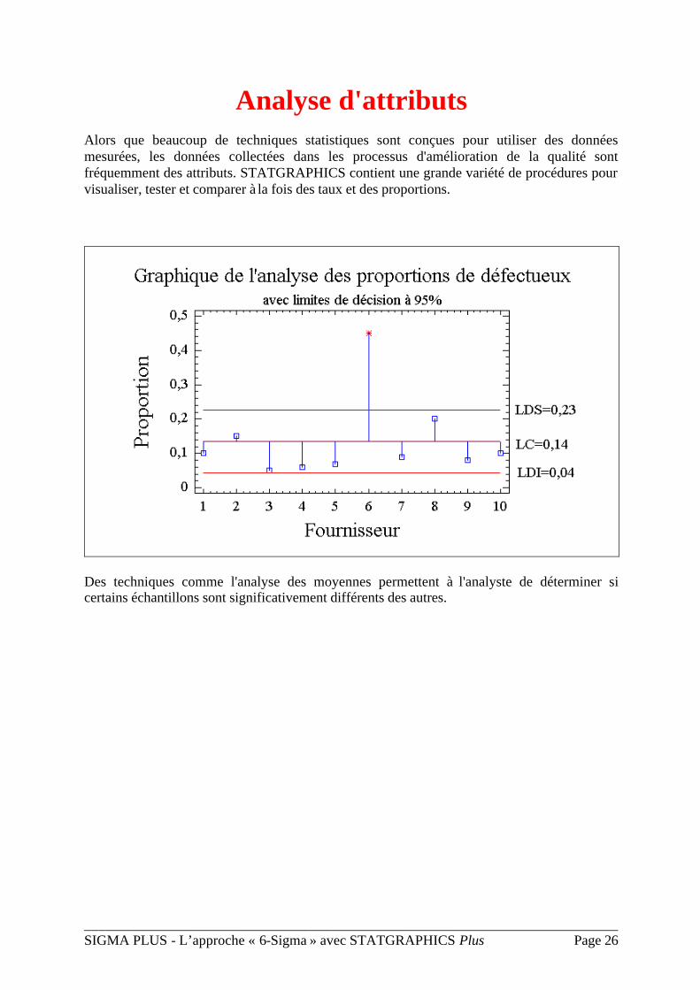
Méthodes de régression
et ajustement de courbes
Une technique couramment utilisée en statistique est la régression, qui estime la relation mathématique entre une variable de réponse Y et une ou plusieurs variables explicatives X:
Différents types de courbes peuvent être ajustés automatiquement et listés en fonction de la qualité de l'ajustement.
___________________________________________________________________________ SIGMA PLUS - L’approche « 6-Sigma » avec STATGRAPHICS Plus Page 28
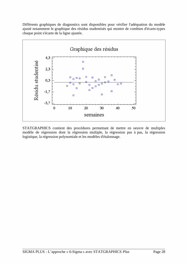
Différents graphiques de diagnostics sont disponibles pour vérifier l'adéquation du modèle ajusté notamment le graphique des résidus studentisés qui montre de combien d'écarts-types chaque point s'écarte de la ligne ajustée.
STATGRAPHICS contient des procédures permettant de mettre en oeuvre de multiples modèle de régression dont la régression multiple, la régression pas à pas, la régression logistique, la régression polynomiale et les modèles d'étalonnage.
___________________________________________________________________________ SIGMA PLUS - L’approche « 6-Sigma » avec STATGRAPHICS Plus Page 29
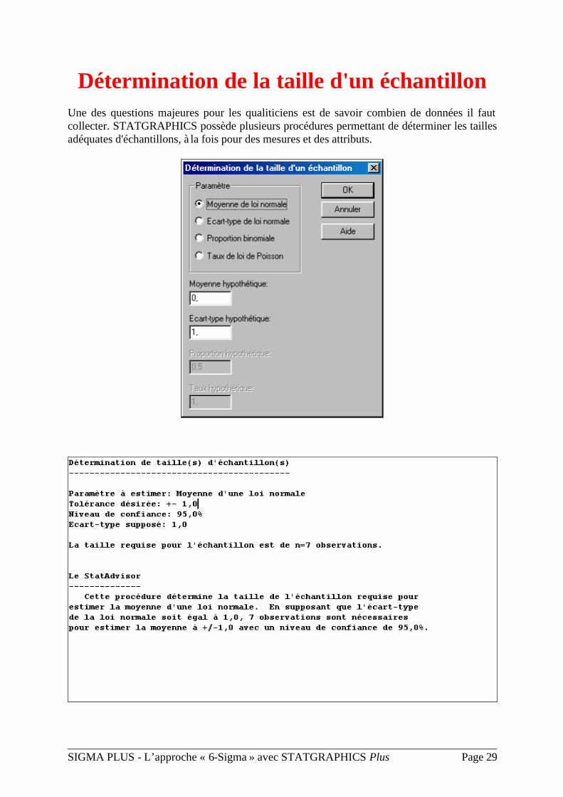
Détermination de la taille d'un échantillon Une des questions majeures pour les qualiticiens est de savoir combien de données il faut collecter. STATGRAPHICS possède plusieurs procédures permettant de déterminer les tailles adéquates d'échantillons, à la fois pour des mesures et des attributs.
___________________________________________________________________________ SIGMA PLUS - L’approche « 6-Sigma » avec STATGRAPHICS Plus Page 30
La taille suggérée pour l'échantillon permettra au qualiticien d'avoir une grande confiance dans les études qu'il va mener et dans sa prise de décision.
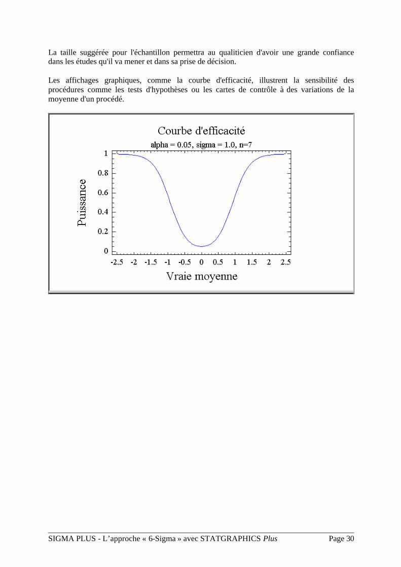
Les affichages graphiques, comme la courbe d'efficacité, illustrent la sensibilité des procédures comme les tests d'hypothèses ou les cartes de contrôle à des variations de la moyenne d'un procédé.
___________________________________________________________________________ SIGMA PLUS - L’approche « 6-Sigma » avec STATGRAPHICS Plus Page 31
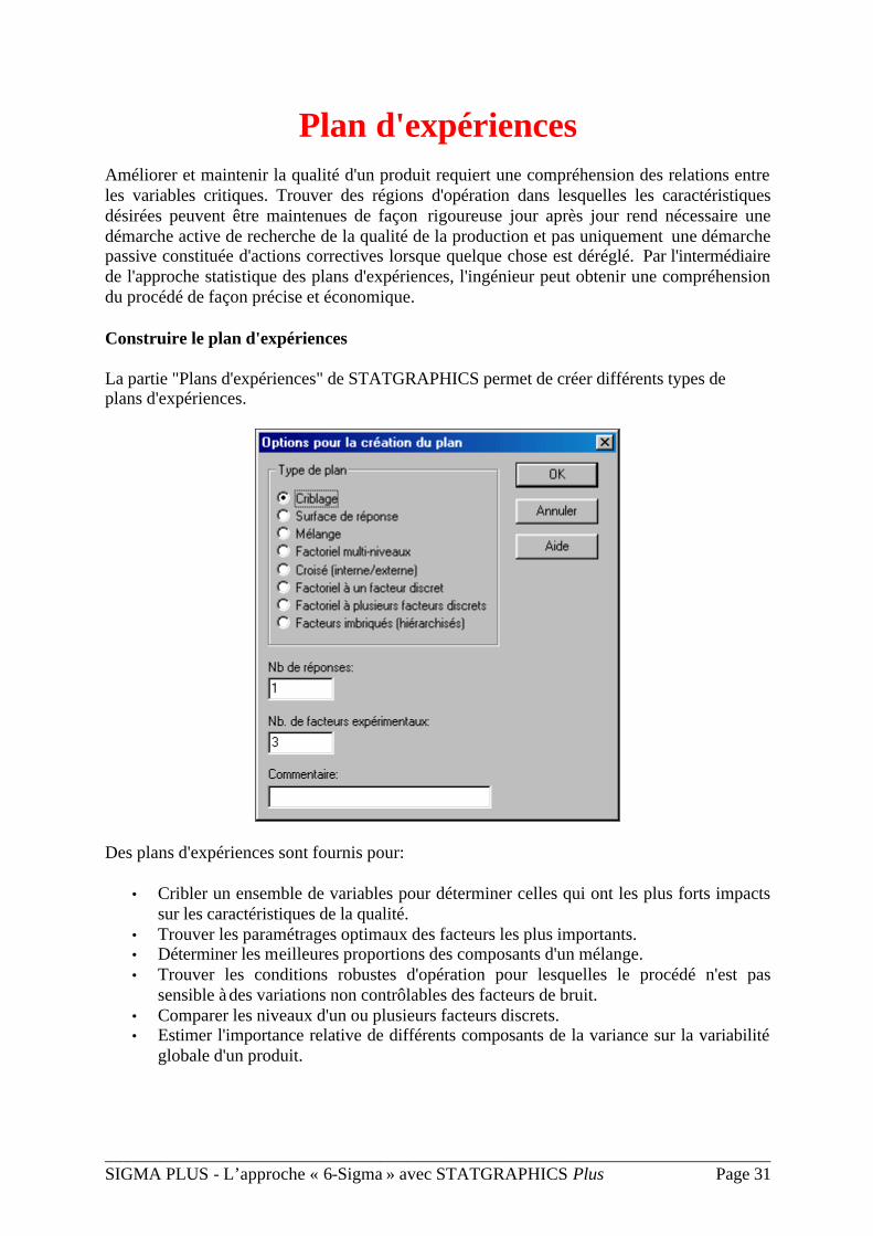
Plan d'expériences Améliorer et maintenir la qualité d'un produit requiert une compréhension des relations entre les variables critiques. Trouver des régions d'opération dans lesquelles les caractéristiques désirées peuvent être maintenues de façon rigoureuse jour après jour rend nécessaire une démarche active de recherche de la qualité de la production et pas uniquement une démarche passive constituée d'actions correctives lorsque quelque chose est déréglé. Par l'intermédiaire de l'approche statistique des plans d'expériences, l'ingénieur peut obtenir une compréhension du procédé de façon précise et économique.
Construire le plan d'expériences
La partie "Plans d'expériences" de STATGRAPHICS permet de créer différents types de plans d'expériences.
Des plans d'expériences sont fournis pour:
• Cribler un ensemble de variables pour déterminer celles qui ont les plus forts impacts sur les caractéristiques de la qualité.
• Trouver les paramétrages optimaux des facteurs les plus importants. • Déterminer les meilleures proportions des composants d'un mélange. • Trouver les conditions robustes d'opération pour lesquelles le procédé n'est pas
sensible à des variations non contrôlables des facteurs de bruit. • Comparer les niveaux d'un ou plusieurs facteurs discrets. • Estimer l'importance relative de différents composants de la variance sur la variabilité
globale d'un produit.
___________________________________________________________________________ SIGMA PLUS - L’approche « 6-Sigma » avec STATGRAPHICS Plus Page 32
A la fois des plans classiques et des plans modernes sont fournis, dont les plans factoriels complets et fractionnaires, centrés composites, Plackett-Burman, Box-Behnken, carrés latins et BIE. Le logiciel inclut également les plans D-optimaux et les plans suggérés par Taguchi.
Analyser le plan d'expériences
En plus de la construction du plan, STATGRAPHICS va prendre en main les mesures expérimentales et les analyser en utilisant les méthodes statistiques les plus appropriées.
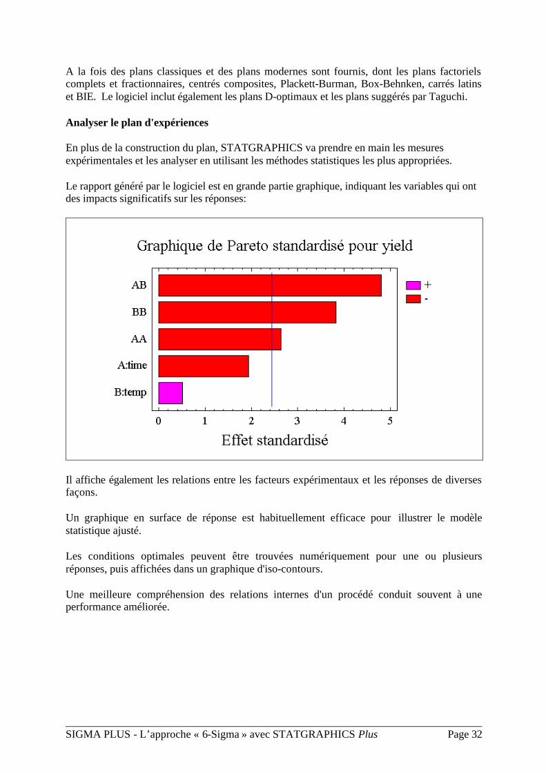
Le rapport généré par le logiciel est en grande partie graphique, indiquant les variables qui ont des impacts significatifs sur les réponses:
Il affiche également les relations entre les facteurs expérimentaux et les réponses de diverses façons.
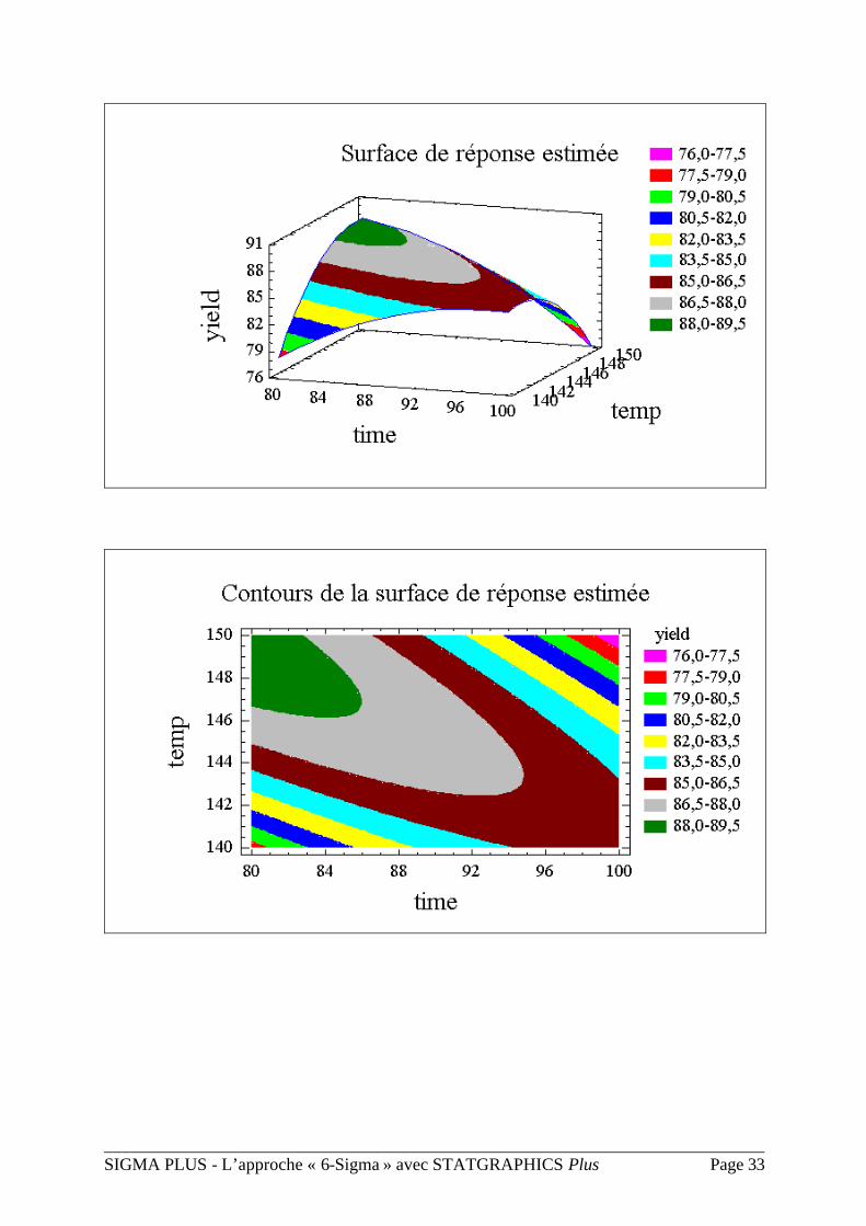
Un graphique en surface de réponse est habituellement efficace pour illustrer le modèle statistique ajusté.
Les conditions optimales peuvent être trouvées numériquement pour une ou plusieurs réponses, puis affichées dans un graphique d'iso-contours.
Une meilleure compréhension des relations internes d'un procédé conduit souvent à une performance améliorée.
___________________________________________________________________________ SIGMA PLUS - L’approche « 6-Sigma » avec STATGRAPHICS Plus Page 33
___________________________________________________________________________ SIGMA PLUS - L’approche « 6-Sigma » avec STATGRAPHICS Plus Page 34
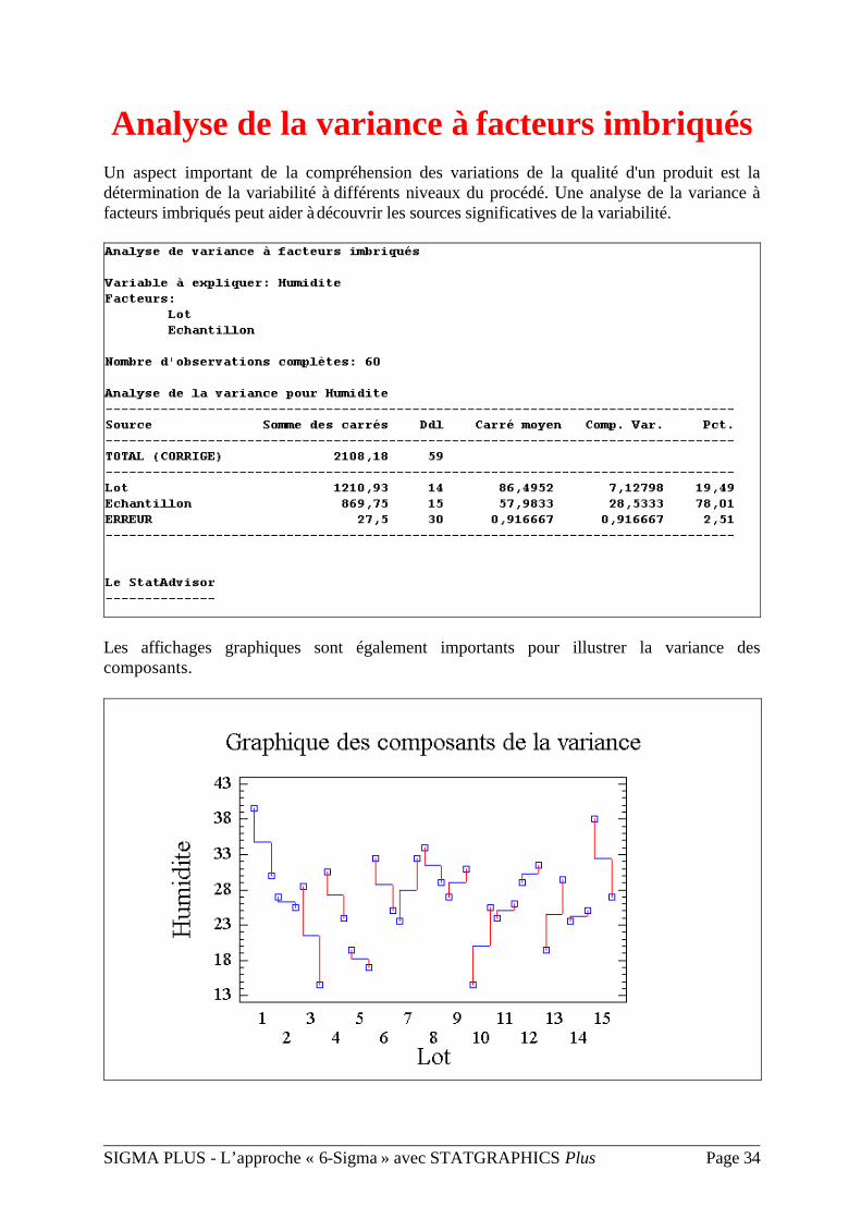
Analyse de la variance à facteurs imbriqués Un aspect important de la compréhension des variations de la qualité d'un produit est la détermination de la variabilité à différents niveaux du procédé. Une analyse de la variance à facteurs imbriqués peut aider à découvrir les sources significatives de la variabilité.
Les affichages graphiques sont également importants pour illustrer la variance des composants.
___________________________________________________________________________ SIGMA PLUS - L’approche « 6-Sigma » avec STATGRAPHICS Plus Page 35
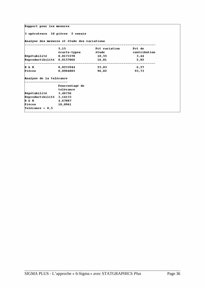
Analyse R&R
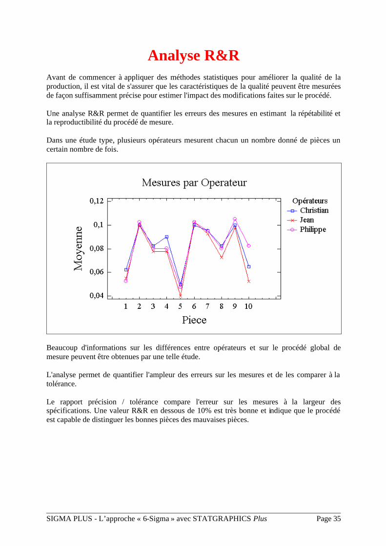
Avant de commencer à appliquer des méthodes statistiques pour améliorer la qualité de la production, il est vital de s'assurer que les caractéristiques de la qualité peuvent être mesurées de façon suffisamment précise pour estimer l'impact des modifications faites sur le procédé.
Une analyse R&R permet de quantifier les erreurs des mesures en estimant la répétabilité et la reproductibilité du procédé de mesure.
Dans une étude type, plusieurs opérateurs mesurent chacun un nombre donné de pièces un certain nombre de fois.
Beaucoup d'informations sur les différences entre opérateurs et sur le procédé global de mesure peuvent être obtenues par une telle étude.
L'analyse permet de quantifier l'ampleur des erreurs sur les mesures et de les comparer à la tolérance.
Le rapport précision / tolérance compare l'erreur sur les mesures à la largeur des spécifications. Une valeur R&R en dessous de 10% est très bonne et indique que le procédé est capable de distinguer les bonnes pièces des mauvaises pièces.
___________________________________________________________________________ SIGMA PLUS - L’approche « 6-Sigma » avec STATGRAPHICS Plus Page 36
___________________________________________________________________________ SIGMA PLUS - L’approche « 6-Sigma » avec STATGRAPHICS Plus Page 37
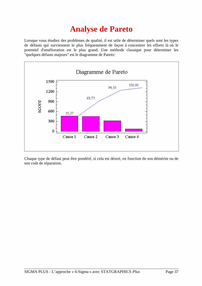
Analyse de Pareto
Lorsque vous étudiez des problèmes de qualité, il est utile de déterminer quels sont les types de défauts qui surviennent le plus fréquemment de façon à concentrer les efforts là où le potentiel d'amélioration est le plus grand. Une méthode classique pour déterminer les "quelques défauts majeurs" est le diagramme de Pareto:
Chaque type de défaut peut être pondéré, si cela est désiré, en fonction de son démérite ou de son coût de réparation.
___________________________________________________________________________ SIGMA PLUS - L’approche « 6-Sigma » avec STATGRAPHICS Plus Page 38
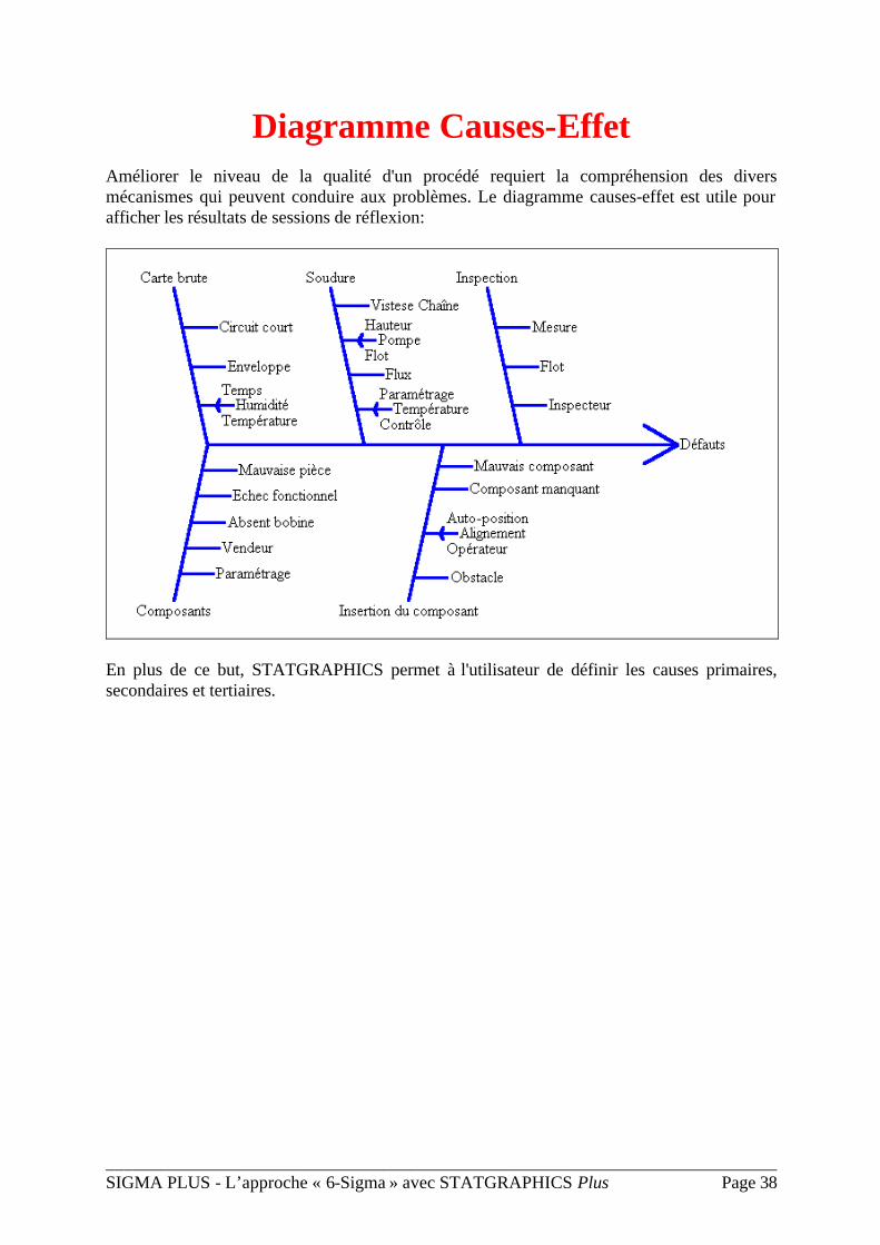
Diagramme Causes-Effet Améliorer le niveau de la qualité d'un procédé requiert la compréhension des divers mécanismes qui peuvent conduire aux problèmes. Le diagramme causes-effet est utile pour afficher les résultats de sessions de réflexion:
En plus de ce but, STATGRAPHICS permet à l'utilisateur de définir les causes primaires, secondaires et tertiaires.
___________________________________________________________________________ SIGMA PLUS - L’approche « 6-Sigma » avec STATGRAPHICS Plus Page 39
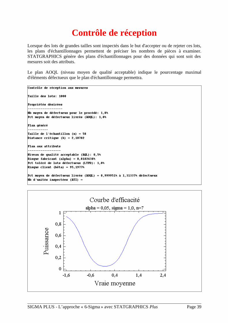
Contrôle de réception
Lorsque des lots de grandes tailles sont inspectés dans le but d'accepter ou de rejeter ces lots, les plans d'échantillonnages permettent de préciser les nombres de pièces à examiner. STATGRAPHICS génère des plans d'échantillonnages pour des données qui sont soit des mesures soit des attributs.
Le plan AOQL (niveau moyen de qualité acceptable) indique le pourcentage maximal d'éléments défectueux que le plan d'échantillonnage permettra.
STATGRAPHICS STATGRAPHICS PlusPlus 5 5
Web-Enabled Statistical Software For Six Sigma
Dr. Neil W. Polhemus
January, 2001
STATGRAPHICS Plus is published by Manugistics, Inc., a leading supplier of software for data analysis and supply chain management.
For more information, visit www.sigmaplus.fr.
SIGMA PLUS – 14-16, rue Clément-Bayard – 92300 Levallois-Perret
Tél : (33) 1 47 30 37 30 – FAX: (33) 1 47 30 37 31
1
Executive SummaryExecutive Summary
STATGRAPHICS Plus 5 is the only full-featured statistical package for Six Sigma which is designed to interact seamlessly with the Internet. It includes all of the statistical capabilities taught in Six Sigma training programs, plus many unique features which make it much more versatile and easy to use than other programs once that training is over. Important features of STATGRAPHICS Plus which are not found in programs such as Minitab or JMP include:
StatAdvisor – takes the numeric results from each statistical analysis and incorporates them into a paragraph of plain English. Analysts may paste these paragraphs into their reports and feel confident that the important conclusions of the analysis have been properly conveyed. StatLink – links a collection of statistical analyses to a data source, which may be an Excel file, a centralized database, or an XML file at a remote site. StatFolio – saves analyses in a format which can be run repeatedly whenever the data in the data source changes. StatReporter – integrates the results of one or more analyses into a report prepared by the analyst. Tables and graphs may be linked back to the analyses so that the report updates automatically whenever the analyses are rerun. StatPublish – uploads the results of each analysis (text and graphics) to a web server for internal and external access. When used together with StatLink and StatReporter, this allows analysts to share up-to-the-minute results with customers or others throughout the company. World Class Graphics – includes hundreds of pre-defined graphs which may be easily modified by the user. For special needs, the StatGallery provides overlay facilities to place several graphs on the same set of axes.
Designed for companies with a serious commitment to Six Sigma, STATGRAPHICS Plus provides the tools necessary to make quality improvement an integral part of corporate data systems.
2
Statistical Computing in the 21Statistical Computing in the 21stst Century Century
In the 1990’s, engineers who wished to analyze data would typically sit down at their computer and:
1. Load a statistical package. 2. Enter or read in some data. 3. Run one or more analyses. 4. Print the results or save them to files. 5. Send copies of the results to whomever they thought might be interested.
There was little integration of the analyses with other corporate-wide systems, either in terms of automated data queries or routine dissemination of results. With the advent of the Internet, it has now become possible to continuously poll data from sites around the world, and to post the results of statistical analyses to web sites so that corporate management and interested customers can view up-to-date information about product quality. Statistical packages such as STATGRAPHICS are now important parts of the overall enterprise computing environment, as illustrated below.
Digital datacollection device
StatLinkpolling ODBC
connection
Internet Browsers
Data Hub
EnterpriseWeb Server
StatPublishAnalysis
STATGRAPHICSWorkstations
Enterprise Applications
StatPublishXML data
EnterpriseSTATGRAPHICS
Server
StatLink ODBC connection
Internet
WAN
Remote DataSource
StatLinkODBC
Connection
EnterpriseSQL
Database
In the 21st century, data is likely to come from a remote source in another part of the world, and the parties interested in the statistical results are likely to be geographically dispersed.
3
Statistical analysis in the 21st century is therefore much more likely to proceed by:
1. Creating a statistical document. 2. Linking a data source to the document. 3. Defining the analyses to be performed on that data. 4. Publishing the results to a web server. 5. Polling the data source at regular intervals to automatically update the web site.
A CapaA Capability Analysis Examplebility Analysis Example
As an example of this new computing paradigm, suppose we interested in supplying information to our customers about the capability of a manufacturing process in some overseas location which produces glass bottles. We will suppose that bottles are sampled from the production line every 15 minutes, measurements made, and the results entered into a centralized database at that facility. We will also suppose that the database is structured so that it periodically generates a summary of the most recent 24 hours worth of production in the form of an XML document, which is becoming a standard method for transferring information across the Internet. A fragment of a typical XML document might take the following form: <DATAFILE_sample> <OBSERVATION> <Date>1/10/01</Date> <Time>0:15</Time> <Strength>255</Strength> </OBSERVATION> <OBSERVATION> <Date>1/10/01</Date> <Time>0:30</Time> <Strength>232</Strength> </OBSERVATION> </DATAFILE_sample> A modern web-enabled statistical package must be able to capture that data, do an assessment of the capability of the process, and publish the results to a web site for viewing by a web browser. With STATGRAPHICS Plus 5, such a task is easy to accomplish.
4
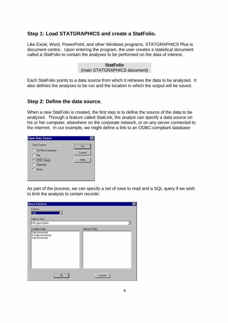
Step 1: Load STATGRAPHICS and create a StatFolio. Like Excel, Word, PowerPoint, and other Windows programs, STATGRAPHICS Plus is document centric. Upon entering the program, the user creates a statistical document called a StatFolio to contain the analyses to be performed on the data of interest. StatFolio
(main STATGRAPHICS document)
Each StatFolio points to a data source from which it retrieves the data to be analyzed. It also defines the analyses to be run and the location in which the output will be saved. Step 2: Define the data source. When a new StatFolio is created, the first step is to define the source of the data to be analyzed. Through a feature called StatLink, the analyst can specify a data source on his or her computer, elsewhere on the corporate network, or on any server connected to the Internet. In our example, we might define a link to an ODBC-compliant database:
As part of the process, we can specify a set of rows to read and a SQL query if we wish to limit the analysis to certain records:
5
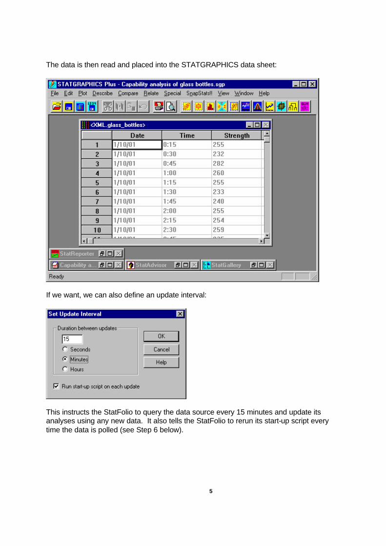
The data is then read and placed into the STATGRAPHICS data sheet:
If we want, we can also define an update interval:
This instructs the StatFolio to query the data source every 15 minutes and update its analyses using any new data. It also tells the StatFolio to rerun its start-up script every time the data is polled (see Step 6 below).
6
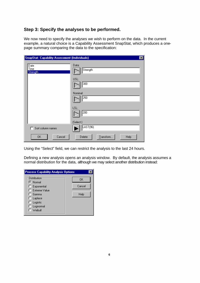
Step 3: Specify the analyses to be performed. We now need to specify the analyses we wish to perform on the data. In the current example, a natural choice is a Capability Assessment SnapStat, which produces a one-page summary comparing the data to the specification:
Using the “Select” field, we can restrict the analysis to the last 24 hours. Defining a new analysis opens an analysis window. By default, the analysis assumes a normal distribution for the data, although we may select another distribution instead:
7
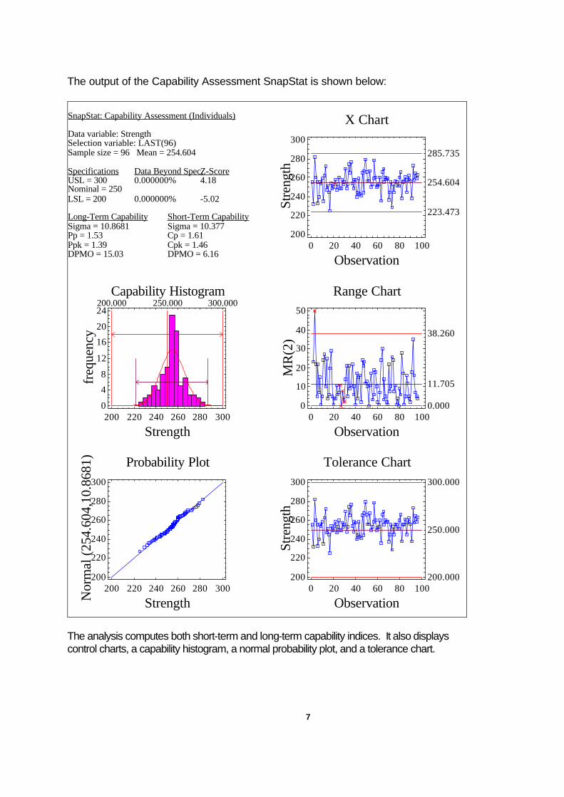
The output of the Capability Assessment SnapStat is shown below:
SnapStat: Capability Assessment (Individuals)
Data variable: StrengthSelection variable: LAST(96)Sample size = 96 Mean = 254.604
Specifications Data Beyond Spec.Z-ScoreUSL = 300 0.000000% 4.18Nominal = 250LSL = 200 0.000000% -5.02
Long-Term Capability Short-Term CapabilitySigma = 10.8681 Sigma = 10.377Pp = 1.53 Cp = 1.61Ppk = 1.39 Cpk = 1.46DPMO = 15.03 DPMO = 6.16
X Chart
Observation
Stre
ngth
0 20 40 60 80 100200
220
240
260
280
300
254.604
285.735
223.473
Capability Histogram
Strength
freq
uenc
y
200.000 250.000 300.000
200 220 240 260 280 3000
4
8
12
16
20
24
Range Chart
Observation
MR
(2)
0 20 40 60 80 1000
10
20
30
40
50
11.705
38.260
0.000
Probability Plot
StrengthNor
mal
(25
4.60
4,10
.868
1)
200 220 240 260 280 300200
220
240
260
280
300
Tolerance Chart
Observation
Stre
ngth
0 20 40 60 80 100200
220
240
260
280
300
250.000
300.000
200.000
The analysis computes both short-term and long-term capability indices. It also displays control charts, a capability histogram, a normal probability plot, and a tolerance chart.
8
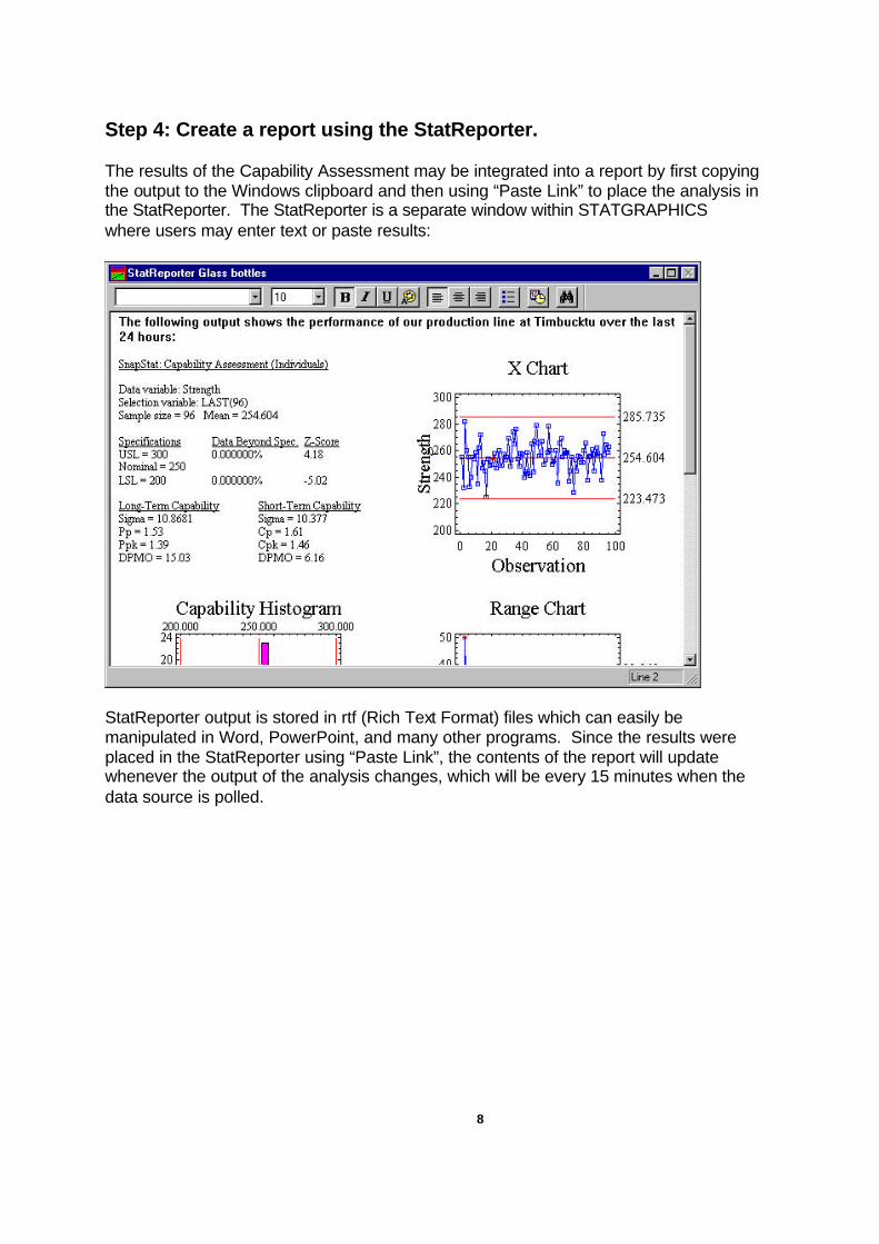
Step 4: Create a report using the StatReporter. The results of the Capability Assessment may be integrated into a report by first copying the output to the Windows clipboard and then using “Paste Link” to place the analysis in the StatReporter. The StatReporter is a separate window within STATGRAPHICS where users may enter text or paste results:
StatReporter output is stored in rtf (Rich Text Format) files which can easily be manipulated in Word, PowerPoint, and many other programs. Since the results were placed in the StatReporter using “Paste Link”, the contents of the report will update whenever the output of the analysis changes, which will be every 15 minutes when the data source is polled.
9
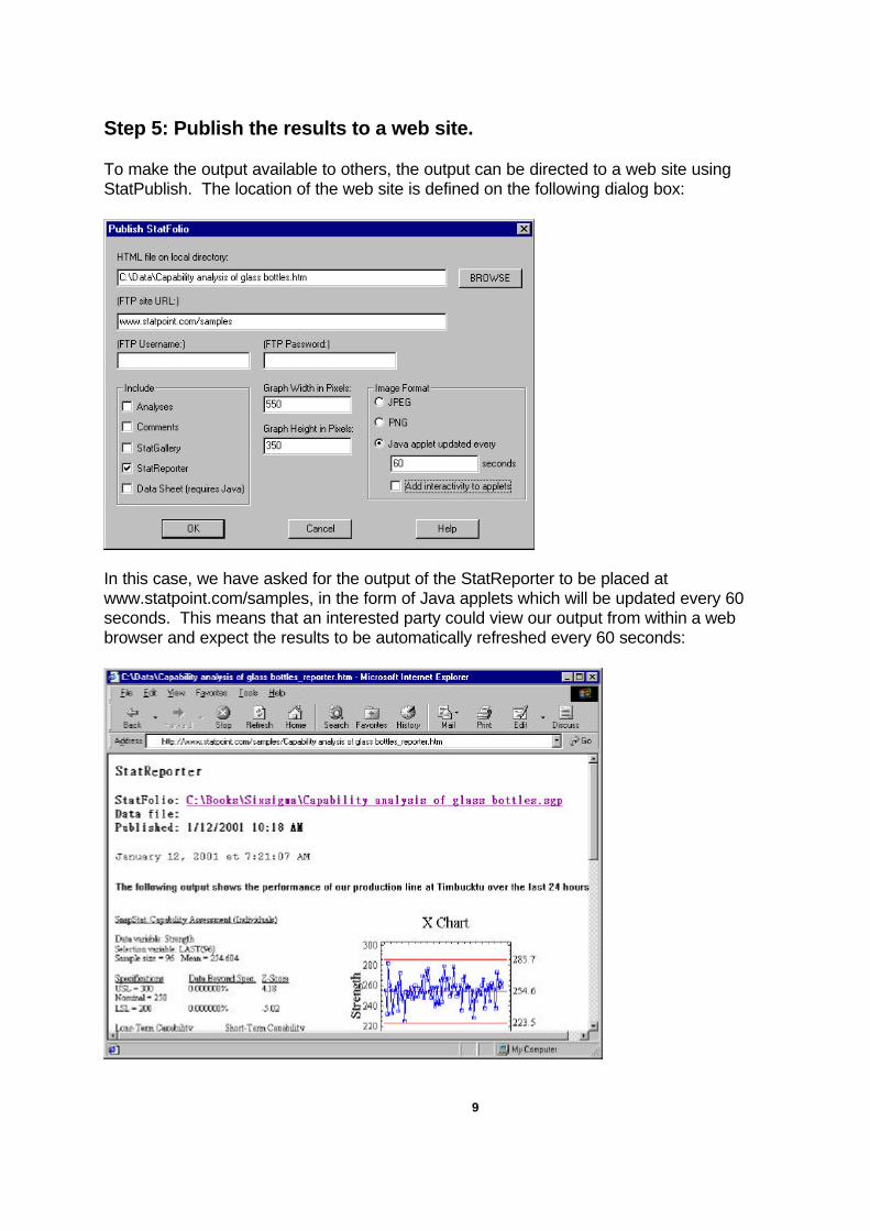
Step 5: Publish the results to a web site. To make the output available to others, the output can be directed to a web site using StatPublish. The location of the web site is defined on the following dialog box:
In this case, we have asked for the output of the StatReporter to be placed at www.statpoint.com/samples, in the form of Java applets which will be updated every 60 seconds. This means that an interested party could view our output from within a web browser and expect the results to be automatically refreshed every 60 seconds:
10
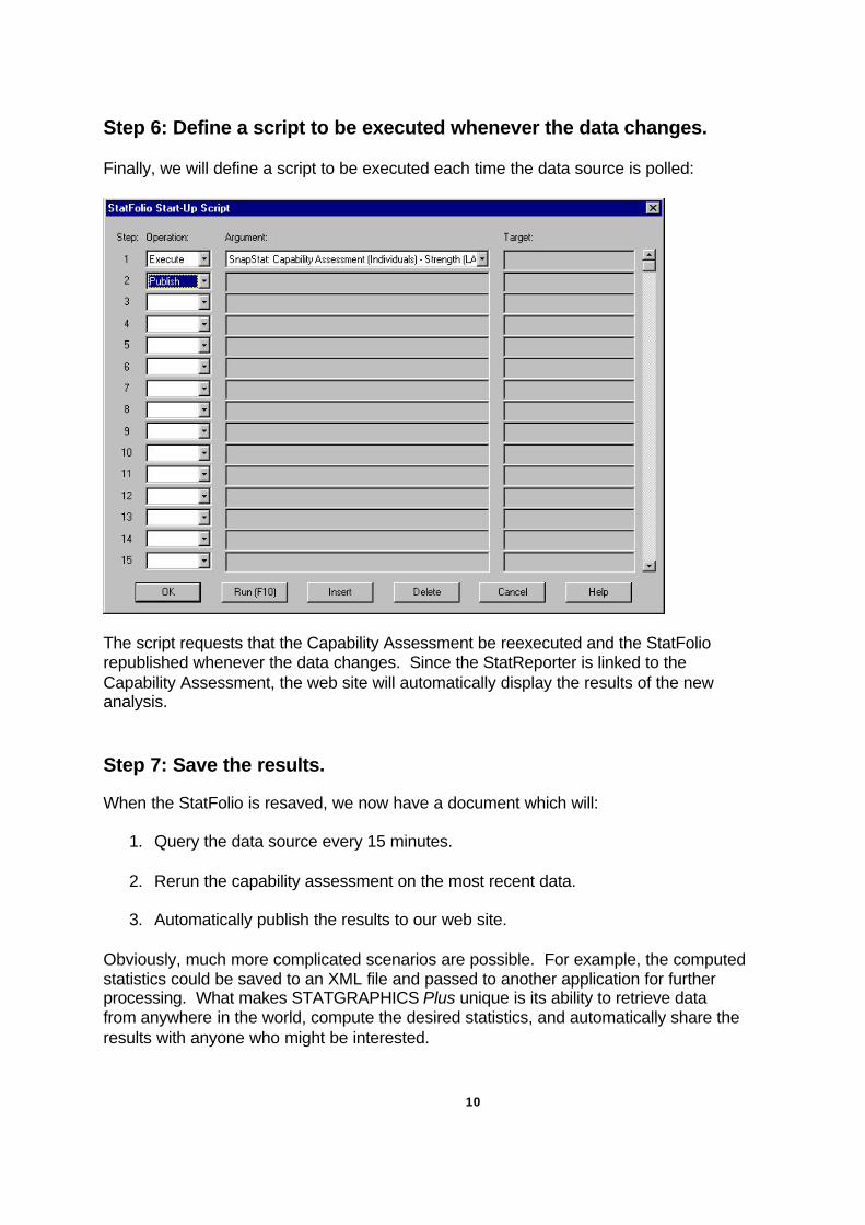
Step 6: Define a script to be executed whenever the data changes. Finally, we will define a script to be executed each time the data source is polled:
The script requests that the Capability Assessment be reexecuted and the StatFolio republished whenever the data changes. Since the StatReporter is linked to the Capability Assessment, the web site will automatically display the results of the new analysis. Step 7: Save the results. When the StatFolio is resaved, we now have a document which will:
1. Query the data source every 15 minutes.
2. Rerun the capability assessment on the most recent data.
3. Automatically publish the results to our web site. Obviously, much more complicated scenarios are possible. For example, the computed statistics could be saved to an XML file and passed to another application for further processing. What makes STATGRAPHICS Plus unique is its ability to retrieve data from anywhere in the world, compute the desired statistics, and automatically share the results with anyone who might be interested.
11
The StatAdvisorThe StatAdvisor
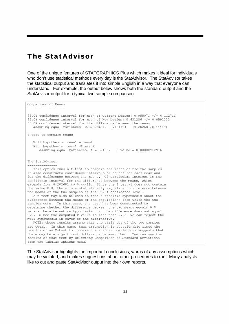
One of the unique features of STATGRAPHICS Plus which makes it ideal for individuals who don’t use statistical methods every day is the StatAdvisor. The StatAdvisor takes the statistical output and translates it into simple English in a way that everyone can understand. For example, the output below shows both the standard output and the StatAdvisor output for a typical two-sample comparison Comparison of Means ------------------- 95.0% confidence interval for mean of Current Design: 0.955071 +/- 0.112711 95.0% confidence interval for mean of New Design: 0.631286 +/- 0.0591332 95.0% confidence interval for the difference between the means assuming equal variances: 0.323786 +/- 0.121104 [0.202681,0.44489] t test to compare means Null hypothesis: mean1 = mean2 Alt. hypothesis: mean1 NE mean2 assuming equal variances: t = 5.4957 P-value = 0.00000912916 The StatAdvisor --------------- This option runs a t-test to compare the means of the two samples. It also constructs confidence intervals or bounds for each mean and for the difference between the means. Of particular interest is the confidence interval for the difference between the means, which extends from 0.202681 to 0.44489. Since the interval does not contain the value 0.0, there is a statistically significant difference between the means of the two samples at the 95.0% confidence level. A t-test may also be used to test a specific hypothesis about the difference between the means of the populations from which the two samples come. In this case, the test has been constructed to determine whether the difference between the two means equals 0.0 versus the alternative hypothesis that the difference does not equal 0.0. Since the computed P-value is less than 0.05, we can reject the null hypothesis in favor of the alternative. NOTE: these results assume that the variances of the two samples are equal. In this case, that assumption is questionable since the results of an F-test to compare the standard deviations suggests that there may be a significant difference between them. You can see the results of that test by selecting Comparison of Standard Deviations from the Tabular Options menu.
The StatAdvisor highlights the important conclusions, warns of any assumptions which may be violated, and makes suggestions about other procedures to run. Many analysts like to cut and paste StatAdvisor output into their own reports.
12
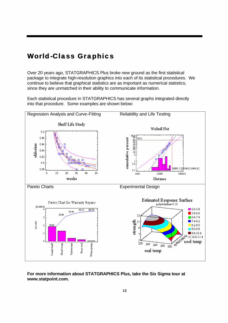
WorldWorld --Class GraphicsClass Graphics
Over 20 years ago, STATGRAPHICS Plus broke new ground as the first statistical package to integrate high-resolution graphics into each of its statistical procedures. We continue to believe that graphical statistics are as important as numerical statistics, since they are unmatched in their ability to communicate information. Each statistical procedure in STATGRAPHICS has several graphs integrated directly into that procedure. Some examples are shown below: Regression Analysis and Curve-Fitting
Reliability and Life Testing
Pareto Charts
Experimental Design
For more information about STATGRAPHICS Plus, take the Six Sigma tour at www.statpoint.com.
INTEGRATING STATGRAPHICS INTO A SIX SIGMA PROGRAM
INTEGRATING STATGRAPHICS INTO A SIX SIGMA PROGRAM
Introduction
This white paper discusses how integrating the STATGRAPHICS Plus statistical tools into a SixSigma program can provide ongoing benefits across an enterprise. Starting with a brief overview ofthe Six Sigma philosophy, the discussion then focuses on how the analytical and reporting toolswithin the STATGRAPHICS Plus software can be used to implement key components of the SixSigma approach.
What is the Six Sigma Philosophy?
The "Six Sigma" quality approach was pioneered in the 1980s by Motorola in response to a risingtide of global competition. Following a top-to-bottom analysis of its business operations, Motorolaadopted a set of processes geared toward reducing the time required to take a product from conceptto manufacture while simultaneously reducing the defects in products distributed to its customers.
Since then the Six Sigma approach has become a widely used management strategy for initiating acomprehensive review of all the processes a company undertakes to create, market, and support itsproducts. A rule-of-thumb is that average processes operate at a three-sigma level; best-in-class atsix sigma. Generally, the fundamental objective is that products and processes experience only 3.4defects per million opportunities.
The benefits of a successful Six Sigma program are many: cost savings, productivity gains,improved production cycle times, reduction in errors, and elimination of unnecessary work. Betterprocesses drive top-line growth, increase operating margins, and reduce working capital andspending.
Implementing Six Sigma
From the STATGRAPHICS Plus perspective, implementing a Six Sigma program means giving acompany's employees the most powerful statistical tools available to achieve their goals. Thesetools should serve both as a guide for improving processes by identifying trends away from setquality standards and as an archive for storing process information for future reference.
A company committing itself to a Six Sigma quality program must put in place an intensivetraining program for key executives and staff. In turn, these people learn to (1) organize andeffectively lead the deployment of the program, and (2) implement and use statistical tools in theirbusiness-improvement efforts.
The STATGRAPHICS Plus Statistical Toolkit
One goal for this white paper is to illustrate the impact that using STATGRAPHICS Plus canhave within an organization. Six Sigma training involves teaching employees how key statisticaltools are combined and sequenced to form a methodical and repeatable process for solving vital
2
manufacturing, engineering and administrative problems. These tools should help users gain abetter understanding of descriptive statistics and the relationship between variables.
Since its development in the early 1980s, STATGRAPHICS Plus has concentrated on providingstatistical tools that can be used both to (1) design quality into products, and (2) ensure thatacceptable quality is maintained throughout the production process. This approach fits well withthe broad Six Sigma mandate to develop an in-depth understanding of the philosophy as well asthe theory, tactics, strategy, and application tools.
STATGRAPHICS Plus is one of the few available statistical software applications that is flexibleenough to provide entry-level access for virtually everyone within a company, while still ensuringthat high-level statistical algorithms are available for addressing complex issues and calculations.It is a statistical software package that will serve a range of users from machine operators andshop floor supervisors to design and process engineers.
To provide this wide latitude of functionality, STATGRAPHICS Plus incorporates a number ofunique features:
StatWizard -- A tool to guide novice or casual users through the creation of an analysis from theselection of data to the choice of analytical options.
StatAdvisor -- A feature that provides short and easy-to-understand interpretations of all thereports and graphs in a statistical analysis.
StatFolios -- The main mechanism within STATGRAPHICS Plus for saving information aboutanalyses and their related data. An alternative to a macro language, this dialog-box drivenapproach allows users to save a single analysis or a combination of analyses that can encompassthe most complex calculations.
StatGallery -- A special tool for archival and report-generation purposes. Up to nine text andgraphics panes can be arranged on a single page. An overlay feature allows users to createcompound graphics. This is an ideal tool for comparing month-to-month or year-to-year data.
StatReporter -- A reporting tool that is accessible from within a STATGRAPHICS Plus session.Users can combine tables, graphs and their own notes into a personalized report. Using the Paste-Link feature, the StatReporter information updates whenever you update the linked analysis.
These features, plus others, embrace a new way of thinking about completing tasks quickly andefficiently. And they can be a powerful force in decision making or empowering employees.
The following sections provide explanations and examples of how various analyses supportmultiple aspects of the goals of a Six Sigma implementation: methods for monitoring, controlling,and improving a process through statistical analysis.
Measuring the Process
Most items manufactured today are produced using established specification limits, which ensurethat a process is producing a quality product. The Process Capability Analysis, based on a sampleof data, estimates the percentage of product that meets the specification limits and calculatesvarious capability indices to summarize the conformance to defects per million criteria.
3
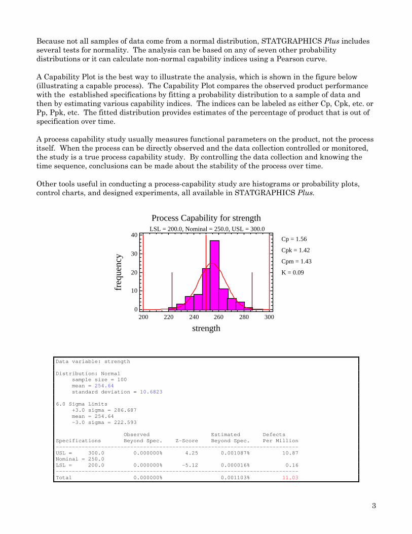
Because not all samples of data come from a normal distribution, STATGRAPHICS Plus includesseveral tests for normality. The analysis can be based on any of seven other probabilitydistributions or it can calculate non-normal capability indices using a Pearson curve.
A Capability Plot is the best way to illustrate the analysis, which is shown in the figure below(illustrating a capable process). The Capability Plot compares the observed product performancewith the established specifications by fitting a probability distribution to a sample of data andthen by estimating various capability indices. The indices can be labeled as either Cp, Cpk, etc. orPp, Ppk, etc. The fitted distribution provides estimates of the percentage of product that is out ofspecification over time.
A process capability study usually measures functional parameters on the product, not the processitself. When the process can be directly observed and the data collection controlled or monitored,the study is a true process capability study. By controlling the data collection and knowing thetime sequence, conclusions can be made about the stability of the process over time.
Other tools useful in conducting a process-capability study are histograms or probability plots,control charts, and designed experiments, all available in STATGRAPHICS Plus.
Cp = 1.56
Cpk = 1.42
Cpm = 1.43
K = 0.09
Process Capability for strength LSL = 200.0, Nominal = 250.0, USL = 300.0
strength
freq
uenc
y
200 220 240 260 280 3000
10
20
30
40
Data variable: strength
Distribution: Normal sample size = 100 mean = 254.64 standard deviation = 10.6823
6.0 Sigma Limits +3.0 sigma = 286.687 mean = 254.64 -3.0 sigma = 222.593
Observed Estimated DefectsSpecifications Beyond Spec. Z-Score Beyond Spec. Per Million---------------------------------------------------------------------------USL = 300.0 0.000000% 4.25 0.001087% 10.87Nominal = 250.0LSL = 200.0 0.000000% -5.12 0.000016% 0.16---------------------------------------------------------------------------Total 0.000000% 0.001103% 11.03
4
The above table shows a process that is operating somewhat above the Six Sigma target of 3.4defects per million. If the process can be re-centered so the upper Z-score rises above 4.5, that goalwill be achieved.
Statistical Tolerance Limits
It is often necessary to use information from a process capability study to set specifications fordiscrete parts or components that interact with other components to form the final product.Engineers want to know what type of limits can be achieved from a given sample of data.Statistical tolerance limits show the estimated interval within which a specified percentage ofproduct lies. Comparing these limits to the specification limits indicates the amount ofimprovement needed in the process.
Normal Tolerance Limits for strength
Normal distribution Sample size = 100 Mean = 254.64 Sigma = 10.6823
Specifications USL = 300.0 Nominal = 250.0 LSL = 200.0
95.0% tolerance interval for 99.9997% of the population Xbar +/- 5.13114 sigma Upper: 309.452 Lower: 199.828
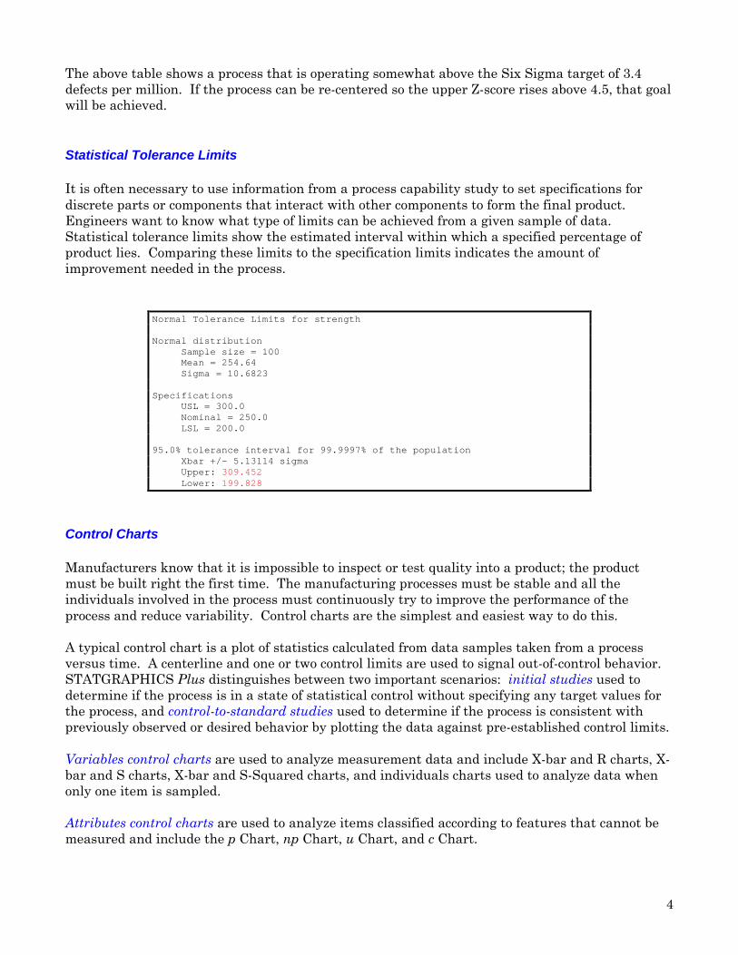
Control Charts
Manufacturers know that it is impossible to inspect or test quality into a product; the productmust be built right the first time. The manufacturing processes must be stable and all theindividuals involved in the process must continuously try to improve the performance of theprocess and reduce variability. Control charts are the simplest and easiest way to do this.
A typical control chart is a plot of statistics calculated from data samples taken from a processversus time. A centerline and one or two control limits are used to signal out-of-control behavior.STATGRAPHICS Plus distinguishes between two important scenarios: initial studies used todetermine if the process is in a state of statistical control without specifying any target values forthe process, and control-to-standard studies used to determine if the process is consistent withpreviously observed or desired behavior by plotting the data against pre-established control limits.
Variables control charts are used to analyze measurement data and include X-bar and R charts, X-bar and S charts, X-bar and S-Squared charts, and individuals charts used to analyze data whenonly one item is sampled.
Attributes control charts are used to analyze items classified according to features that cannot bemeasured and include the p Chart, np Chart, u Chart, and c Chart.
5
X-bar Chart for cereal
Subgroup
X-b
ar
CTR = 16.32
UCL = 16.82
LCL = 15.82
0 4 8 12 16 2015
15.4
15.8
16.2
16.6
17
For situations when a process shifts only a small amount from its usual level, STATGRAPHICSPlus provides time-weighted control charts that take into account the past history of the processwhen determining if a process is out of control. Time-weighted control charts include the MovingAverage Chart, EWMA Chart, CuSum Chart (V-mask and H-K), as well as individuals charts foreach of the above.
STATGRAPHICS Plus allows various enhancements to be made to all of its control charts. Forexample, warning limits can be added for an early signal that drifts are occurring in a process, ormoving-average smoothers can be added to estimate underlying trends.
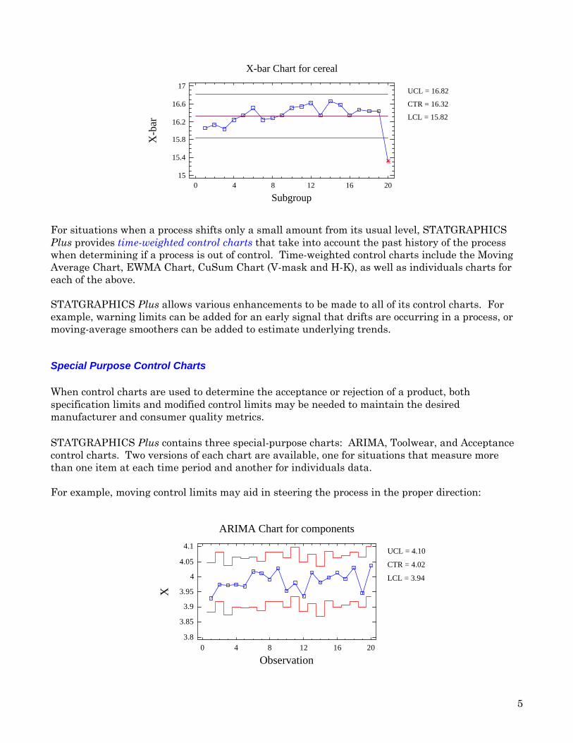
Special Purpose Control Charts
When control charts are used to determine the acceptance or rejection of a product, bothspecification limits and modified control limits may be needed to maintain the desiredmanufacturer and consumer quality metrics.
STATGRAPHICS Plus contains three special-purpose charts: ARIMA, Toolwear, and Acceptancecontrol charts. Two versions of each chart are available, one for situations that measure morethan one item at each time period and another for individuals data.
For example, moving control limits may aid in steering the process in the proper direction:
ARIMA Chart for components
Observation
X
CTR = 4.02
UCL = 4.10
LCL = 3.94
0 4 8 12 16 203.8
3.85
3.9
3.95
4
4.05
4.1
6
When control charts are used to determine acceptance or rejection of a product, both specificationlimits and modified control limits may be needed to maintain desired producer's and consumer'srisks:
Acceptance ChartLSL=200.0, USL=300.0
Observation
X
CTR = 254.6
UCL = 292.7
LCL = 207.3
0 20 40 60 80 100200
220
240
260
280
300
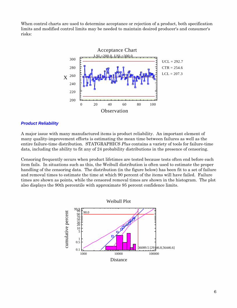
Product Reliability
A major issue with many manufactured items is product reliability. An important element ofmany quality-improvement efforts is estimating the mean time between failures as well as theentire failure-time distribution. STATGRAPHICS Plus contains a variety of tools for failure-timedata, including the ability to fit any of 24 probability distributions in the presence of censoring.
Censoring frequently occurs when product lifetimes are tested because tests often end before eachitem fails. In situations such as this, the Weibull distribution is often used to estimate the properhandling of the censoring data. The distribution (in the figure below) has been fit to a set of failureand removal times to estimate the time at which 90 percent of the items will have failed. Failuretimes are shown as points, while the censored removal times are shown in the histogram. The plotalso displays the 90th percentile with approximate 95 percent confidence limits.
90.0
36089.5 [29146.8,56446.6]
Weibull Plot
Distance
cum
ulat
ive
perc
ent
1000 10000 1000000.1
0.51
51020305070909999.9
7
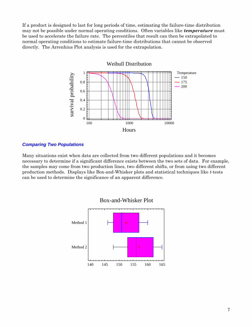
If a product is designed to last for long periods of time, estimating the failure-time distributionmay not be possible under normal operating conditions. Often variables like temperature mustbe used to accelerate the failure rate. The percentiles that result can then be extrapolated tonormal operating conditions to estimate failure-time distributions that cannot be observeddirectly. The Arrenhius Plot analysis is used for the extrapolation.
Weibull Distribution
Hours
surv
ival
pro
babi
lity Temperature
150175200
100 1000 100000
0.2
0.4
0.6
0.8
1
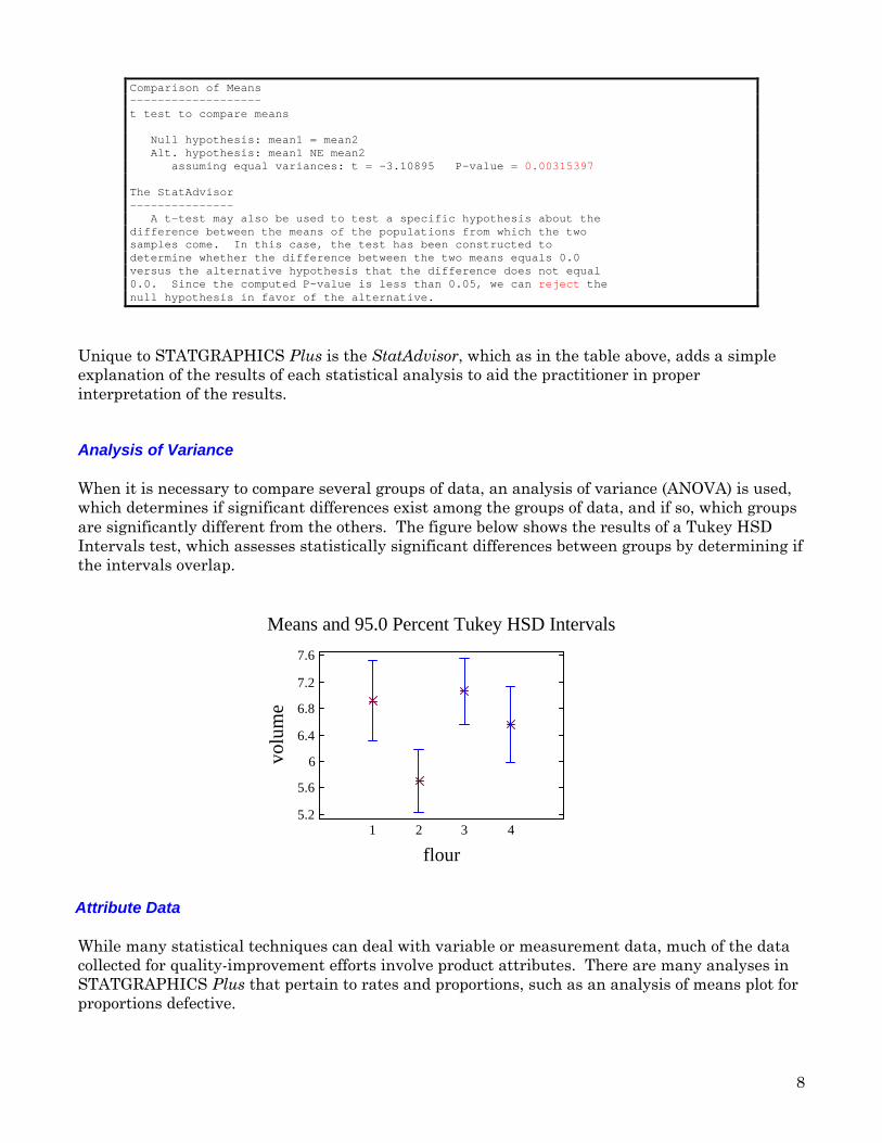
Comparing Two Populations
Many situations exist when data are collected from two different populations and it becomesnecessary to determine if a significant difference exists between the two sets of data. For example,the samples may come from two production lines, two different shifts, or from using two differentproduction methods. Displays like Box-and-Whisker plots and statistical techniques like t-testscan be used to determine the significance of an apparent difference.
Box-and-Whisker Plot
140 145 150 155 160 165
Method 1
Method 2
8
Comparison of Means-------------------t test to compare means
Null hypothesis: mean1 = mean2 Alt. hypothesis: mean1 NE mean2 assuming equal variances: t = -3.10895 P-value = 0.00315397
The StatAdvisor--------------- A t-test may also be used to test a specific hypothesis about thedifference between the means of the populations from which the twosamples come. In this case, the test has been constructed todetermine whether the difference between the two means equals 0.0versus the alternative hypothesis that the difference does not equal0.0. Since the computed P-value is less than 0.05, we can reject thenull hypothesis in favor of the alternative.
Unique to STATGRAPHICS Plus is the StatAdvisor, which as in the table above, adds a simpleexplanation of the results of each statistical analysis to aid the practitioner in properinterpretation of the results.
Analysis of Variance
When it is necessary to compare several groups of data, an analysis of variance (ANOVA) is used,which determines if significant differences exist among the groups of data, and if so, which groupsare significantly different from the others. The figure below shows the results of a Tukey HSDIntervals test, which assesses statistically significant differences between groups by determining ifthe intervals overlap.
Means and 95.0 Percent Tukey HSD Intervals
flour
volu
me
1 2 3 45.2
5.6
6
6.4
6.8
7.2
7.6
Attribute Data
While many statistical techniques can deal with variable or measurement data, much of the datacollected for quality-improvement efforts involve product attributes. There are many analyses inSTATGRAPHICS Plus that pertain to rates and proportions, such as an analysis of means plot forproportions defective.
9
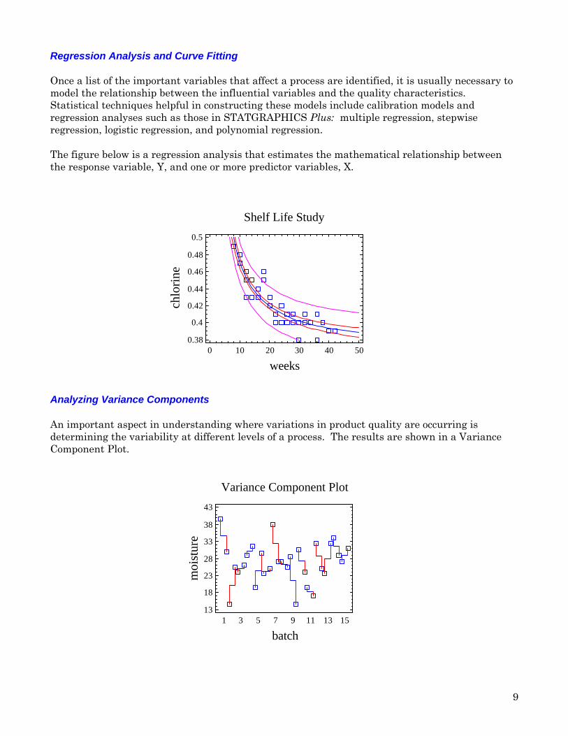
Regression Analysis and Curve Fitting
Once a list of the important variables that affect a process are identified, it is usually necessary tomodel the relationship between the influential variables and the quality characteristics.Statistical techniques helpful in constructing these models include calibration models andregression analyses such as those in STATGRAPHICS Plus: multiple regression, stepwiseregression, logistic regression, and polynomial regression.
The figure below is a regression analysis that estimates the mathematical relationship betweenthe response variable, Y, and one or more predictor variables, X.
Shelf Life Study
weeks
chlo
rine
0 10 20 30 40 500.38
0.4
0.42
0.44
0.46
0.48
0.5
Analyzing Variance Components
An important aspect in understanding where variations in product quality are occurring isdetermining the variability at different levels of a process. The results are shown in a VarianceComponent Plot.
Variance Component Plot
batch
moi
stur
e
1 3 5 7 9 11 13 1513
18
23
28
33
38
43
10
Experimental Design
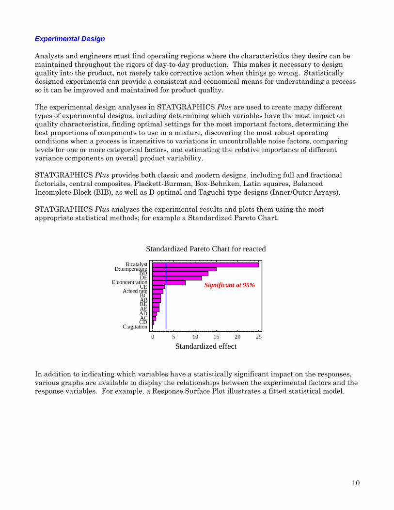
Analysts and engineers must find operating regions where the characteristics they desire can bemaintained throughout the rigors of day-to-day production. This makes it necessary to designquality into the product, not merely take corrective action when things go wrong. Statisticallydesigned experiments can provide a consistent and economical means for understanding a processso it can be improved and maintained for product quality.
The experimental design analyses in STATGRAPHICS Plus are used to create many differenttypes of experimental designs, including determining which variables have the most impact onquality characteristics, finding optimal settings for the most important factors, determining thebest proportions of components to use in a mixture, discovering the most robust operatingconditions when a process is insensitive to variations in uncontrollable noise factors, comparinglevels for one or more categorical factors, and estimating the relative importance of differentvariance components on overall product variability.
STATGRAPHICS Plus provides both classic and modern designs, including full and fractionalfactorials, central composites, Plackett-Burman, Box-Behnken, Latin squares, BalancedIncomplete Block (BIB), as well as D-optimal and Taguchi-type designs (Inner/Outer Arrays).
STATGRAPHICS Plus analyzes the experimental results and plots them using the mostappropriate statistical methods; for example a Standardized Pareto Chart.
Standardized Pareto Chart for reacted
Standardized effect0 5 10 15 20 25
C:agitationCDACADAEBEABBC
A:feed rateCE
E:concentrationDEBD
D:temperatureB:catalyst
Significant at 95%
In addition to indicating which variables have a statistically significant impact on the responses,various graphs are available to display the relationships between the experimental factors and theresponse variables. For example, a Response Surface Plot illustrates a fitted statistical model.
11
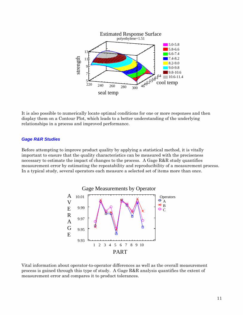
Estimated Response Surfacepolyethylene=1.51
seal temp
cool tempst
reng
th220 240 260 280 300 464952555861645
7
9
11
13
5.0-5.85.8-6.66.6-7.47.4-8.28.2-9.09.0-9.89.8-10.610.6-11.4
It is also possible to numerically locate optimal conditions for one or more responses and thendisplay them on a Contour Plot, which leads to a better understanding of the underlyingrelationships in a process and improved performance.
Gage R&R Studies
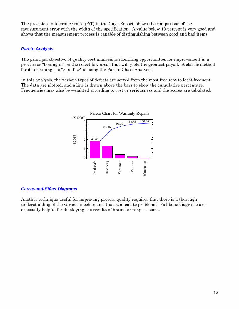
Before attempting to improve product quality by applying a statistical method, it is vitallyimportant to ensure that the quality characteristics can be measured with the precisenessnecessary to estimate the impact of changes to the process. A Gage R&R study quantifiesmeasurement error by estimating the repeatability and reproducibility of a measurement process.In a typical study, several operators each measure a selected set of items more than once.
Gage Measurements by Operator
PART
9.93
9.95
9.97
9.99
10.01AVERAGE
1 2 3 4 5 6 7 8 9 10
OperatorsABC
Vital information about operator-to-operator differences as well as the overall measurementprocess is gained through this type of study. A Gage R&R analysis quantifies the extent ofmeasurement error and compares it to product tolerances.
12
The precision-to-tolerance ratio (P/T) in the Gage Report, shows the comparison of themeasurement error with the width of the specification. A value below 10 percent is very good andshows that the measurement process is capable of distinguishing between good and bad items.
Pareto Analysis
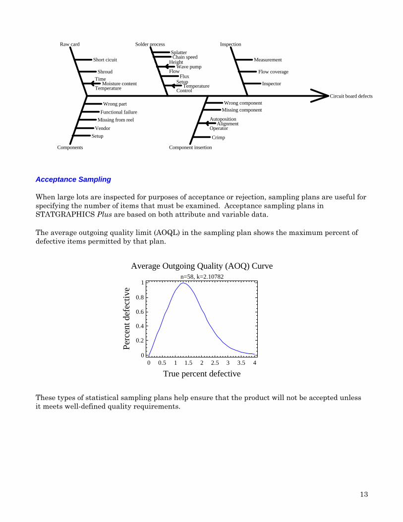
The principal objective of quality-cost analysis is identifing opportunities for improvement in aprocess or "honing in" on the select few areas that will yield the greatest payoff. A classic methodfor determining the "vital few" is using the Pareto Chart Analysis.
In this analysis, the various types of defects are sorted from the most frequent to least frequent.The data are plotted, and a line is drawn above the bars to show the cumulative percentage.Frequencies may also be weighted according to cost or seriousness and the scores are tabulated.
Pareto Chart for Warranty Repairs
scor
e
0
1
2
3
4(X 10000)
Cra
nksh
aft
Hea
d w
arp
Val
vetr
ain
Rea
r se
al
Wat
erpu
mp
48.66
83.0693.39
98.75 100.00
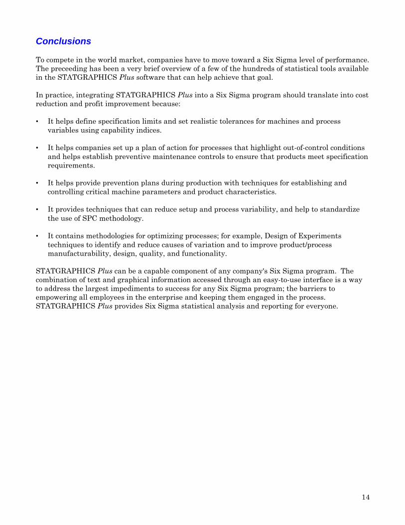
Cause-and-Effect Diagrams
Another technique useful for improving process quality requires that there is a thoroughunderstanding of the various mechanisms that can lead to problems. Fishbone diagrams areespecially helpful for displaying the results of brainstorming sessions.
13
Circuit board defects
Raw card
Short cicuit
Shroud
Moisture contentTime
Temperature
Solder process
SplatterChain speed
Wave pumpHeight
FlowFlux
TemperatureSetup
Control
Inspection
Measurement
Flow coverage
Inspector
Components
Wrong part
Functional failure
Missing from reel
Vendor
Setup
Component insertion
Wrong componentMissing component
AlignmentAutoposition
Operator
Crimp
Acceptance Sampling
When large lots are inspected for purposes of acceptance or rejection, sampling plans are useful forspecifying the number of items that must be examined. Acceptance sampling plans inSTATGRAPHICS Plus are based on both attribute and variable data.
The average outgoing quality limit (AOQL) in the sampling plan shows the maximum percent ofdefective items permitted by that plan.
Average Outgoing Quality (AOQ) Curven=58, k=2.10782
True percent defective
Perc
ent d
efec
tive
0 0.5 1 1.5 2 2.5 3 3.5 40
0.2
0.4
0.6
0.8
1
These types of statistical sampling plans help ensure that the product will not be accepted unlessit meets well-defined quality requirements.
14
Conclusions
To compete in the world market, companies have to move toward a Six Sigma level of performance.The preceeding has been a very brief overview of a few of the hundreds of statistical tools availablein the STATGRAPHICS Plus software that can help achieve that goal.
In practice, integrating STATGRAPHICS Plus into a Six Sigma program should translate into costreduction and profit improvement because:
• It helps define specification limits and set realistic tolerances for machines and processvariables using capability indices.
• It helps companies set up a plan of action for processes that highlight out-of-control conditionsand helps establish preventive maintenance controls to ensure that products meet specificationrequirements.
• It helps provide prevention plans during production with techniques for establishing andcontrolling critical machine parameters and product characteristics.
• It provides techniques that can reduce setup and process variability, and help to standardizethe use of SPC methodology.
• It contains methodologies for optimizing processes; for example, Design of Experimentstechniques to identify and reduce causes of variation and to improve product/processmanufacturability, design, quality, and functionality.
STATGRAPHICS Plus can be a capable component of any company's Six Sigma program. Thecombination of text and graphical information accessed through an easy-to-use interface is a wayto address the largest impediments to success for any Six Sigma program; the barriers toempowering all employees in the enterprise and keeping them engaged in the process.STATGRAPHICS Plus provides Six Sigma statistical analysis and reporting for everyone.